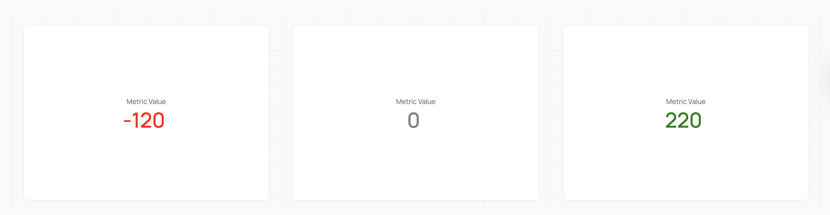
Documentation Index
Fetch the complete documentation index at: https://docs.omni.co/llms.txt
Use this file to discover all available pages before exploring further.
This example shows a KPI chart with dynamic color styling using the Markdown visualization.
Setup
This pattern uses a SQL CASE statement to assign a label based on the value of a metric. That label is then referenced in the Markdown as a CSS class to control styling.
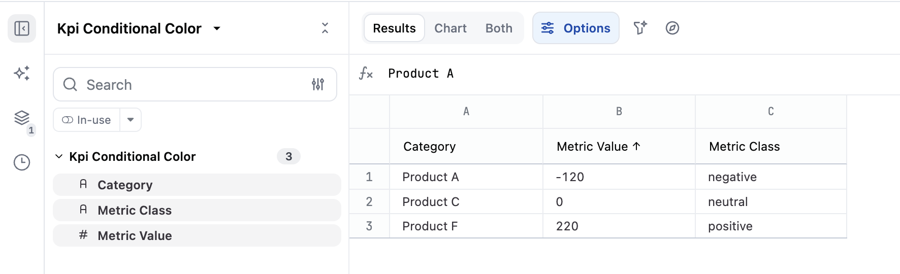
For example:
CASE
WHEN ${kpi_conditional_color.metric_value} < 0 THEN 'negative'
WHEN ${kpi_conditional_color.metric_value} = 0 THEN 'neutral'
WHEN ${kpi_conditional_color.metric_value} > 0 THEN 'positive'
END AS metric_class
Which would look like this in the workbook query:
Example code
<style>
.kpi-visualization.negative {
color: red;
}
.kpi-visualization.positive {
color: green;
}
.kpi-visualization.neutral {
color: gray;
}
</style>
<div class="kpi-visualization kpi-vertical-center {{result._first.kpi_conditional_color.metric_class.raw}}">
<div class="kpi-markdown-wrapper kpi-align-center">
<single-value label="Metric Value">
<span>{{result._first.kpi_conditional_color.metric_value.value}}</span>
</single-value>
</div>
</div>