Fill to progress level
This style shows the unmet progress levels as unfilled, but with a border color to indicate the meaning of the level.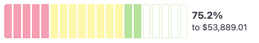
Setup
This chart has a very simple structure - the current measurement, the target, and the necessary calculations to create the chart. Adjust your calculation as needed for your data, but make sure you use the % formatting on the “progress” column. The following table explains each field used in the example, including the calculation formulas.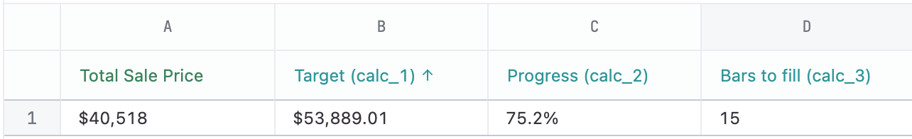
Example code
Show unmet levels as faded
This style shows the unmet progress levels as solid, but semi-transparent. As the progress levels fill, they become bolder and opaque.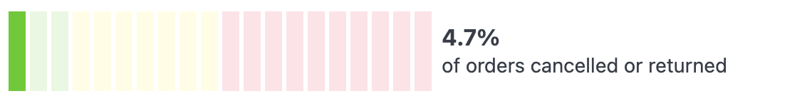
Setup
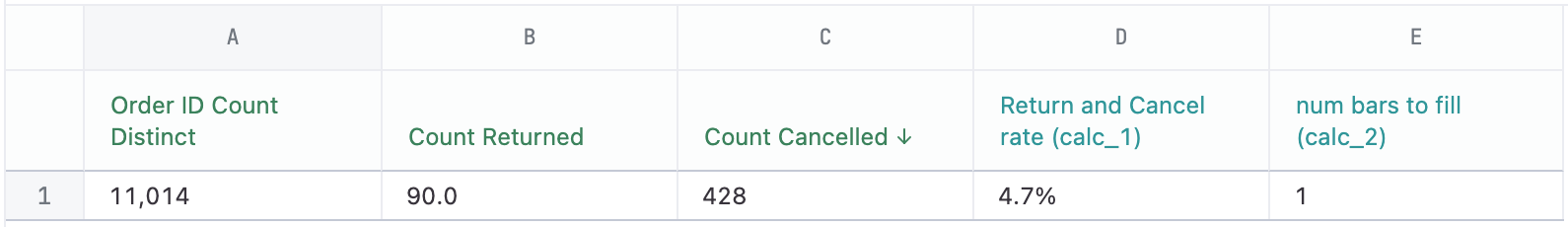
The data in this example shows an inverted coloring, where low is good, as it is measuring the percentage of returned or cancelled orders. You can adjust the calculations and coloring to suit your use case, but make sure you use the % formatting on the “progress” column. The following table explains each field used in the example, including the calculation formulas.