
Setup
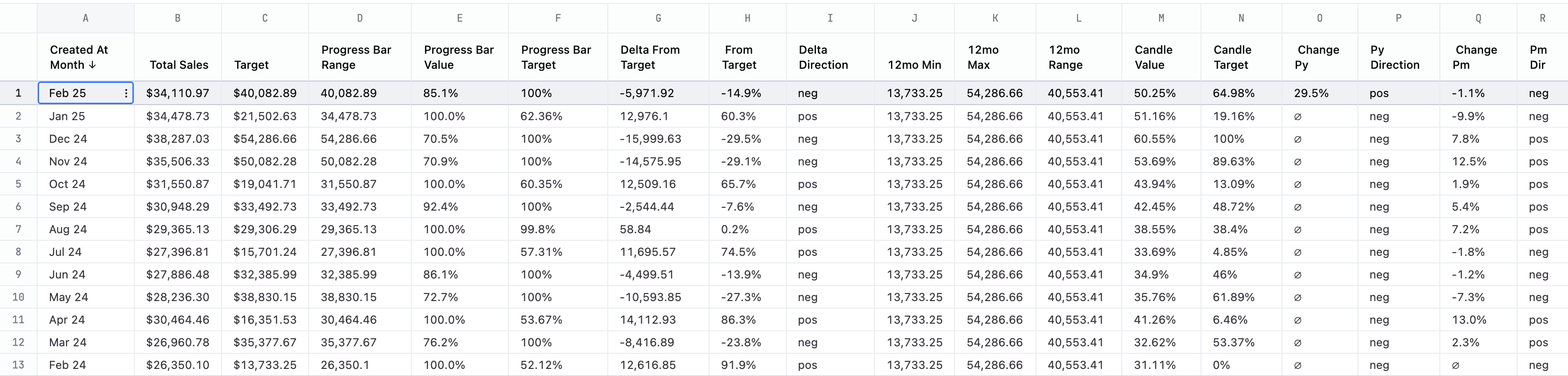
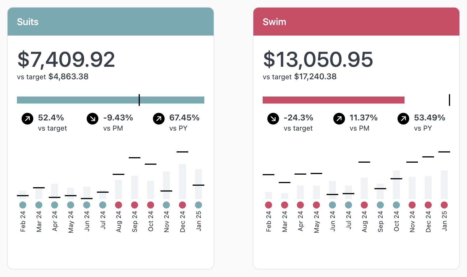
This markdown in this example complex and references a lot of calculations to position and style elements. Use this sample dataset, instructions, and code to recreate this example in your own instance.- Download the sample CSV.
- Upload the sample CSV to your instance. Refer to the Data input tables guide for instructions.
-
In a new query tab, select all fields except
Candlesticks Count. -
Format the fields as follows:
- Currency -
Total SalesandTarget Sales - Percent -
Progress Bar Value,Progress Bar Target,From Target,Candle Value,Candle Target,Change Py, andChange Pm
- Currency -
-
Format
Created At Monthto the month abbreviation with 2 digits for the year. -
Sort the query so the most recent month in the data set,
Feb 25, is first.