
Setup
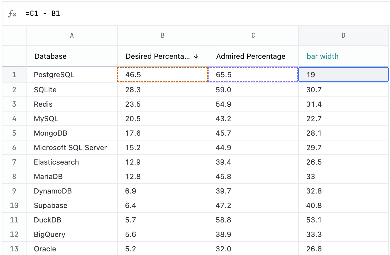
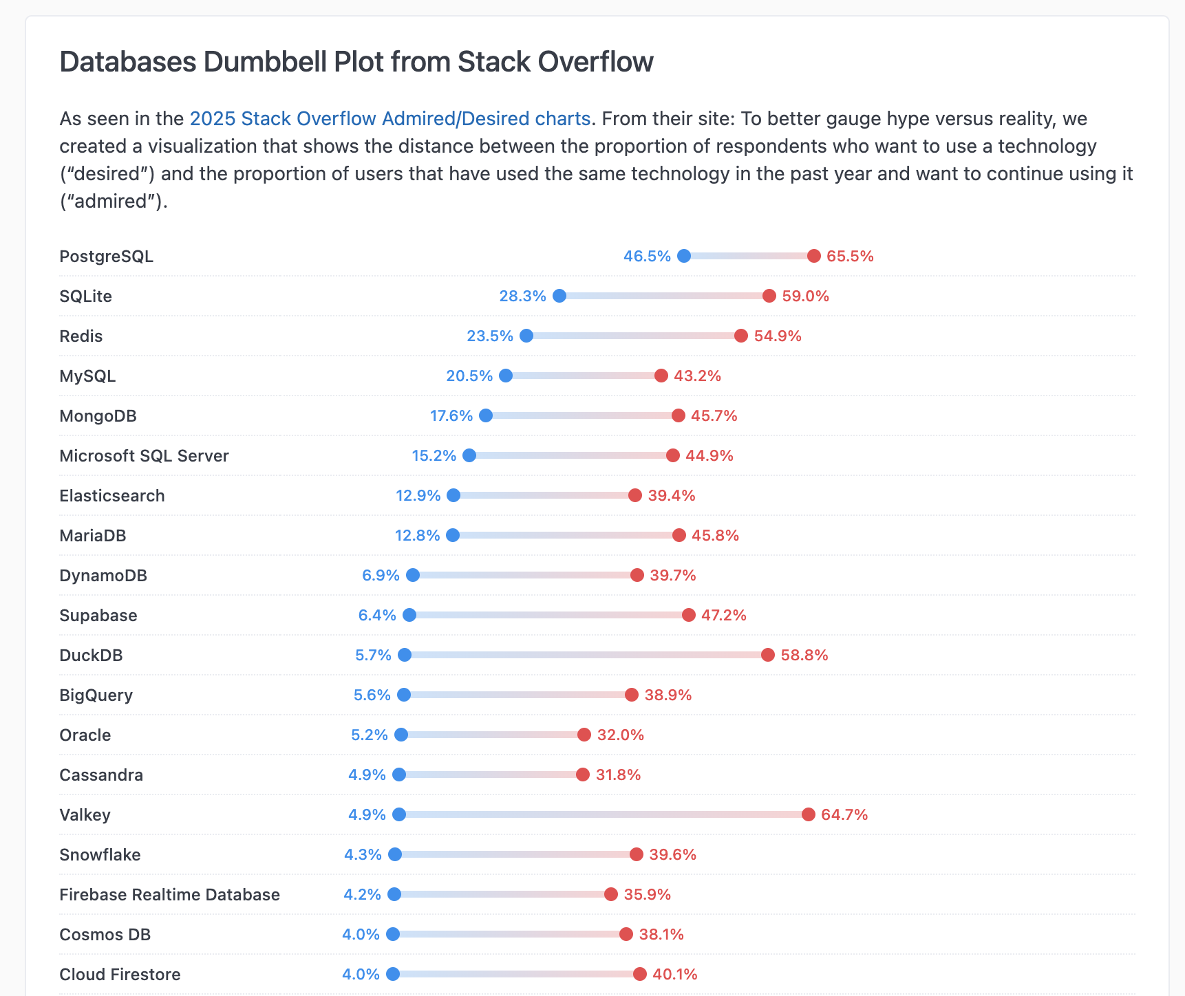
These charts use the Mustache iterator syntax to draw a chart for each row in the results. Your query should have a column with the category label for each dumbbell that you want to display along with the start and end values for each category. Additionally, you’ll need a calculation to get the length of the bar. Note: This example only covers a positive change between start and end values. You’ll need to make some adjustments if the change you are measuring can also be negative. The following table explains each field used in the example, including the calculation formulas.