Red/green uptime heatmap
This example shows the last 30 days of data, coloring any day red if the service level percentage is anything but 100%.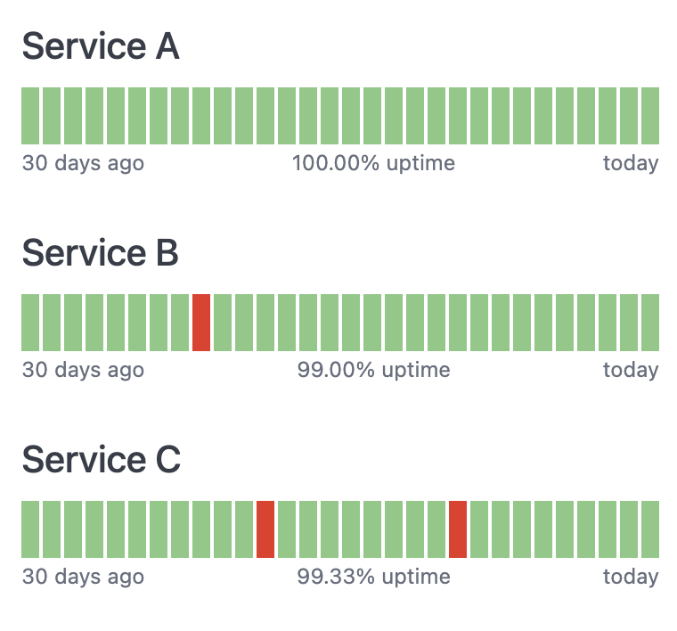
Setup
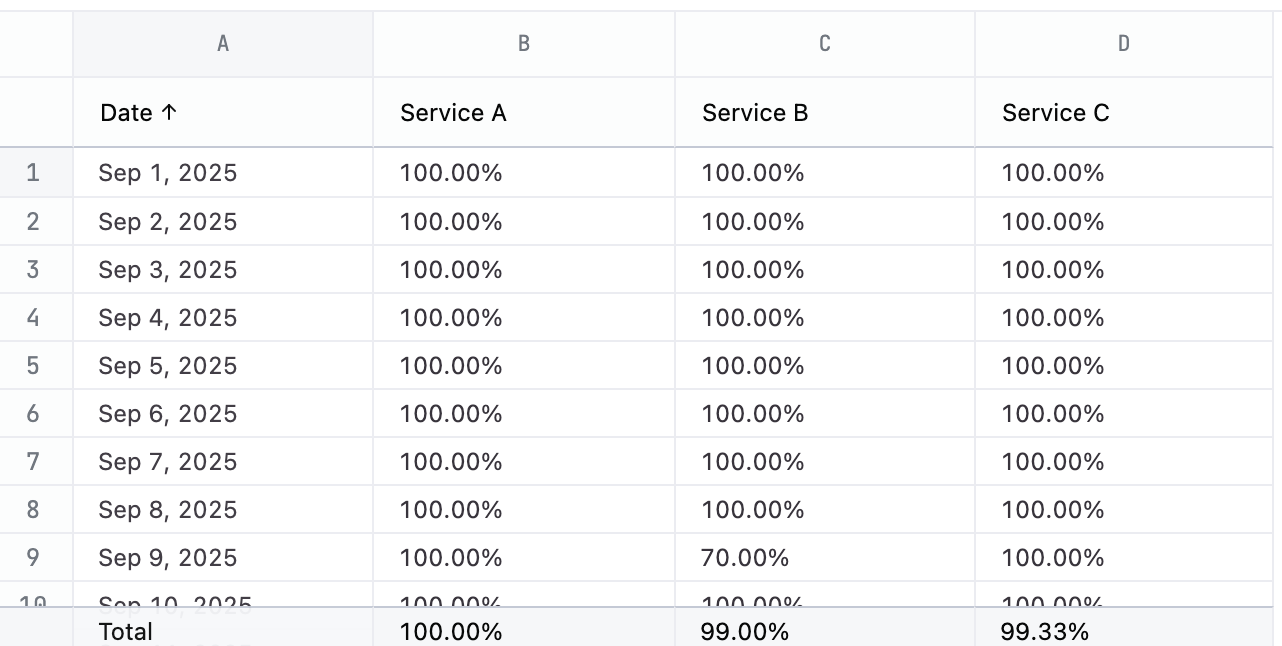
This chart has a simple structure - the time slot and a % value for each chart you want to make. Add column totals to the query and change the total calculation toaverage to add the average uptime below each chart.
Example code
Gradient uptime heatmap
This example shows the last 30 days of data, bucketing the colors along a red to yellow to green gradient. It also adds colored text to explain the current status.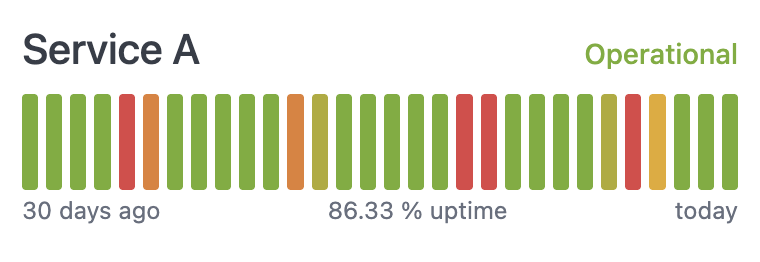
Setup
You’ll need a column for the time unit, a column for the percentage measurement, and a calculation to figure out how to apply the color. The gradient in this example is bucketed into 5 possible values. Adjust the calculation forColor tier to control how the coloring is applied. Add column totals to the query and change the total calculation to average to add the average uptime below each chart.
Note that this example invents an uptime percentage value via a calculation.
The following table explains the query setup, including the calculation formulas.