

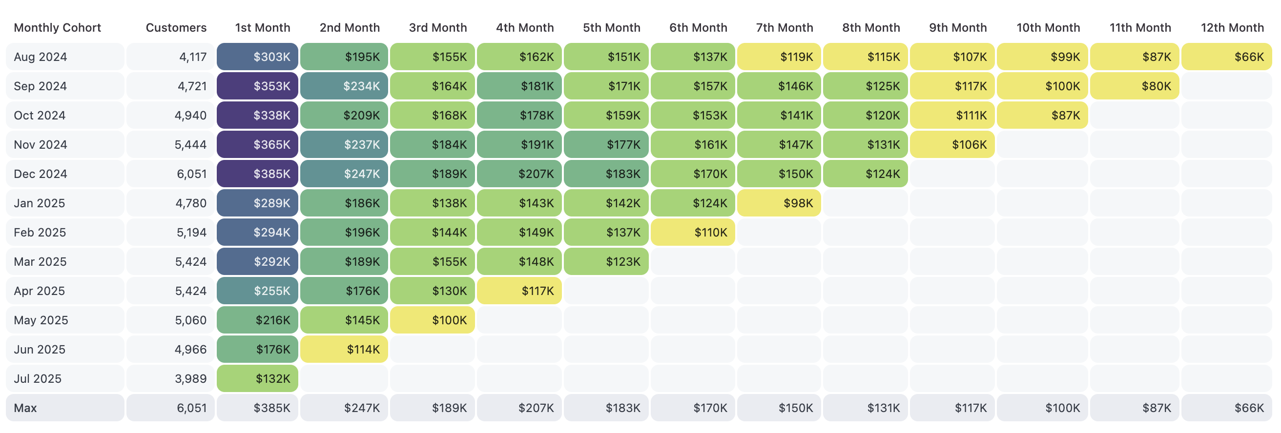
Setup
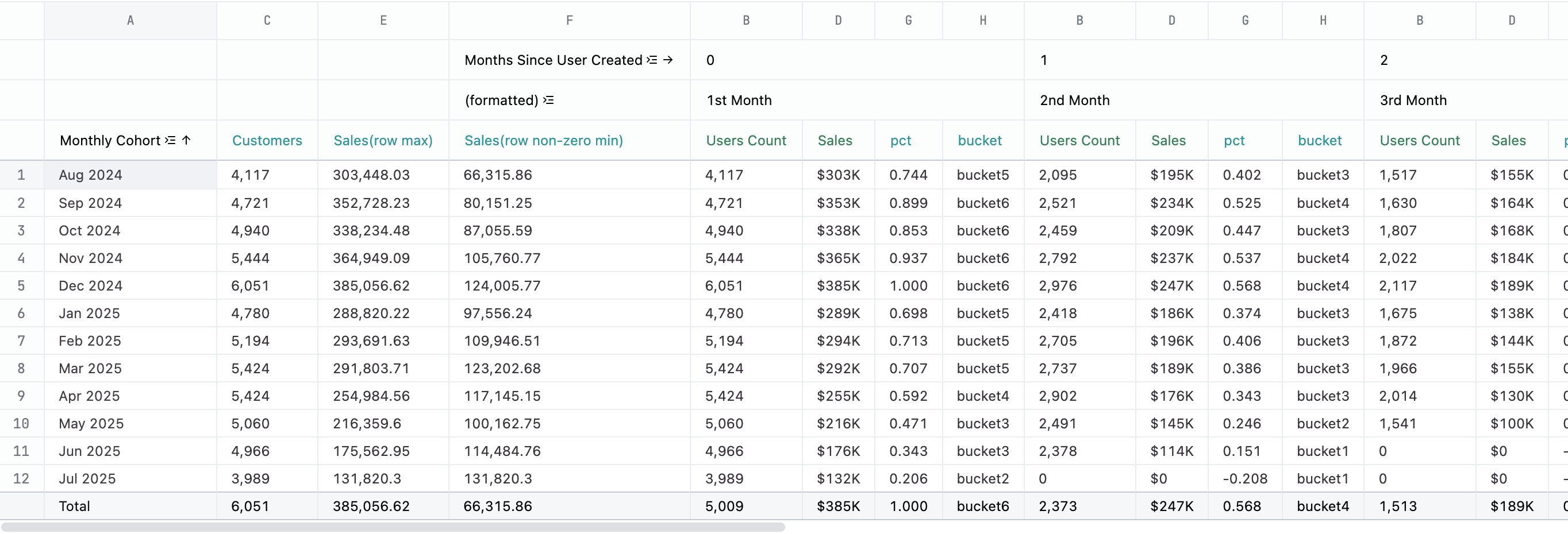
To build this chart you will need to structure your query with the cohorts as the rows and the time passed as the pivot. A calculation is used to pull the cohort size out of the pivot. Additional calculations are necessary to figure out how to color each cell. We’ll also need the column totals enabled. The following table explains each field used in the example, including the calculation formulas.| Col | Name | Description or formula | Purpose |
|---|---|---|---|
| A | Monthly cohort | query field | A row for each cohort, sorted with the oldest at the top |
| B | Users Count | query field | Count of users in the cohort (inside pivot) |
| C | Customers | =PIVOTOFFSET(B1, 0, 0) | First column of users count is the size of the cohort |
| D | Sales | query field | Total sales for the cohort (inside pivot) |
| E | Sales (row max) | =MAX(PIVOTROW(D1)) | Maximum sales value for the row - set total calculation to maximum |
| F | Sales (row non-zero min) | =IFERROR(MINIFS(PIVOTROW(D1), PIVOTROW(D1), “>0”), 0) | Minimum non-zero value for the row. If row is all zeros, will set to 0. Set total calculation to minimum |
| G | pct | =(D1 - F_TOTAL) / (E_TOTAL - F_TOTAL) | how close to the max value is the current cell - will be a value between 0 and 1 where 0 is the overall min sales value, 1 is the overall max value |
| H | bucket | =IF(G1 <= 0.167, “bucket1”, IF(G1 <= 0.333, “bucket2”, IF(G1 <= 0.5, “bucket3”, IF(G1 <= 0.667, “bucket4”, IF(G1 <= 0.833, “bucket5”, “bucket6”))))) | string to identify bin for coloring |
- column D - Sales - to be
maximum - column E - Sales (row max) - to be
maximum - column F - Sales (row non-zero min) - to be
minimum
Example code
<style>
.cohort-table {
  --header-color: var(--color-foreground2);
  --total-color: var(--color-border1);
  --empty-color: var(--color-foreground2);
  --cell-radius: 8px;
  border-spacing: 2px;
  width: 100%;

  & th {
    text-align: right;
    padding: 4px 8px;
    font-weight: 500;
  }

  & th.left-align {
    text-align: left;
  }

  & td {
    text-align: right;
    padding: 4px 8px;
  }

  & tbody th {
    background: var(--header-color);
    border-radius: var(--cell-radius);
    font-weight: normal;
  }

  & tfoot th {
    background: var(--total-color);
    border-radius: var(--cell-radius);
    font-weight: 500;
  }

  & tfoot td {
    background: var(--total-color);
    border-radius: var(--cell-radius);
  }

  & tbody td {
    background: transparent;
    border-radius: var(--cell-radius);
  }

  & tbody td.bucket1 { background: #F0E654ee; color: hsl(219deg 3% 3% / 85%); }
  & tbody td.bucket2 { background: #94D161ee; color: hsl(219deg 3% 3% / 85%); }
  & tbody td.bucket3 { background: #5DB27Fee; color: hsl(219deg 3% 3% / 85%); }
  & tbody td.bucket4 { background: #468C8Dee; color: hsl(180deg 0% 100% / 85%); }
  & tbody td.bucket5 { background: #40628Aee; color: hsl(180deg 0% 100% / 85%); }
  & tbody td.bucket6 { background: #423076ee; color: hsl(180deg 0% 100% / 85%); }

  /* blank out bottom right */
  & tbody {
    & tr:nth-of-type(2) td:nth-child(n+14) { color: var(--empty-color); background: var(--empty-color); }
    & tr:nth-of-type(3) td:nth-child(n+13) { color: var(--empty-color); background: var(--empty-color); }
    & tr:nth-of-type(4) td:nth-child(n+12) { color: var(--empty-color); background: var(--empty-color); }
    & tr:nth-of-type(5) td:nth-child(n+11) { color: var(--empty-color); background: var(--empty-color); }
    & tr:nth-of-type(6) td:nth-child(n+10) { color: var(--empty-color); background: var(--empty-color); }
    & tr:nth-of-type(7) td:nth-child(n+9) { color: var(--empty-color); background: var(--empty-color); }
    & tr:nth-of-type(8) td:nth-child(n+8) { color: var(--empty-color); background: var(--empty-color); }
    & tr:nth-of-type(9) td:nth-child(n+7) { color: var(--empty-color); background: var(--empty-color); }
    & tr:nth-of-type(10) td:nth-child(n+6) { color: var(--empty-color); background: var(--empty-color); }
    & tr:nth-of-type(11) td:nth-child(n+5) { color: var(--empty-color); background: var(--empty-color); }
    & tr:nth-of-type(12) td:nth-child(n+4) { color: var(--empty-color); background: var(--empty-color); }
  }
}
</style>

<table class="cohort-table">
  <thead>
    <tr>
      <th class="left-align">Monthly Cohort</th>
      <th>Customers</th>
      <th>1st Month</th>
      <th>2nd Month</th>
      <th>3rd Month</th>
      <th>4th Month</th>
      <th>5th Month</th>
      <th>6th Month</th>
      <th>7th Month</th>
      <th>8th Month</th>
      <th>9th Month</th>
      <th>10th Month</th>
      <th>11th Month</th>
      <th>12th Month</th>
    </tr>
  </thead>
  <tbody>
    {{#result}}
    <tr>
      <th class="left-align">{{ecomm__users.created_at[month].value}}</th>
      <th>{{calc_1.value_static}}</th>
      <td class="{{0.1st Month.calc_5.raw}}">{{0.1st Month.ecomm__order_items.sale_price_sum.value}}</td>
      <td class="{{1.2nd Month.calc_5.raw}}">{{1.2nd Month.ecomm__order_items.sale_price_sum.value}}</td>
      <td class="{{2.3rd Month.calc_5.raw}}">{{2.3rd Month.ecomm__order_items.sale_price_sum.value}}</td>
      <td class="{{3.4th Month.calc_5.raw}}">{{3.4th Month.ecomm__order_items.sale_price_sum.value}}</td>
      <td class="{{4.5th Month.calc_5.raw}}">{{4.5th Month.ecomm__order_items.sale_price_sum.value}}</td>
      <td class="{{5.6th Month.calc_5.raw}}">{{5.6th Month.ecomm__order_items.sale_price_sum.value}}</td>
      <td class="{{6.7th Month.calc_5.raw}}">{{6.7th Month.ecomm__order_items.sale_price_sum.value}}</td>
      <td class="{{7.8th Month.calc_5.raw}}">{{7.8th Month.ecomm__order_items.sale_price_sum.value}}</td>
      <td class="{{8.9th Month.calc_5.raw}}">{{8.9th Month.ecomm__order_items.sale_price_sum.value}}</td>
      <td class="{{9.10th Month.calc_5.raw}}">{{9.10th Month.ecomm__order_items.sale_price_sum.value}}</td>
      <td class="{{10.11th Month.calc_5.raw}}">{{10.11th Month.ecomm__order_items.sale_price_sum.value}}</td>
      <td class="{{11.12th Month.calc_5.raw}}">{{11.12th Month.ecomm__order_items.sale_price_sum.value}}</td>
    </tr>
    {{/result}}
  </tbody>
  <tfoot>
    <tr>
      <th class="left-align">Max</th>
      <td>{{result._totals.0.calc_1.value_static}}</td>
      <td>{{result._totals.0.0.1st Month.ecomm__order_items.sale_price_sum.value_static}}</td>
      <td>{{result._totals.0.1.2nd Month.ecomm__order_items.sale_price_sum.value_static}}</td>
      <td>{{result._totals.0.2.3rd Month.ecomm__order_items.sale_price_sum.value_static}}</td>
      <td>{{result._totals.0.3.4th Month.ecomm__order_items.sale_price_sum.value_static}}</td>
      <td>{{result._totals.0.4.5th Month.ecomm__order_items.sale_price_sum.value_static}}</td>
      <td>{{result._totals.0.5.6th Month.ecomm__order_items.sale_price_sum.value_static}}</td>
      <td>{{result._totals.0.6.7th Month.ecomm__order_items.sale_price_sum.value_static}}</td>
      <td>{{result._totals.0.7.8th Month.ecomm__order_items.sale_price_sum.value_static}}</td>
      <td>{{result._totals.0.8.9th Month.ecomm__order_items.sale_price_sum.value_static}}</td>
      <td>{{result._totals.0.9.10th Month.ecomm__order_items.sale_price_sum.value_static}}</td>
      <td>{{result._totals.0.10.11th Month.ecomm__order_items.sale_price_sum.value_static}}</td>
      <td>{{result._totals.0.11.12th Month.ecomm__order_items.sale_price_sum.value_static}}</td>
    </tr>
  </tfoot>
</table>