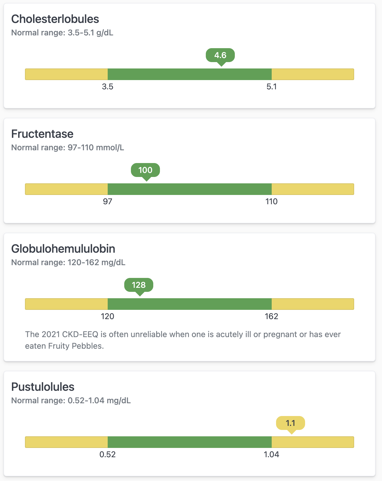
Setup
This query used for this example has the following structure:- Test name - Title for the card
- Normal min - Value for the minimum “normal” range
- Normal max - Value for the maximum “normal” range
- Measurement - The current “test” result/value to plot on the chart
- Chart min (calc_4) - Calculated “min” of the whole chart using the (
=B1 - ((C1 - B1) / 2)) - Chart max (calc_1) - Calculated “max” of the whole chart using the (
=(C1 - B1) / 2 + C1) - % position (calc_2) -
- Result classification (calc_5) - calculation to use for coloring (
=IF(D1 < B1, "low", IF(D1 > C1, "high", "normal"))) - Units - For labeling
- Notes (calc_3) - Additional context for the card
