Use cases
Sankey charts are particularly useful for visualizing:- User flows through a website or application
- Conversion funnels showing drop-off at each stage
- Resource allocation across different categories
- Migration patterns or transitions between states
- Budget flows and spending breakdowns
Limitations
Cycles are not currently supported. If your data contains a cycle - that is, a circular reference - aSankey does not support cycles or paths that loop back to previous nodes. error will display. Refer to the Troubleshooting section for more information.
Data structure
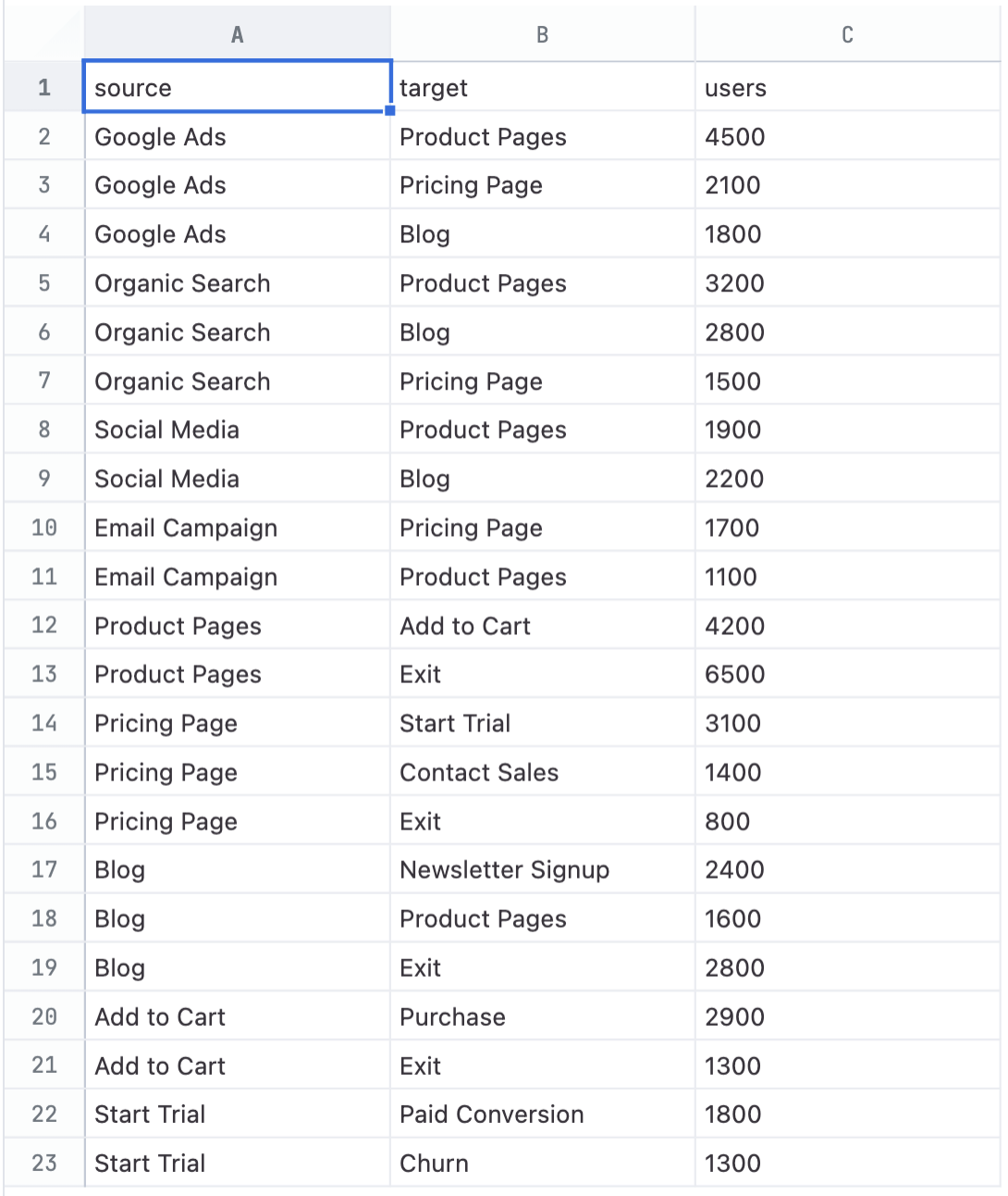
Sankey charts require at least two dimensions and a measure:- Source - The starting node for each flow (dimension)
- Target - The destination node for each flow (dimension)
- Link width - The magnitude of each flow (measure)
- Sankey charts work best with a manageable number of nodes. Too many nodes can make the visualization difficult to read.
- Ensure your data includes all relevant flows between stages for an accurate representation
Multi-level sankeys
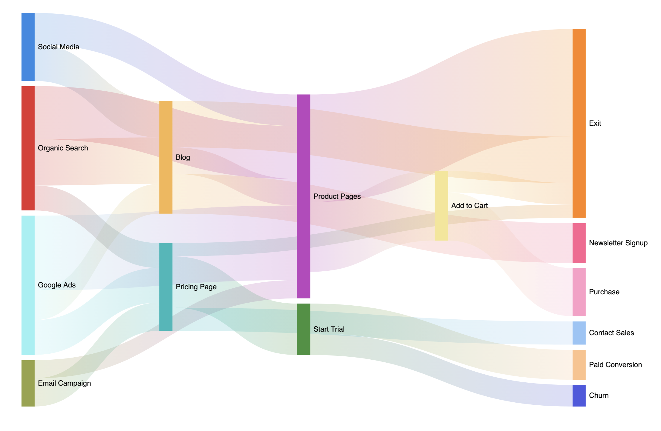
You can create multi-level sankey charts when nodes appear in both the source and target fields. For example, if your dataset has nodesA → B → C, where B serves as both a target (from A) and a source (to C), the chart will display multiple levels of flow.
For example, consider the dataset used for the chart at the top of this page:
Configuration
To view the configuration options for a sankey chart, open the Chart options panel in a workbook: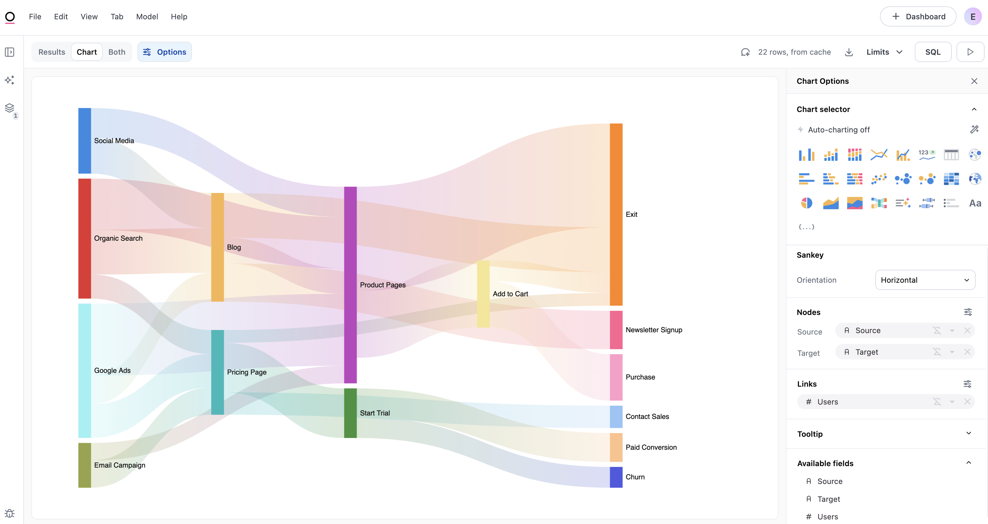
Orientation
Located in the Sankey section of the Chart options panel, the Orientation setting controls how the flows are displayed:- Horizontal - Default. Nodes arranged left to right with flows moving horizontally.
- Vertical - Nodes arranged top to bottom with flows moving vertically
Nodes
The Nodes section controls the appearance of the bars at each stage of the flow.Field mapping
- Source - The dimension representing the starting point of each flow
- Target - The dimension representing the destination of each flow
Color
Nodes support two coloring modes:- Discrete - Assigns a distinct color from the palette to each node
- Gradient - Applies a continuous color scale based on node size, where larger nodes receive more saturated colors
Labels
Toggle data labels to display node names on the chart. Label options include:- Position - Top, bottom, left, right, or inside
- Font size - Adjust the label text size
- Styling - Bold and italic options
Links
The Links section controls the appearance of the flows between nodes.Field mapping
- Link width - The measure that determines the width of each flow
Color
Links support four coloring options:- Source-target gradient - Default. A gradient from the source node color to the target node color.
- Source - Solid color matching the source node
- Target - Solid color matching the target node
- Custom - A single color of your choice for all links
Data labels
Toggle data labels to display values on the links. Link labels support:- Font size and styling - Standard text formatting options
- Format - Number formatting options, such as currency or percentage
Tooltips
Tooltips appear when hovering over links and nodes to display information about the flow.Default tooltip content
- Node tooltips - Display the node name and value
- Link tooltips - Display the source node, target node, and flow value
Show percentages
Enable the Show percentages toggle to display percentage calculations in tooltips:- Node tooltips - Shows the node value as a percentage of the total of all nodes
- Link tooltips - Shows three percentage values:
- % of total - The link value as a percentage of all link values
- % of source node - The link value as a percentage of the source node’s total value
- % of target node - The link value as a percentage of the target node’s total value
Percentage rows only appear in tooltips when a field is configured for the tooltip and the Show percentages toggle is enabled.
Troubleshooting
Sankey option is not available
Sankey option is not available
The Sankey chart type requires at least three fields in your query:
- two dimensions (for source and target nodes)
- one measure (for link width)
'Sankey does not support cycles or paths that loop back to previous nodes.' error
'Sankey does not support cycles or paths that loop back to previous nodes.' error
Sankey charts require data that flows in one direction without loops. This error appears when your data contains circular references. For example, if
A → B and B → A both exist in your dataset.To fix this, review your data for bidirectional flows or loops where a node eventually flows back to itself. You’ll need to either remove the rows that create the cycle or restructure your data so flows only move forward through the stages.