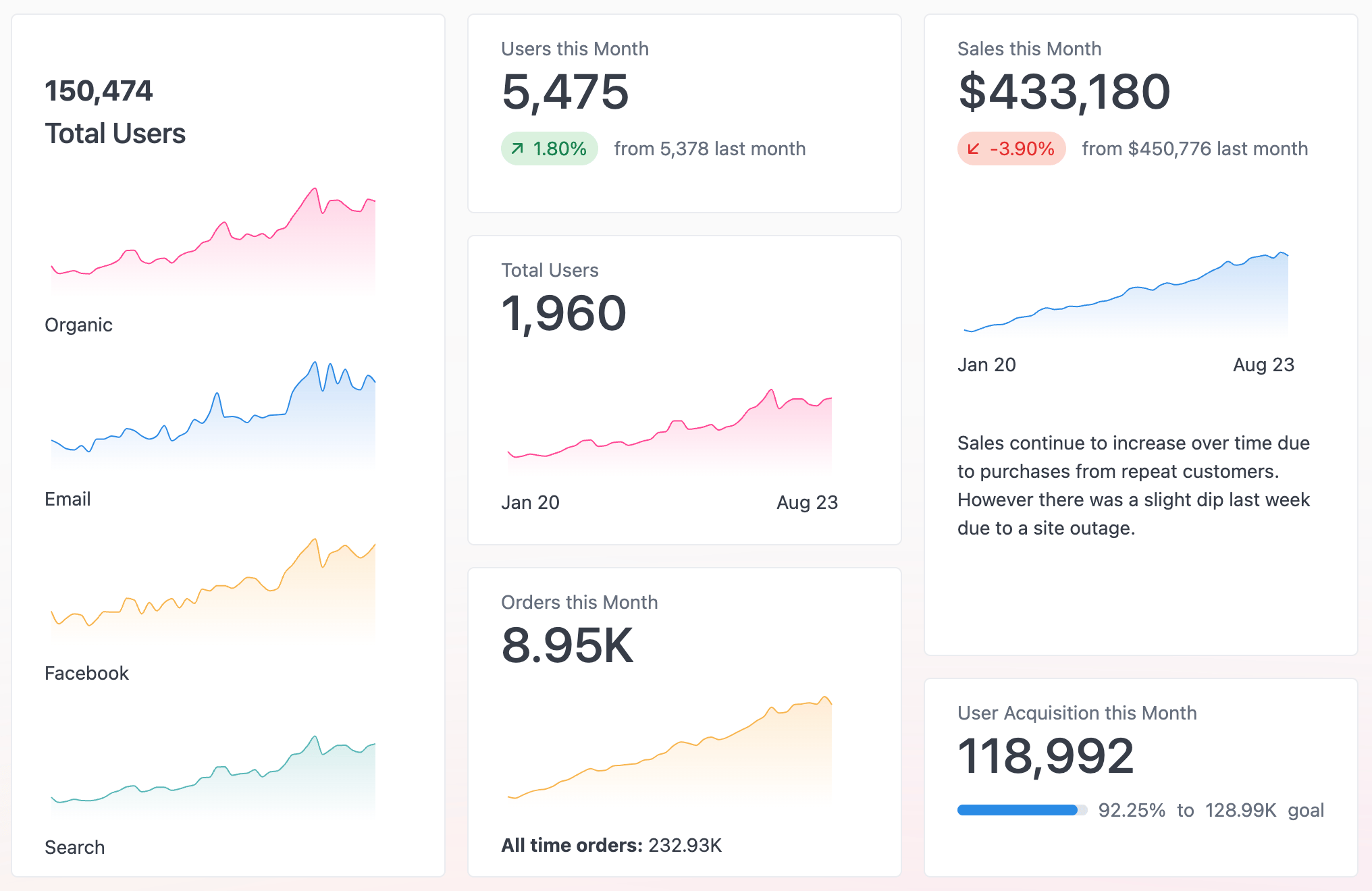
Adding components
KPIs support several types of components, allowing you to customize the content and layout of your visualization. Click the Add button in the visualization to add a new component.Customizing components
To customize the display of a component, click the component in the visualization editor. Use the KPI Builder tab in the chart configuration options to make changes to the component.Component types
KPIs support several component types, each suited to a different way of presenting data. You can mix and match them within a single visualization.Number
Highlights a single value.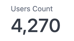
A number component highlighting a single value
Comparison
Comparison components compare one value to another and support comparing across columns and pivots. Select the same column for both comparison fields to compare two rows within a dataset.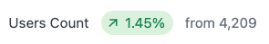
A comparison component comparing one value to another
Progress
Compares two values. Useful for showing progress to a goal. Can be displayed as a bar (shown) or a circle.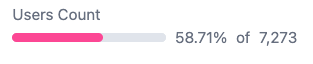
A progress component shown as a bar
Chart
Chart components display a mini sparkline, bar, or line chart. Renders a sparkline by default.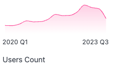
A chart component rendered as a sparkline
Text
Markdown enabled free text. Useful for titles, headings, and descriptions. For complex layouts, use the Markdown visualization.
A text component displaying Markdown-formatted text
Image
Images display an inline image. Configured by providing a URL to a publicly accessible image.
An image component displaying an inline image
Styling options
Use the Style tab in the chart configuration options to customize the alignment and text sizes for KPI components.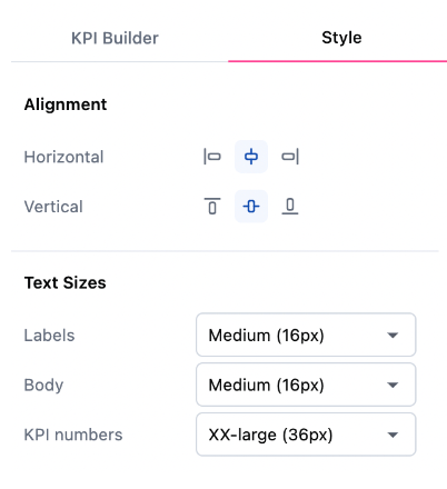
KPI style configuration options