Use cases
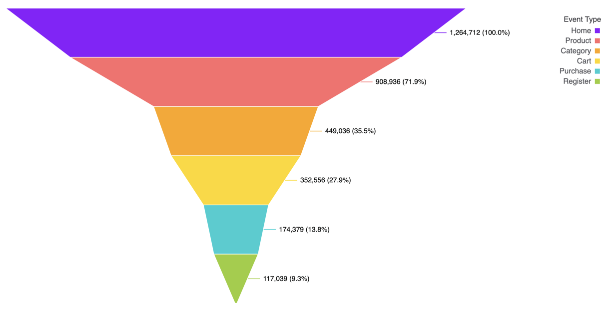
Funnel charts are particularly useful for visualizing:- Conversion funnels showing user progression through a workflow
- Sales pipelines tracking deals from lead to close
- Customer journey stages from awareness to purchase
- Application processes with multiple steps
- Any sequential process where you want to highlight drop-off between stages
Data structure
Funnel charts require at least one dimension and one measure:- Stage - The sequential steps in your process (dimension)
- Value - The count or value at each stage (measure)
- Stages should be ordered sequentially to accurately represent the flow
- Values typically decrease at each stage, though this is not required
- Use measures that make sense to compare across stages (e.g., user count, deal value)
Configuration
To view the configuration options for a funnel chart, open the Chart options panel in a workbook: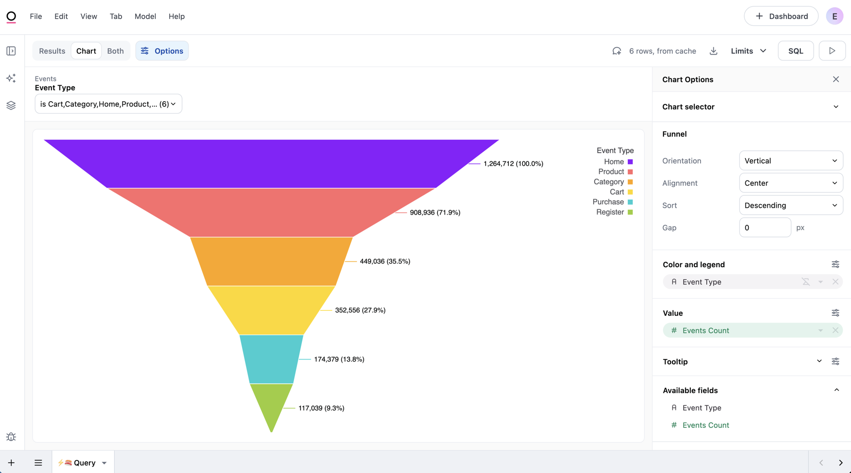
Orientation and alignment
The Orientation setting controls how the funnel is displayed:- Vertical - Stages arranged top to bottom with the widest segment at the top
- Horizontal - Stages arranged left to right with the widest segment on the left
- Left - Aligns the funnel to the left
- Center - Aligns the funnel in the center
- Right - Aligns the funnel to the right
Gap spacing
The Gap setting controls the amount of whitespace (in pixels) between each stage in the funnel.Color
Funnel charts support standard color configuration options:- Assign colors to individual stages
- Use color palettes for automatic coloring
- Apply modeled colors when defined
Labels
Toggle data labels to display stage names and values on the chart. Access the following label options by clicking the icon above the Color and legend and Value sections. Click the Data labels checkbox to enable label visibility, which will display some label configuration options: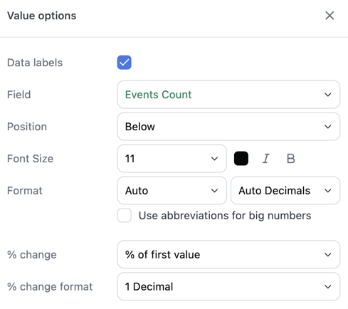
- Position - Where labels appear relative to each segment. Available positions depend on the funnel orientation:
- Horizontal - Top, bottom, or middle
- Vertical - Left, right, or middle
- Font styling - Adjust the label text size, color, and styling (bold, italic)
- Format - Number formatting options, such as currency or percentage and decimal places
- % change - Display a conversion percentage alongside each label. Options include:
- None - No percentage will display
- Percent of first - Each stage’s value as a percentage of the first stage
- Percent of previous - Each stage’s value as a percentage of the preceding stage
- % change format - Control how many decimal places appear in the percentage value
Tooltips
Tooltips appear when hovering over funnel segments and display information about each stage. By default, tooltips show both the percent of first and percent of previous stage values for each segment. You can format or hide these values individually. Use the tooltip configuration to further customize what information appears and add additional fields.Next steps
- Learn more about color configuration
- Explore tooltip customization
- Review other chart types