Using a classic dashboard? Upgrade it to use the features in this guide.
Requirements
Creating and modifying filters requires Editor, Manager, or Owner permissions on the document.String filter display options
String filters can be displayed in a few ways, including:- Buttons, for both single and multiple selections
- Dropdown list (multi-select)
Displaying options as buttons
Filters must be placed inside a container to use this display option.
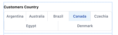
Inline
Displays inline with the dashboard content
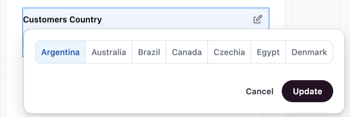
Popover
Opens in an overlay when clicked
Add and configure the filter
- Open a dashboard and enter draft mode by clicking Edit.
- Click Add > Filter to add a new filter.
- Configure the filter, clicking Done when finished.
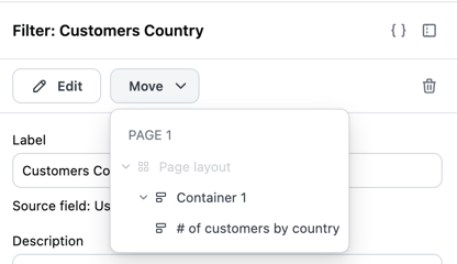
Move the filter into a container
Next, you’ll move the filter into a dashboard container. This is required to access the filter’s single selection options.
- At the top of the dashboard, click Catalog, then the filter. This will open the filter’s properties panel on the right side of the page.
- In the filter properties panel, click Move.
-
In the dropdown, select the container you want to move the filter to:
Configure selection options
- If the filter properties panel is no longer open, click the filter to open it.
-
Configure the following fields:
- Filter type - Select Single selection or Multiple selection
- Filter control - Set to Button toggle
- Filter display - Select Inline or Popover
- Values - Define the options you want to include in the filter display:
- All values - Default. Up to the first 50 values for the filter column will display.
- Select exact values - Choose specific values to include. After selecting this option, a value picker will appear where you can check the values you want.
Displaying multiple selection options as buttons
Filters must be placed inside a container to use this display option.
Inline
Displays inline with the dashboard content
Popover
Opens in an overlay when clicked
Add and configure the filter
- Open a dashboard and enter draft mode by clicking Edit.
- Click Add > Filter to add a new filter.
- Configure the filter, clicking Done when finished.
Move the filter into a container
Next, you’ll move the filter into a dashboard container. This is required to access the filter’s button group options.
- At the top of the dashboard, click Catalog, then the filter. This will open the filter’s properties panel on the right side of the page.
- In the filter properties panel, click Move.
-
In the dropdown, select the container you want to move the filter to:
Configure multiple selection button options
- If the filter properties panel is no longer open, click the filter to open it.
-
Configure the following fields:
- Filter type - Set to Multiple selection
- Filter control - Set to Button group
- Filter display - Select Inline or Popover
- Values - Define the options you want to include in the filter display:
- All values - Default. Up to the first 50 values for the filter column will display.
- Select exact values - Choose specific values to include. After selecting this option, a value picker will appear where you can check the values you want.
Displaying multiple selection options as dropdowns
String filters can be configured to allow multiple value selection using a dropdown interface. This allows users to select several options at once, allowing viewers to filter data across multiple categories at once.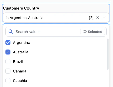
Add and configure the filter
- Open a dashboard and enter draft mode by clicking Edit.
- Click Add > Filter to add a new filter.
- Configure the filter, clicking Done when finished.
Configure multiple selection options
- If the filter properties panel is no longer open, click the filter to open it.
-
Configure the following fields:
- Filter type - Set to Multiple selection
- Filter control - Set to Dropdown. This is currently the only supported control type for multiple selection.
- The filter will automatically display inline with your dashboard content.
Date filter display options
Date filters can be displayed as a full range picker, a single-day calendar, or a timeframe control with preset options like “Last 7 days.” Choose the interface that matches how viewers need to interact with dates in your dashboard.Selecting a date filter interface
When working with date filters, you can choose how the filter interface appears to users. First create the filter, then use the Filter type setting to choose a display option:Default
The standard date filter interface with range selection and preset options: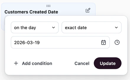
Single day
A simplified calendar interface that allows users to select a specific day. This is useful when you want to focus dashboard viewers on analyzing data for one date at a time, such as daily reports or date-specific snapshots.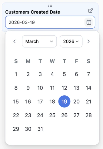
Configuring timeframe selection
The timeframe filter control provides a user-friendly way to filter data by common time periods. Instead of selecting exact dates, users can choose from preset options like “Last 7 days” or “Last 30 days,” and optionally define custom date ranges when needed. This control is useful when your dashboard viewers need to quickly switch between common time windows without navigating a full date picker interface. To configure a date filter to use the timeframe control:Add and configure the filter
- Open a dashboard and enter draft mode by clicking Edit.
- Click Add > Filter to add a new filter.
- Configure the filter with a date field, clicking Done when finished.
Set the filter control type
- If the filter properties panel is no longer open, click the filter to open it.
- Set Filter control to Timeframe.
Select preset options
Choose which timeframe options to make available to users. You can select from Omni’s preset options or create custom timeframes. The selected options will appear as choices in the filter control.
Next steps
- Learn to build dashboard layouts with containers and items like charts, text, filters, and controls.
- Use pages to create multi-page dashboards, where each page has its own layout, items, and filters.
- Customize page navigation to control how viewers move between pages, including custom tabs and dynamic labels.