Creating themes
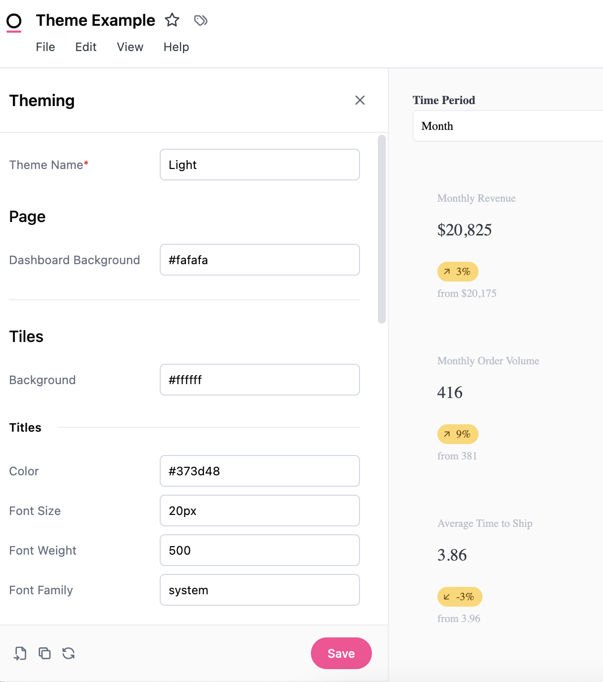
There are four main areas that can be controlled by themes: background, titles, borders, and elements. Changes are automatically applied when a user interacts with the theme builder, but are only saved by pressing the Save button in the bottom right-hand corner of the panel.Using CSS in theme components
Omni leverages the power of CSS in themes. For example themable items that use CSS <color> value syntax support any valid CSS color value:
Background colors can also accept CSS <gradient> values:
Importing themes
If you’ve already created a theme for your embedded dashboards you can import the theme by pasting the JSON into the Import modal.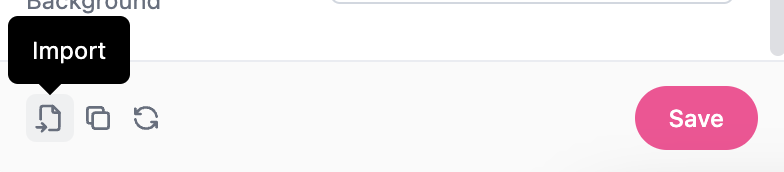
Setting and customizing default color palettes for themes
When creating or editing a theme, you can set default color palettes for discrete and continuous data. These settings control the default colors applied to charts in dashboards using the theme. Both built-in palettes (such as Basic Blues, Viridis, and Category 10) and custom palettes created by your organization are available in the palette dropdowns. The selected palettes will be automatically applied to charts in the dashboard based on the data type.Only palettes that are visible in your organization settings will appear in the theme editor palette selection.
Editing themes
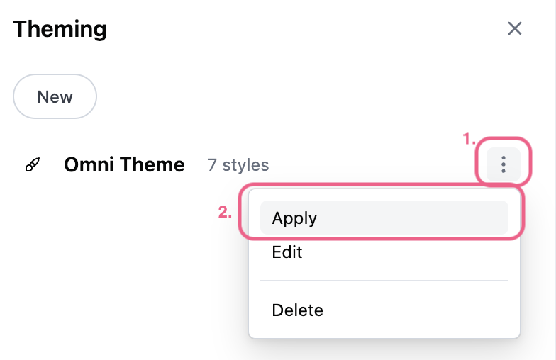
To make changes to the theme, use the (three dots icon) and select Edit. Any changes made to the theme will impact other internal dashboards that are using the theme.Managing themes
Organization Admins can manage document themes in their organization by navigating to Settings > Themes > Document themes.Appearance settings
Themes are not designed to work with the Appearance settings for individuals. For instance if an individual user has selected dark mode, for their appearance settings, some themes might look a little off.Themable components
This table highlights the elements currently available (and some sneak peeks for what is going to be available soon). For a visual example, you can toggle between light and dark mode to see how the different elements are impacted by themes and how that lines up with the CSS.
The table also matches the order of the Theming panel. It will automatically refresh as you make changes, but don’t forget to press Save to apply the settings.