Requirements
To follow the steps in this guide, you’ll need:- Permissions in Omni that allow you to use the Omni Agent.
- A dataset that includes at least two date fields — a fixed user attribute date (e.g., account creation date) and an activity or event date. These should be accessible from a single Omni topic.
Define cohort and activity dates
To start, you need to establish the fixed date for your users and the activity date you are measuring.
-
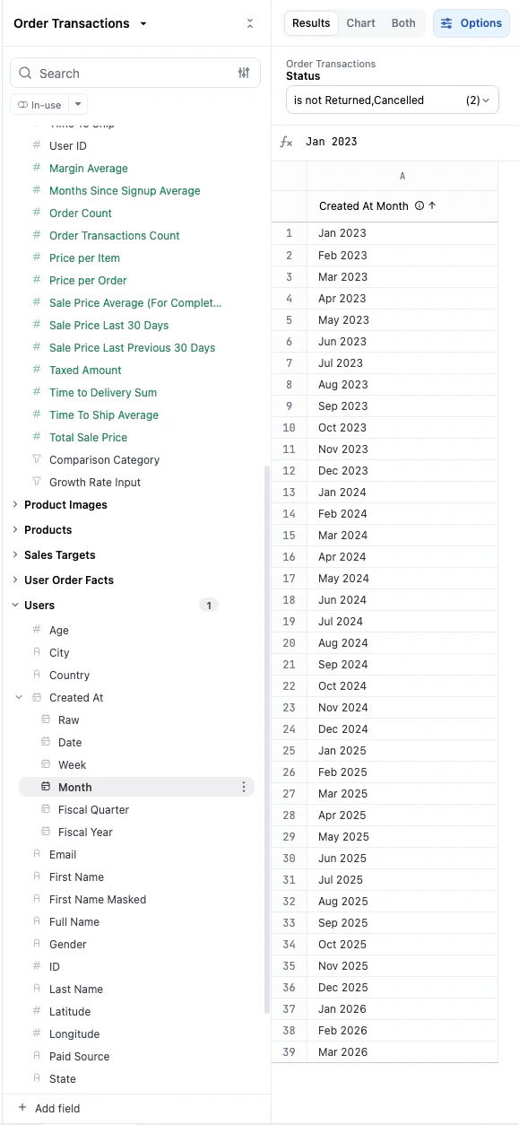
Select the user creation date (for example,
Created At). This serves as your fixed dimension for the X-axis. -
Select the date field representing user activity or transactions:
Calculate the month offset with AI
Instead of writing complex SQL, use the Omni Agent to calculate the time difference between your two dates.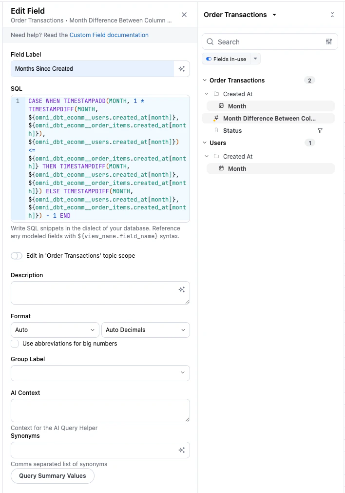
- Click AI calcs ( icon) in the workbook toolbar.
-
In the Omni Agent prompt, enter:
"Calculate the difference in months between column a and b."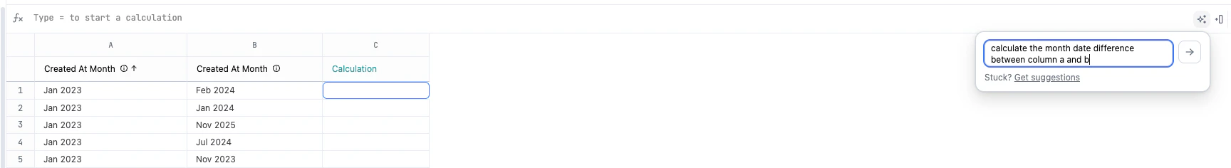
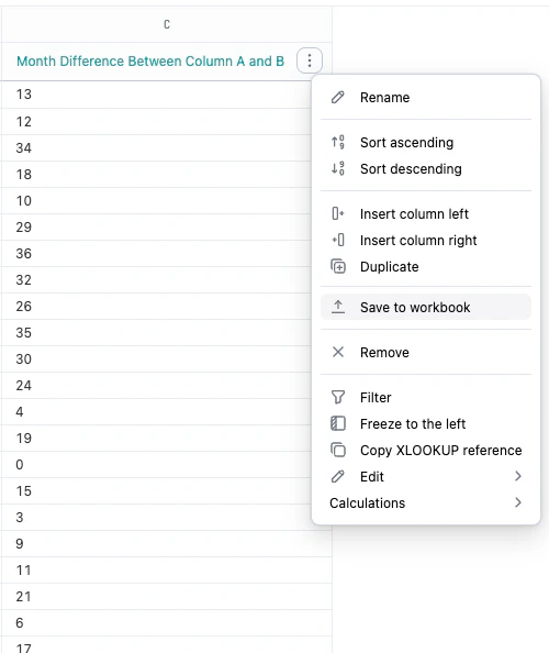
- After the calculation generates, hover over the column and click the icon.
-
Click Save to workbook to make the field available for your analysis.
-
Rename the new field to something clear, such as
Months since Created, by clicking the icon next to the field name in the field picker and opening the Edit Field view.
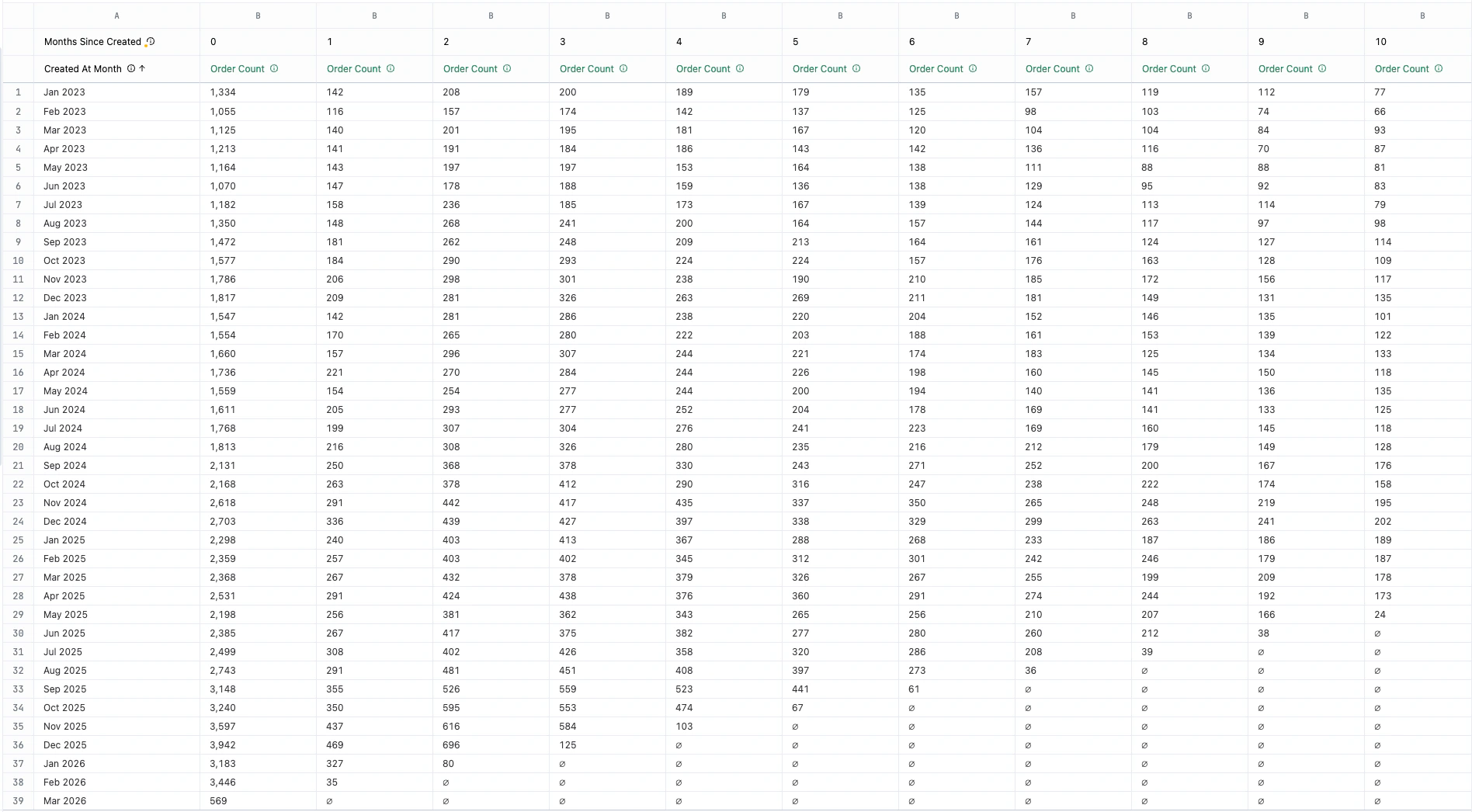
Structure the cohort view
Once your offset is calculated, you can arrange your data to see the “cohort triangle” pattern.
-
Create a pivot on the new
Months since Createdfield.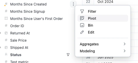
- Select a measure to track, such as a Count of users or Count Distinct of specific behaviors.
-
The results will automatically format into a cohort-style visualization:
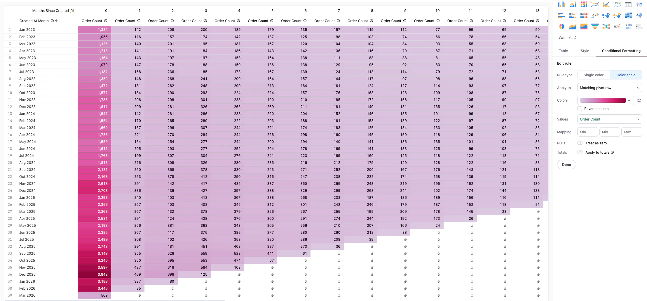
Add conditional formatting
Enhance your table to visually highlight performance trends across different cohorts.
- Navigate to the Visualizations tab and click the Table visualization.
- Click the Conditional Formatting tab in the Chart Options panel.
- Choose Color Scale.
-
Select your primary measure to apply the color scale:
Video walkthrough
Next steps
Now that you’ve built your AI-driven cohort, you can:- Explore more advanced AI formulas to calculate retention percentages.
- Learn more about Table visualization options to further customize your reports.