Create the cohort grid
To build your initial cohort, follow these steps:
-
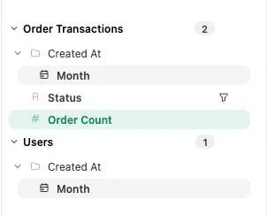
Choose a fixed dimension, such as the date a user was created. This date acts as your cohort identifier and should be placed on the X-axis.
- Choose the date representing the behavior or activity you want to track.
-
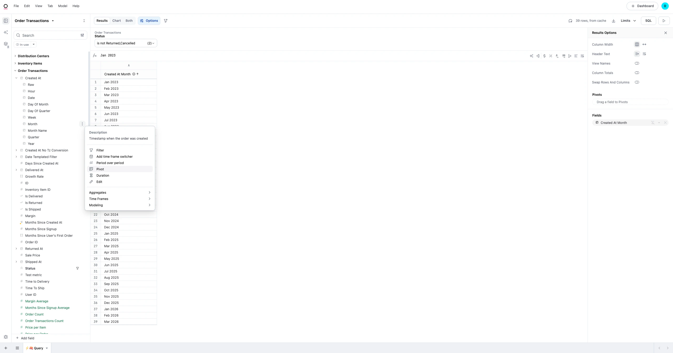
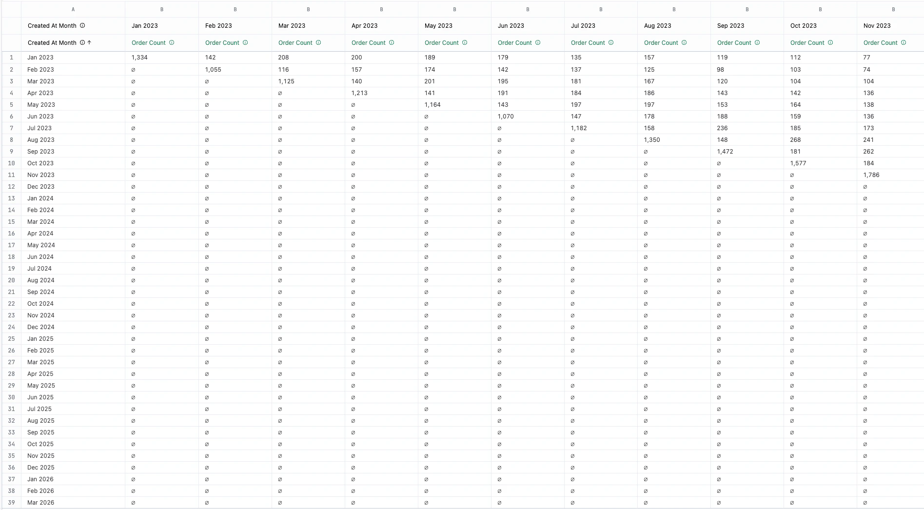
Pivot the activity date to see how activity changes over subsequent periods.
-
Choose a measure that reflects the behavior you are analyzing, such as a Count or Count Distinct of a specific action.
-
Review the results. Omni automatically generates the “cohort triangle” visualization based on these selections.
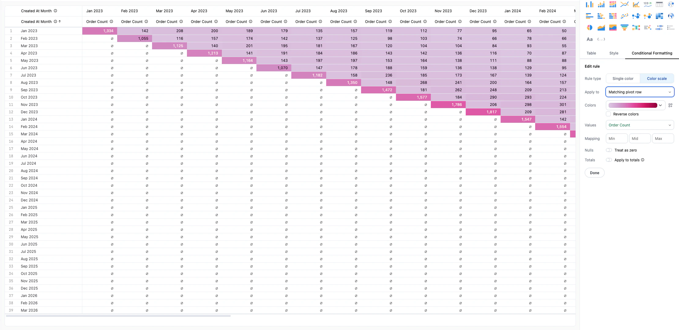
Visualize with conditional formatting
You can make your analysis more readable by applying a color scale to the table:
- In the Visualizations tab, select the Table visualization.
- Click the Conditional Formatting tab in the Chart Options panel.
- For Rule type, select Color Scale.
-
In Apply to, select the measure to apply the scale against. This visually highlights how each cohort is performing relative to others.
Video walkthrough
Next steps
- Learn more about table visualizations to further customize your view.
- Explore advanced querying to add filters or custom calculations to your cohort.