- Granularity control with automated filtering: A single control that changes the granularity of time series charts (e.g., month to quarter) while simultaneously filtering to the “last complete” period.
- The “everything” toggles: Giving you the ability to swap the underlying date field, timeframe granularity, and date range all from a single dashboard interface using multiple filters.
Requirements
To follow the steps in this guide, you’ll need:- Modeler or Connection Admin permissions for the model you want to work with
- A basic understanding of templated filters
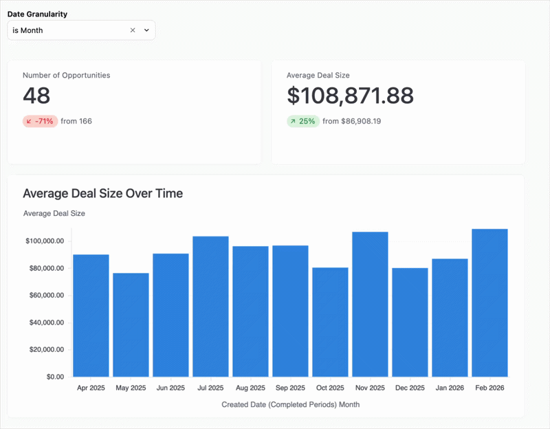
Pattern 1: Dynamic charts with “last complete period” logic
When looking at data over time, comparing a partial current month against a full previous month can be misleading. This pattern creates a dimension that automatically nulls out the current, incomplete period based on the granularity you’ve selected.1
Create a filter-only field for granularity
In your model, define a string filter that will act as the toggle:
2
Build the dynamic date dimension
Next, create a custom dimension using templated filters. This dimension will evaluate the user’s selection and apply the “last complete” logic.For example, when
Quarter is selected, the CASE statement returns NULL for the current (incomplete) quarter and truncates to the quarter otherwise. The same pattern applies for Year and Month.Use the following code to add the dimension, replacing saas__opportunities.created_date with your own view and date field:3
Implement on a dashboard
- In a workbook, select the
Created Date (Completed Periods)dimension for your time series charts. - Navigate to your dashboard and click Add > Filter.
- Configure the filter to point at your
date_granularityfield.
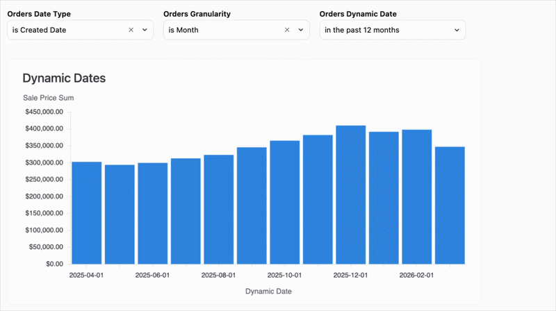
Pattern 2: The “everything” toggles
This pattern gives you three independent dashboard controls: the date field (e.g., switching from Created Date to Shipped Date), the granularity, and the date range window.1
Define the selection filters
In your model, create two filter-only fields: one for the field choice and one for the granularity.
2
Create the dynamic logic
This pattern requires two dimensions to work: one to swap the raw date field, and the second to truncate that field based on the selected granularity.
- Dimension 1: Swap raw date field
- Dimension 2: Truncate field
The
dynamic_date dimension uses a CASE statement to swap the underlying source column (for example, created_at vs. shipped_at) based on the filter selection:3
Build the view
- In a workbook, build your charts using the
Dynamic Date Granularitydimension. - When finished, complete the following on the document’s dashboard:
- Add filters to the dashboard for both
As of DateandDate Granularity. - Add a standard date range filter and map it to the
Dynamic Date Granularityfield to control the window of time.
- Add filters to the dashboard for both
Next steps
- Learn more about filter-only fields to create more interactive toggles.
- Learn how to map dashboard filters to different tile fields to ensure your filters apply correctly across tiles.