You can apply a custom theme to your embedded Omni instance to make it blend with the look and feel of your own application. Themes let you control colors, typography, and overall styling so the analytics experience matches your brand, not the other way around. Whether you’re going for subtle alignment or a fully bespoke look, embedding with a custom theme helps create a seamless, cohesive experience for your users.

Customizing application themes

To have this feature enabled, reach out to Omni support.
The Styles section, located in Settings > Themes > Application tab, allows you to customize a limited number of application-level theme properties.

Customizing dashboard themes

There are two ways to create and use custom dashboard themes: directly on a dashboard or through the URL.
To make your theme dynamic using some external logic, you can adjust the URL theme properties using the customTheme parameter.

Page properties

Property NameDescriptionAccepts
dashboard-backgroundThe background of the embedded dashboard.background
dashboard-page-paddingThe padding of the embedded dashboard page.padding

Tile properties

Property NameDescriptionAccepts
dashboard-tile-marginThe spacing around tile elements on the embedded dashboard.padding
dashboard-tile-backgroundThe background of the embedded dashboard’s tiles.background
dashboard-tile-shadowThe box shadow of the embedded dashboard’s tiles.box-shadow
dashboard-tile-text-body-colorThe text color of primary text in the embedded dashboard’s tiles. Primary text refers to the tile title of most tiles or the single value tiles.color
dashboard-tile-text-secondary-colorThe text color of secondary text in the embedded dashboard’s tiles.color
dashboard-tile-border-colorThe border color of the embedded dashboard’s tiles.color
dashboard-tile-border-radiusThe border radius of the embedded dashboard’s tiles.border-radius
dashboard-tile-border-styleThe border style of the embedded dashboard’s tiles.border-style
dashboard-tile-border-widthThe border width of the embedded dashboard’s tiles.border-width
dashboard-tile-title-font-sizeThe font size of the embedded dashboard tiles’ titles.font-size
dashboard-tile-title-font-weightThe font weight of embedded dashboard tiles’ titles.font-weight
dashboard-tile-title-text-colorThe text color of title text in the embedded dashboard’s tiles.color
dashboard-tile-title-font-familyThe font family of title text in the embedded dashboard’s tiles. Pass a link to a remote woff2 file to use a custom font.woff2 url
dashboard-tile-text-body-font-familyThe font family of the body text in the embedded dashboard’s tiles. Pass a link to a remote woff2 file to use a custom font.woff2 url
dashboard-tile-text-code-font-familyThe font family of a markdown <code> element in the embedded dashboard’s markdown tiles. Pass a link to a remote woff2 file for custom font usage.woff2 url

Controls

Page-level controls like filters, field switchers, and period-over-period.
Property NameDescriptionAccepts
dashboard-control-backgroundThe background of filter controls in the embedded dashboard.background
dashboard-control-radiusThe border radius of controls.border-radius
dashboard-control-border-colorThe border color of filter controls in the embedded dashboard.color
dashboard-control-text-colorThe text color of filter controls in the embedded dashboard.color
dashboard-control-placeholder-colorThe text color of placeholder text inside controls.color
dashboard-control-label-colorThe text color of labels above filter controls in the embedded dashboard.color
dashboard-control-outline-colorThe outline color for controls when they have focus.outline-color

Control popover properties

Styles applied to control popovers and the inputs inside of them.
Property NameDescriptionAccepts
dashboard-control-popover-backgroundThe background of filter control popovers in the embedded dashboard.background
dashboard-control-popover-text-colorThe base text color in control popovers.color
dashboard-control-popover-secondary-text-colorThe secondary text color in control popovers.color
dashboard-control-popover-link-colorThe color of links in control popovers.color
dashboard-control-popover-divider-colorThe color of dividers in control popovers.color
dashboard-control-popover-radiusThe border radius of control popovers.border-radius
dashboard-control-popover-border-colorThe border color of control popovers.color
dashboard-filter-input-backgroundThe background of filter inputs inside of the popover.background
dashboard-filter-input-radiusThe border radius of filter inputs inside the popover.border-radius
dashboard-filter-input-border-colorThe border color of filter inputs inside the popover.color
dashboard-filter-input-text-colorThe text color of filter inputs inside the popover in the embedded dashboard.color
dashboard-filter-input-placeholder-colorThe color of placeholder text inside filter inputs.color
dashboard-filter-input-icon-colorThe color of icons inside filter inputs.color
dashboard-filter-input-outline-colorThe outline color inputs when they have focus.outline-color
dashboard-filter-input-accent-colorThe color of checkbox, radio, and toggle inputs.color
dashboard-filter-input-accent-invert-colorThe invert color of elements in checkbox and radio inputs.color
dashboard-filter-input-token-colorThe background color of tokens in multi-select inputs.color
dashboard-filter-input-token-text-colorThe text color of tokens in multi-select inputs.color

Button properties

Property NameDescriptionAccepts
dashboard-key-colorThe key color of the embedded dashboard, used on filter Update buttons and other key elements.color
dashboard-key-text-colorThe key text color of the embedded dashboard, used on the text of filter Update buttons and other key elements.color
dashboard-button-radiusThe border radius of buttons in popover controls.border-radius
dashboard-button-transparent-text-colorThe text color of transparent buttons in filter control popovers.color
dashboard-button-transparent-interactive-colorThe background color of transparent buttons in filter control popovers when the user hovers over the button.color
dashboard-menu-item-interactive-colorThe background color of menu items in filter control popovers when the user hovers over it.color
If you have a woff2 file link like this:https://fonts.gstatic.com/s/libertinuskeyboard/v2/NaPEcYrQAP5Z2JsyIac0i2DYHaapaf43dru5tEg8zfg.woff2You must wrap it with the css url function when used in Omni, like so:url(https://fonts.gstatic.com/s/libertinuskeyboard/v2/NaPEcYrQAP5Z2JsyIac0i2DYHaapaf43dru5tEg8zfg.woff2)
Font family properties like dashboard-tile-title-font-family support links to a remote woff2 file. A typical use case is to link to a woff2 file from a Google Font. To grab the link to a Google Font woff2 file, perform the following steps:
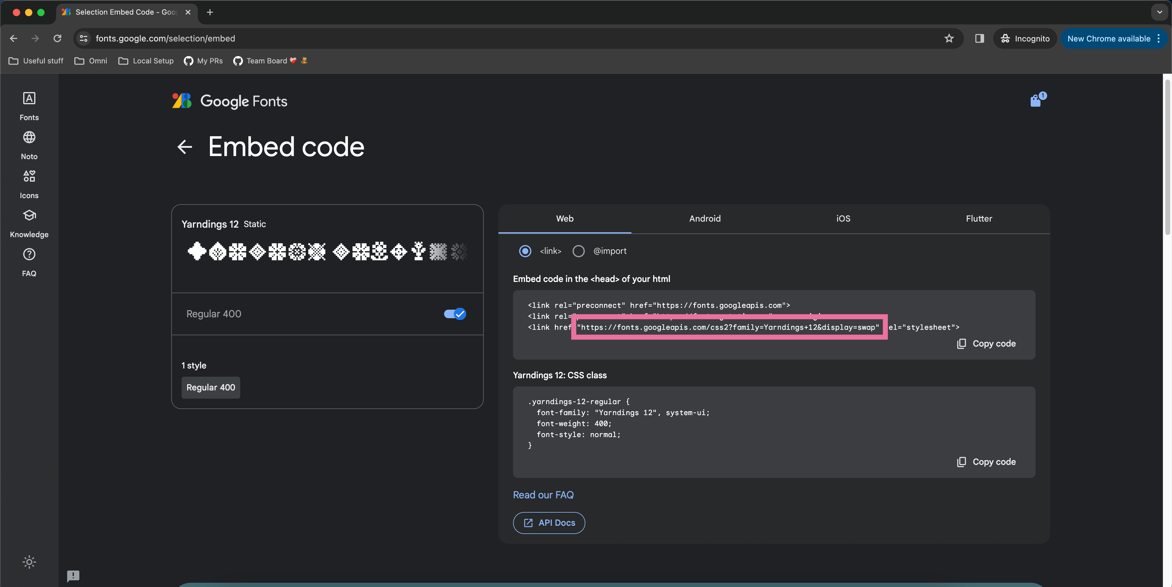
  1. Navigate fonts.google.com and click on your font of choice. For this example, we’ll be using the “Yarndings 12” font.
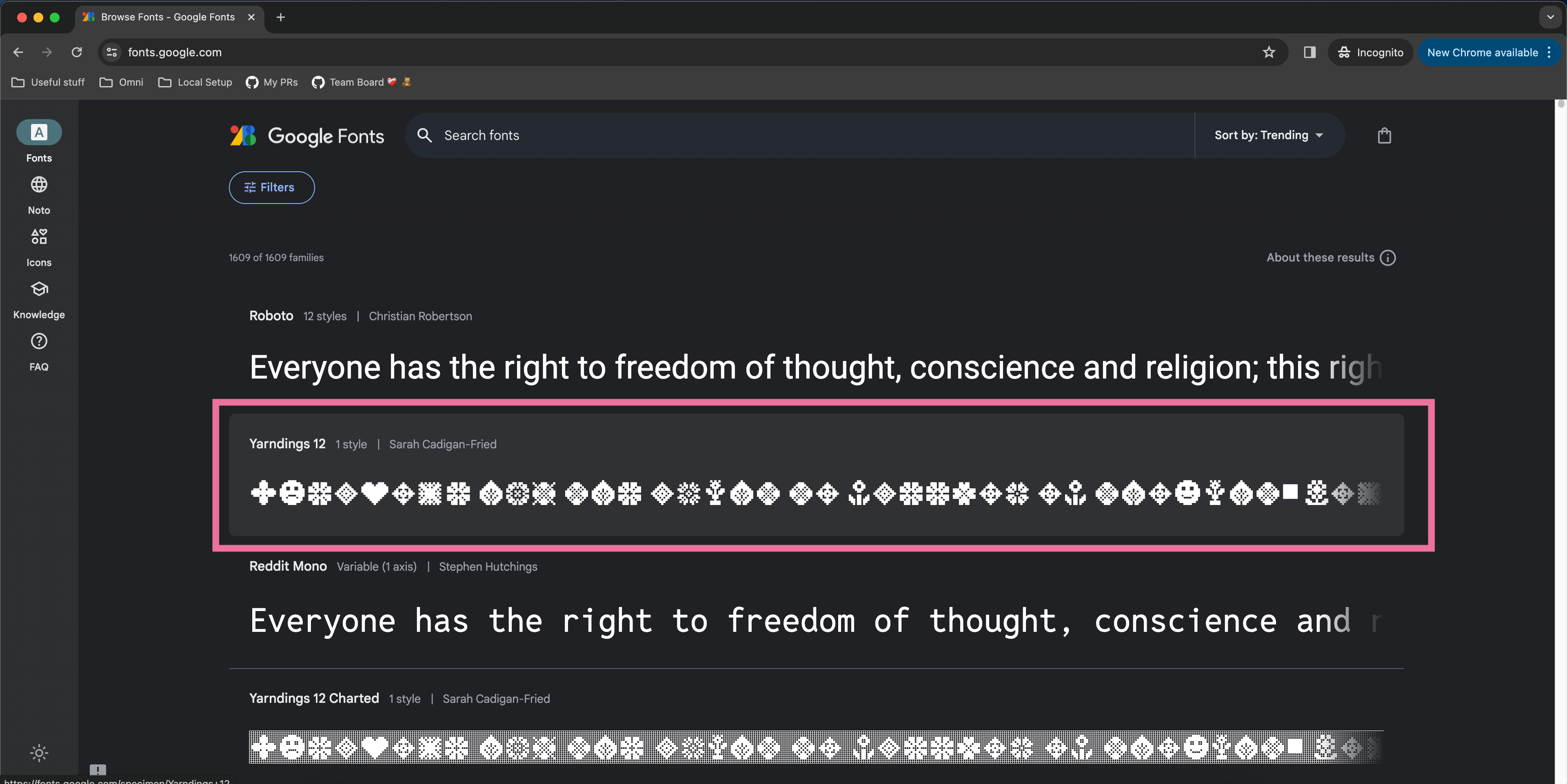
  1. That click should take you to a font specimen page. On that font specimen page, click the “Get font” button.
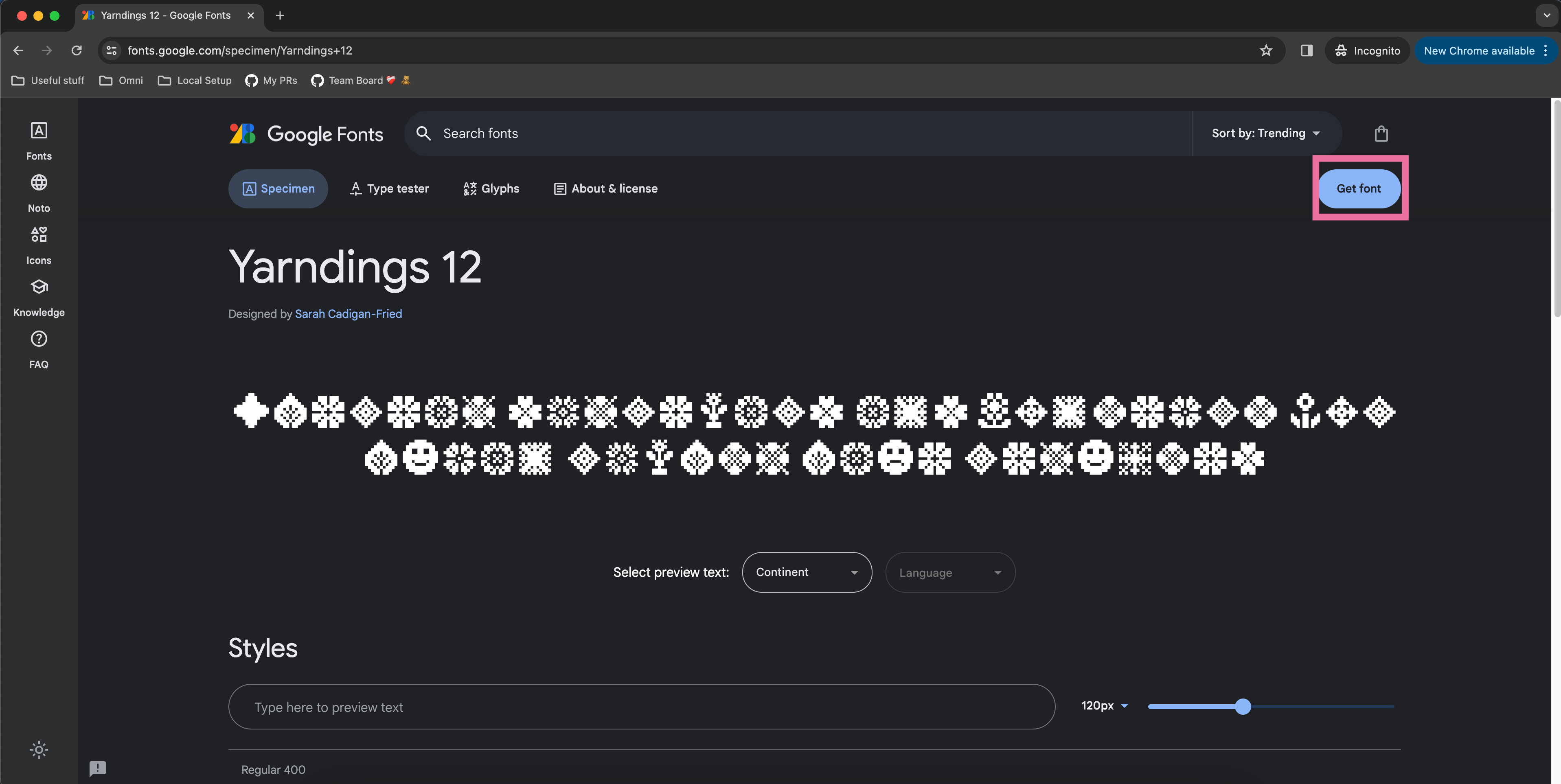
  1. After pressing “Get font” you’ll be taken to a selection page. On that selection page, click the “Get embed code” button.
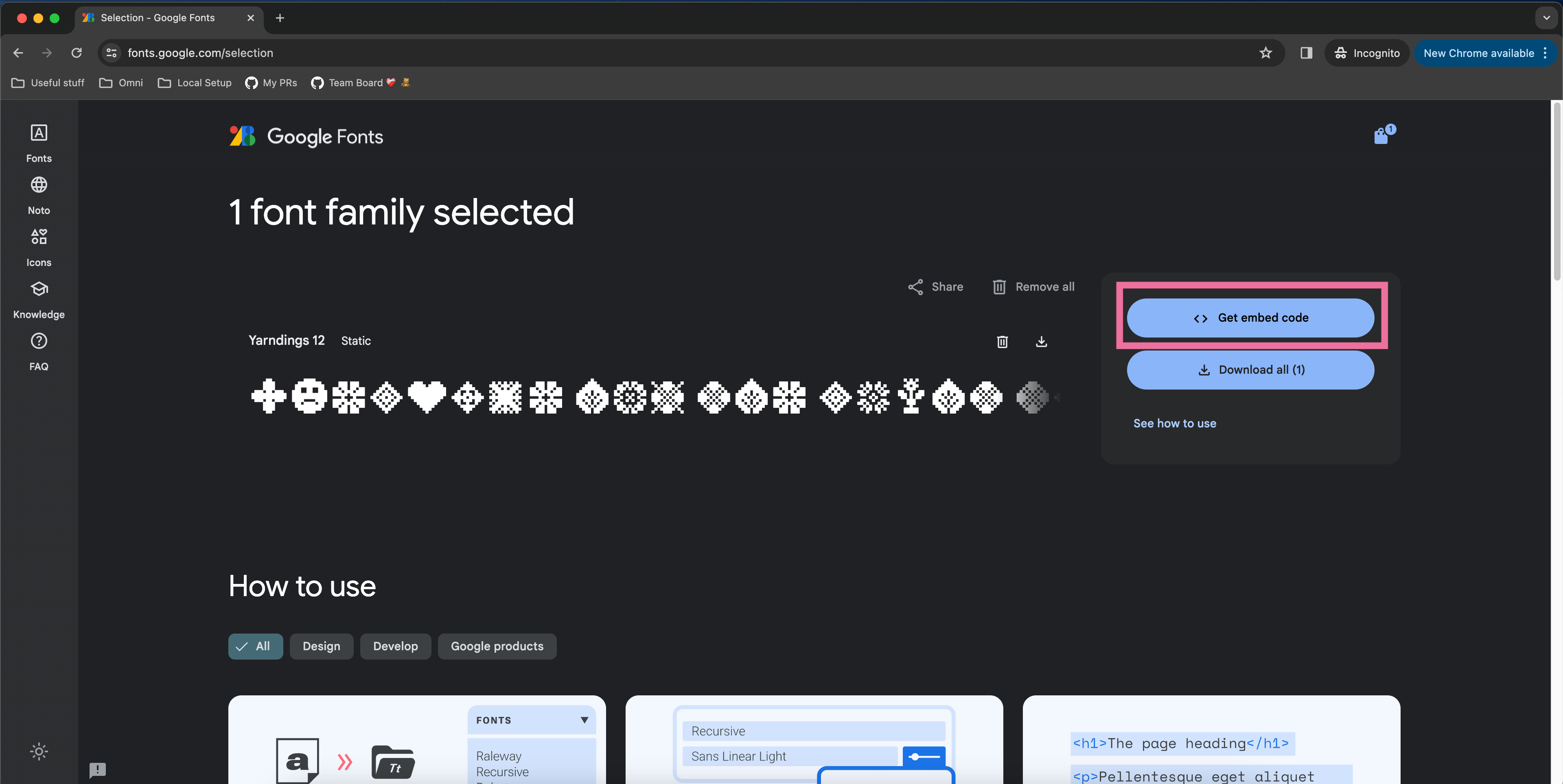
  1. Go to the fonts.googleapis.com link that appears in the third <link> element of the example embed code. Note that some Google Fonts allow you to customize font weight and font style in the left panel so feel free to filter down to the exact font styling you’d like.
  1. Find the @font-face at-rule under labeled “latin” and copy the src property url(…).
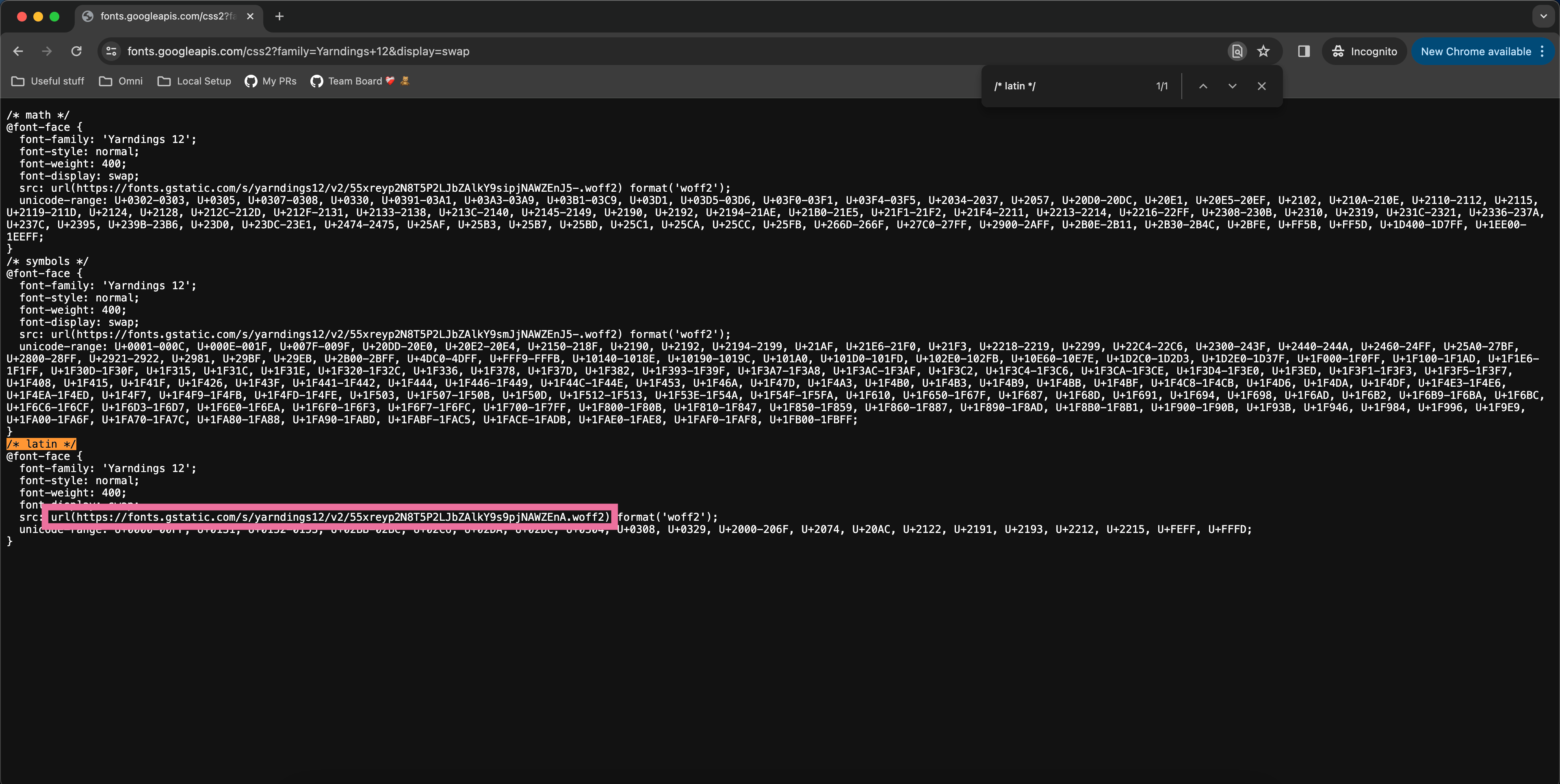
  1. Pass that url(...) value into the appropriate customTheme property when generating your Omni SSO embed link.
  {    "dashboard-tile-title-font-family": "url(https://fonts.gstatic.com/s/yarndings12/v2/55xreyp2N8T5P2LJbZAlkY9s9pjNAWZEnA.woff2)",  }
  1. And voilà!