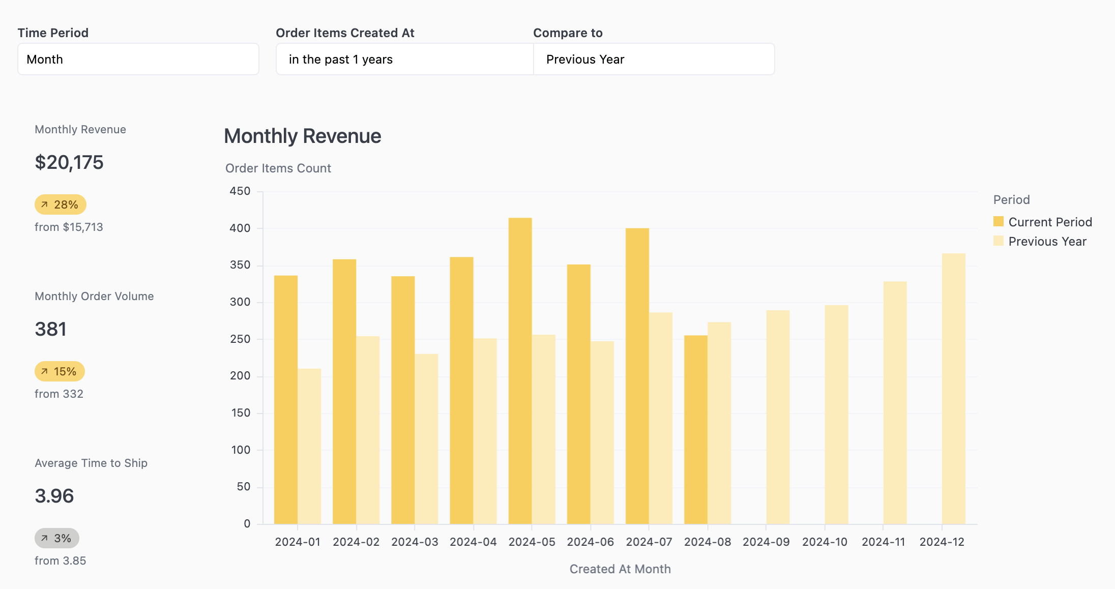
Controls allow you to choose which fields will be shown in a tile.Documentation Index
Fetch the complete documentation index at: https://docs.omni.co/llms.txt
Use this file to discover all available pages before exploring further.
Creating dashboard controls
To add a control to the dashboard, go into edit mode and click Add > Control in the toolbar. Configuring a control asks that you start by picking one of the underlying fields common to the tiles you want to control. Otherwise the control will have no impact (e.g. adding a field switcher between “order volume” and “total sales” to a tile that is showing “user count” will have no impact). Like filters, when you are editing the control you can pick which tiles on the dashboard to connect by toggling the icon in the top right of each tile. You can also set initial default values and optionally hide the control from dashboard viewing.Control types
There are five types of controls:Field switcher
Field switcher
These controls will allow the dashboard viewer to swap a single field for another field within the underlying query. When used with dimensions, this will change the grouping or breakdown of a query. For example, a field switcher with dimensions like country, gender, and age group to allow viewers to slice the metrics in the connected tiles in different ways. When used with measures, the metric to displayed in the connected charts will update.When configuring, you can add as many fields to the field swapper as you need. While typically a field swapper is all measures or all dimensions, they can be mixed. You can also select to add a “no field” option. This is useful for situations where you may want to offer viewers a way to see the total metric value or pick a dimension to change the grouping.
Multi-field picker
Multi-field picker
A multi-field picker allows you to pick zero or more fields to show in a chart. Usually most useful on table visualizations, it can be connected to any chart tile on the dashboard.
Time frame switcher
Time frame switcher
For date fields, you may want to provide a control to allow the viewer to change the granularity of the date grouping. For example, change a grouping from months to weeks or to days. Time frame switchers make this easy. When configuring, select the underlying date field to control and then select the time frames you want to make available.
Period over period
Period over period
To compare a metric between time periods, use a period over period control. When configuring, select the underlying date field that controls the time periods you want to compare. Choose the current period and one or more comparison periods. Any attached charts will break down the metric between the current and previous time period(s).

Mapping period over period controls to tiles
Period over period controls can only be applied to tiles that have queries with matching period over period computations. When editing a period over period control, you may see:- Disabled mapping options: If a tile’s query doesn’t include period over period computations, the mapping option will be disabled in the tile-level filter mapping UI
- Informative messages: The UI will display a message explaining why the mapping is unavailable for specific tiles
- Informational banner: When some tiles on your dashboard lack period over period support, an informational banner will appear in the filter edit panel
Parent controls
Parent controls
A parent controls coordinates the toggling of multiple controls at once. A common example here is for a dashboard that has a timeseries with a
created_at date, another timeseries with a received_at date, and lastly a timeseries with a returned_at date. This can’t be done with a single time frame switcher. Instead, build 3 time frame switchers and then add a parent control to control all 3 time frame switchers. You can then hide each child time frame switcher.To configure the control, you’ll need to add the display options for the parent control and then connect the children options to the parent options.mobile-display
