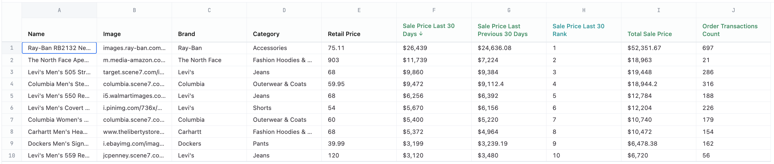
Example dataset
Example code
Copy
Ask AI
<style>
/* https://play.tailwindcss.com/vHqt0FBGy8 */
.deals-container {
display: grid;
padding: 1.5rem;
grid-template-columns: repeat(1, minmax(0, 1fr));
column-gap: 1.5rem;
row-gap: 2rem;
list-style: none;
@media (min-width: 1024px) {
grid-template-columns: repeat(2, minmax(0, 1fr));
}
@media (min-width: 1280px) {
grid-template-columns: repeat(2, minmax(0, 1fr));
column-gap: 2rem;
}
@media (min-width: 1536px) {
grid-template-columns: repeat(3, minmax(0, 1fr));
column-gap: 2rem;
}
@media (min-width: 1960px) {
grid-template-columns: repeat(3, minmax(0, 1fr));
column-gap: 2rem;
}
}
.deal-container {
overflow: hidden;
border-radius: 0.75rem;
border: 1px solid #E5E7EB;
list-style: none;
}
.deal-header {
display: flex;
padding: 1.5rem;
column-gap: 1rem;
align-items: center;
border-bottom: 1px solid rgb(17 24 39 / 0.05);
background-color: #F9FAFB;
}
.deal-logo {
object-fit: cover;
flex: none;
border-radius: 0.5rem;
border: 1px solid rgb(229 231 235);
box-shadow: 0 0 0 0 calc(1px) rgb(229 231 235);
width: 4rem;
height: 4rem;
background-color: #ffffff;
}
.deal-name {
font-size: 1rem;
line-height: 1.25rem;
font-weight: 500;
line-height: 1.5rem;
color: #111827;
}
.deal-details {
padding-top: 1rem;
padding-bottom: 1rem;
padding-left: 1.5rem;
padding-right: 1.5rem;
margin-top: -0.75rem;
margin-bottom: -0.75rem;
border-top-width: 1px;
border-color: #F3F4F6;
font-size: 0.875rem;
line-height: 1.25rem;
line-height: 1.5rem;
}
.deal-details-inner {
display: flex;
padding-top: 0.3rem;
padding-bottom: 0.3rem;
column-gap: 1rem;
justify-content: space-between;
}
/* Tailwind Helpers */
.-my-3 {
margin-top: -0.75rem;
margin-bottom: -0.75rem;
}
.flex {
display: flex;
}
.flex-row {
flex-direction: row;
}
.flex-col {
flex-direction: column;
}
.grid {
display: grid;
}
.h-12 {
height: 3rem;
}
.w-12 {
width: 3rem;
}
.flex-none {
flex: none;
}
.grid-cols-1 {
grid-template-columns: repeat(1, minmax(0, 1fr));
}
.items-start {
align-items: flex-start;
}
.items-center {
align-items: center;
}
.justify-between {
justify-content: space-between;
}
.gap-x-2 {
column-gap: 0.5rem;
}
.gap-x-4 {
column-gap: 1rem;
}
.gap-x-6 {
column-gap: 1.5rem;
}
.gap-y-8 {
row-gap: 2rem;
}
.divide-y > :not([hidden]) ~ :not([hidden]) {
border: 0;
border-style: solid;
border-top-width: 1px;
border-bottom-width: 1px;
}
.divide-y > div.deal-details-inner:last-of-type {
border-bottom-width: 0px;
}
.divide-gray-100 > :not([hidden]) ~ :not([hidden]) {
border-color: rgb(243 244 246);
}
.overflow-hidden {
overflow: hidden;
}
.rounded-lg {
border-radius: 0.5rem;
}
.rounded-md {
border-radius: 0.375rem;
}
.rounded-xl {
border-radius: 0.75rem;
}
.border {
border-width: 1px;
}
.border-b {
border-bottom-width: 1px;
}
.border-gray-200 {
border-color: rgb(229 231 235);
}
.border-gray-900\/5 {
border-color: rgb(17 24 39 / 0.05);
}
.bg-gray-50 {
background-color: rgb(249 250 251);
}
.bg-red-50 {
background-color: rgb(254 242 242);
}
.bg-white {
background-color: rgb(255 255 255);
}
.object-cover {
object-fit: cover;
}
.p-6 {
padding: 1.5rem;
}
.px-2 {
padding-left: 0.5rem;
padding-right: 0.5rem;
}
.px-6 {
padding-left: 1.5rem;
padding-right: 1.5rem;
}
.py-1 {
padding-top: 0.25rem;
padding-bottom: 0.25rem;
}
.py-3 {
padding-top: 0.75rem;
padding-bottom: 0.75rem;
}
.py-4 {
padding-top: 1rem;
padding-bottom: 1rem;
}
.text-sm {
font-size: 0.875rem;
line-height: 1.25rem;
}
.text-xs {
font-size: 0.75rem;
line-height: 1rem;
}
.font-medium {
font-weight: 500;
}
.leading-6 {
line-height: 1.5rem;
}
.text-gray-500 {
color: rgb(107 114 128);
}
.text-gray-700 {
color: rgb(55 65 81);
}
.text-gray-900 {
color: rgb(17 24 39);
}
.text-red-700 {
color: rgb(185 28 28);
}
.px-1 {
padding-left: 0.25rem;
padding-right: 0.25rem;
}
.pl-1 {
padding-left: 0.25rem;
}
.pr-1 {
padding-right: 0.25rem;
}
.pl-2 {
padding-left: 0.50rem;
}
.pr-2 {
padding-right: 0.50rem;
}
.text-sky-700 {
color: rgb(3 105 161);
}
.ring-sky-600\/10 {
border: 1px solid rgb(2 132 199 / 0.1);
}
.bg-sky-50 {
background-color: rgb(240 249 255);
}
.ml-2 {
margin-left: 0.5rem;
}
.bg-green-50 {
background-color: rgb(240 253 244);
}
.text-green-700 {
color: rgb(21 128 61);
}
.ring-green-600\/10 {
border: 1px solid rgb(22 163 74 / 0.1);
}
</style>
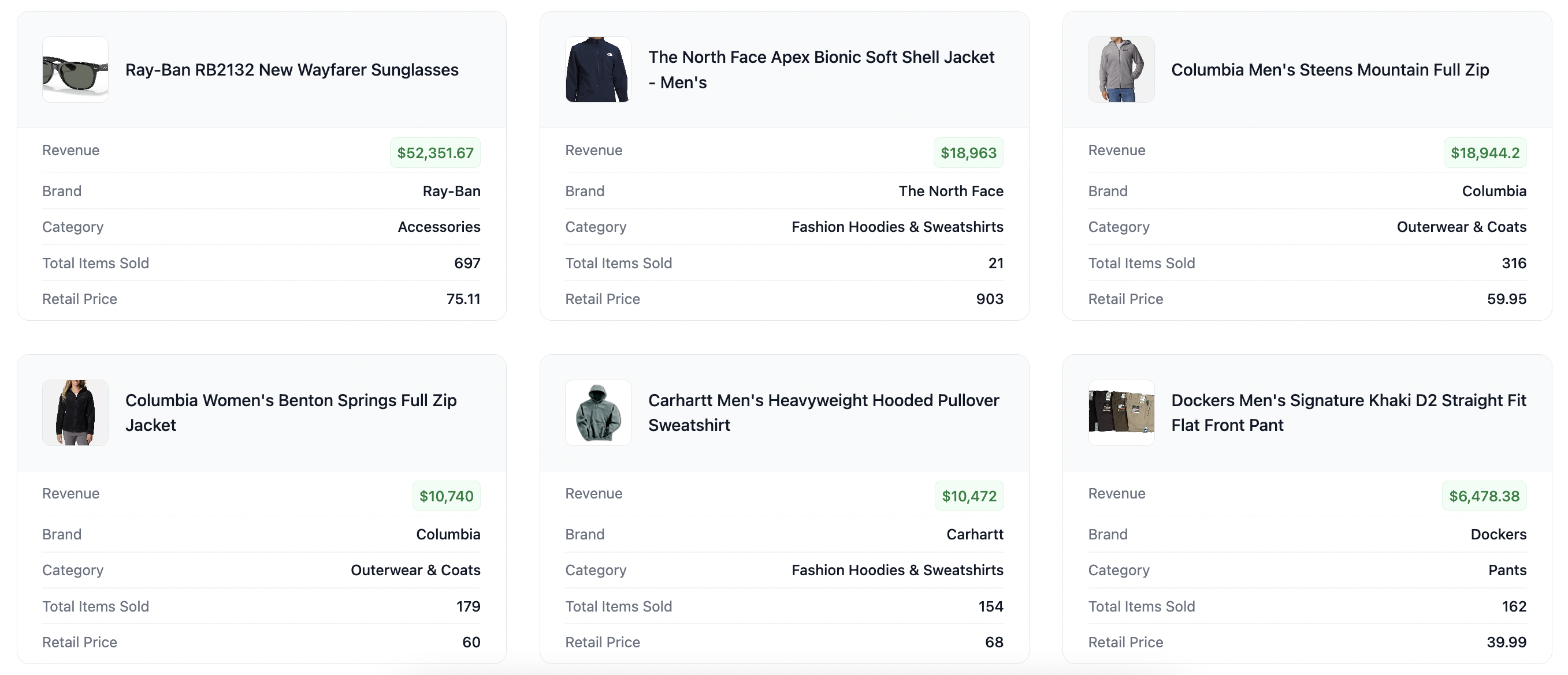
<ul class="deals-container">
{{#result}}
<li class="deal-container">
<div class="deal-header">
<img src="https://{{omni_dbt__product_images.image.value_static}}?size=512" class="deal-logo">
<section class="deal-name flex flex-col" style="justify-content: start;">
<div class="flex flex-row" style="align-items: center;">{{omni_dbt__products.name.value}}</div>
</section>
</div>
<dl class="-my-3 divide-y divide-gray-100 px-6 py-4 text-sm leading-6">
<div class="deal-details-inner" style="border-bottom: none;">
<dt class="text-gray-500">Revenue</dt>
<dd class="flex items-start gap-x-2">
<section class="rounded-md ml-2 font-medium ring-1 ring-inset text-green-700 bg-green-50 ring-green-600/10" style="padding: 2px 6px">{{omni_dbt__order_items.total_sale_price.value}}</section>
</dd>
</div>
<div class="deal-details-inner">
<dt class="text-gray-500">Brand</dt>
<dd class="flex items-start gap-x-2">
<div class="font-medium text-gray-900">{{omni_dbt__products.brand.value}}</div>
</dd>
</div>
<div class="deal-details-inner">
<dt class="text-gray-500">Category</dt>
<dd class="flex items-start gap-x-2">
<div class="font-medium text-gray-900">{{omni_dbt__products.category.value}}</div>
</dd>
</div>
<div class="deal-details-inner">
<dt class="text-gray-500">Total Items Sold</dt>
<dd class="flex items-start gap-x-2">
<div class="font-medium text-gray-900">{{omni_dbt__order_items.count.value}}</div>
</dd>
</div>
<div class="deal-details-inner">
<dt class="text-gray-500">Retail Price</dt>
<dd class="flex items-start gap-x-2">
<div class="font-medium text-gray-900">{{omni_dbt__products.retail_price.value}}</div>
</dd>
</div>
</dl>
</li>
{{/result}}
</ul>