

- Stack or group measures, such as
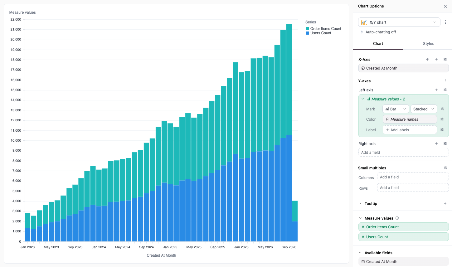
Order Items CountandUsers Countin one stacked bar - Color by measure, so that each measure gets its own color and legend entry
- Make a chart for each measure with small multiples
Requirements
- The chart uses layers
- The query has two or more measures. The fields are always available, but they’re useful only with more than one measure.
The two fields
Measure values and Measure names display in italics at the bottom of Available fields. They aren’t fields in your query or your model. They exist only in the chart.- Measure values is the values of several measures, plotted as one layer. The field shows how many measures it holds, for example Measure values • 2.
- Measure names is the name of the measure that each value comes from. Use it to tell the measures apart.
Created At Month, Order Items Count, and Users Count. With Measure values on the Y-axis, each month has two values in one layer: one for Order Items Count and one for Users Count. Measure names holds Order Items Count or Users Count for each value.
Choose the measures
The Measure values section in the Chart tab lists the measures that Measure values holds. By default, it holds the measures on the chart.- Drag a measure into the section to add it. Only number fields can be added.
- Drag a measure out of the section, or click its X, to remove it. The section always keeps at least one measure.
- Drag the measures in the section to change their order. The legend uses the same order.
Stack or group measures
- Drag Measure values to Left axis or Right axis in Y-axes.
- Expand the Measure values layer, and set Color to Measure names if Omni didn’t set it for you.
- Use the layer’s Stacking select to pick Stacked, Stacked %, Grouped, or Overlay.
Make a chart for each measure
Drag Measure names to Columns or Rows in Small multiples. Omni draws one chart for each measure in Measure values.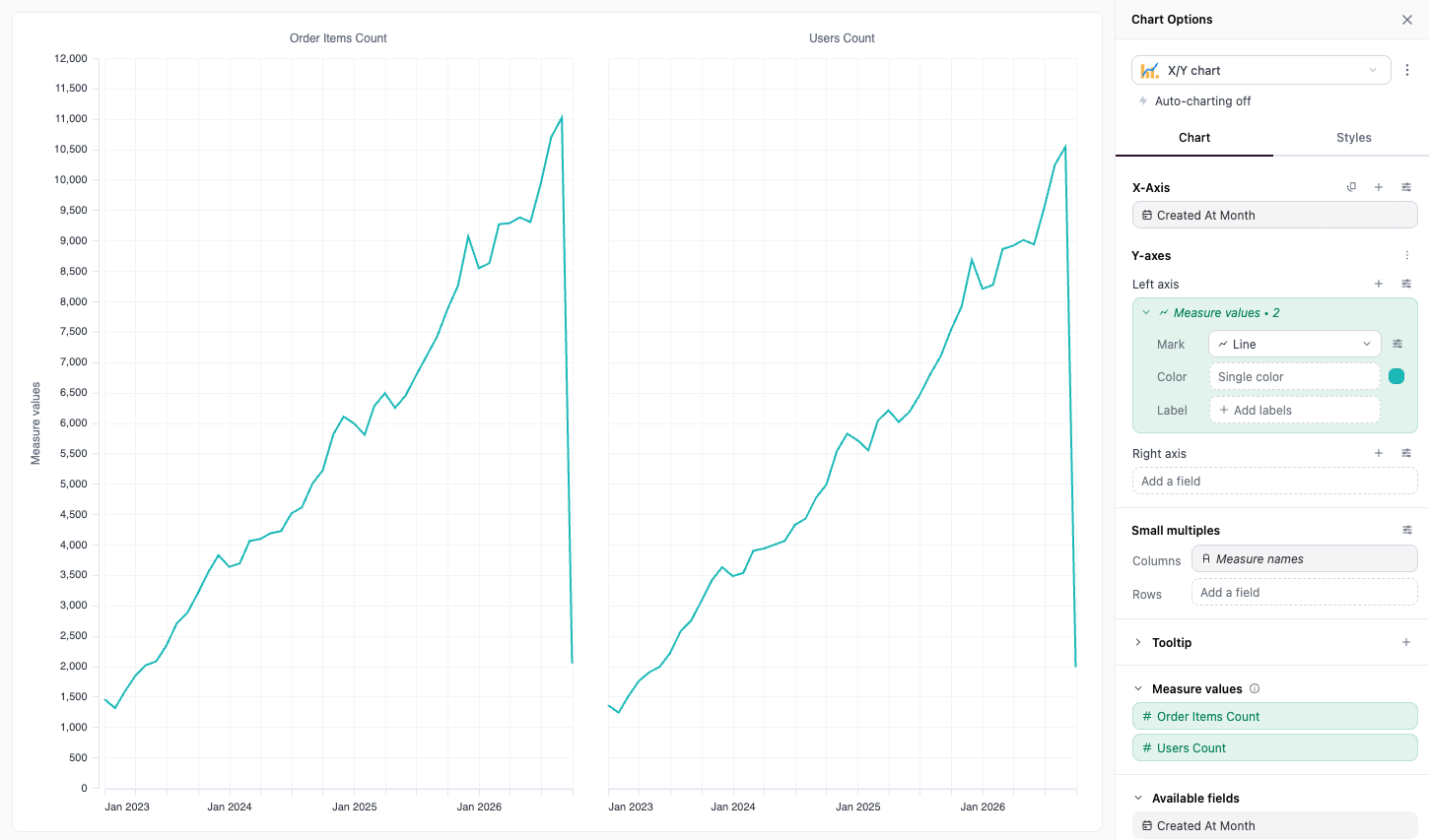
Limitations
- Measure values and Measure names have no Field properties. You can’t set a title, a regression line, or a moving average on the Measure values layer. To change the axis title, use the axis settings.
- A chart has one Measure values field, so you can’t stack one set of measures on the left axis and another set on the right axis. Put all the measures that you want to stack in Measure values on one axis.
- If a measure has its own layer colored by Measure names, and the measure isn’t in Measure values, that layer draws nothing.