

Requirements
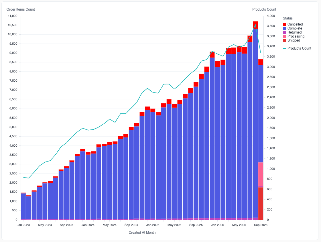
Layers must be turned on for your organization. To turn on layers, contact Omni support. Layers apply to X/Y charts: bar, line, area, and scatter. Other chart types, such as tables, pie charts, and maps, don’t use layers. When enabled, new X/Y charts use layers automatically. Existing charts keep the classic editor until you move them to layers. Refer to Switch between the layers and classic editors to move an existing chart to layers, or to move a chart back.How layers work
Each measure on the Y-axis is one layer. The Y-axes section always shows a Left axis and a Right axis, so you can drop a field on either axis. Each axis has its own scale. When you rotate the chart, the section is X-axes, with a Bottom axis and a Top axis. On each axis, the first layer draws on top. Drag a layer’s field to change the order. A layer that stacks, such as a bar layer colored byStatus, stacks only its own segments. Separate layers never stack on each other. To stack or group several measures together, put them in one Measure values layer.
Chart options
When a chart uses layers, the Chart options panel has two tabs:- Chart - The axes and their layers, Small multiples, Tooltip, Measure values, and Available fields
- Styles - The chart palette and the legends
Add and change fields
You can drag fields to the axes and other sections. You can also use these controls:- Click + in a section header, or click an empty Add a field slot, to pick a field from a list.
- Right-click a field, or open its menu, to use these options:
- Field properties… - Opens the field’s title, format, and analytics settings, such as regression lines and moving averages
- Aggregation - Changes how the field aggregates
- Switch to… - Replaces the field with another field in place
- Click the X on a field to remove it.
Layer settings
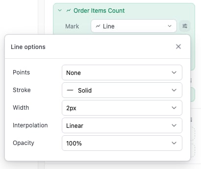
A layer’s settings are under its field on the axis. Click the arrow at the start of the field to expand or collapse the layer. When a chart has one layer, that layer is expanded by default. The icon on the field shows the layer’s mark, so you can identify each layer when it’s collapsed. An expanded layer has these rows:
Click the icon at the end of a row to open more options for that row.
Change every layer at once
Click the icon next to the Y-axes heading to open the axes menu. Use the options under All values to set the same value on every layer:- Mark - The mark type
- Color - Single color, or a field that colors each layer
- Size - Fixed size, or a field that sets the size of each point. This option displays only when the chart has a Scatter layer.
- Label - No labels, or a field that labels each layer
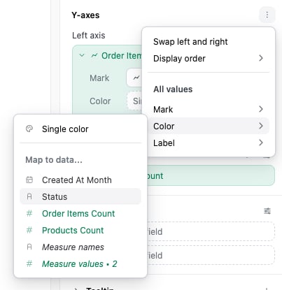
- Swap left and right - Moves every layer to the other axis. The layers keep their order, and each axis’s settings, such as its title and scale, move with its layers. For a rotated chart, this option is Swap top and bottom.
- Display order - Sets which axis’s layers draw on top: Left values on top or Right values on top. This option displays only when both axes have layers.
Stacking
A layer can stack when it has a color field. For a Measure values layer, the color field is usually Measure names. The Stacking select displays next to the layer’s mark only when the layer has a color field.
Bar and area layers stack by default. Line and scatter layers overlay by default.
A chart with two or more measure layers and no color field overlays the layers. To stack the measures, move them into Measure values.
Stack order
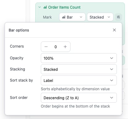
For a Stacked or Stacked % layer, open the mark options to control the order of the segments:- Sort stack by - The segment order:
- Label - Alphabetical by the color field’s values
- Segment value - By each segment’s value within its own stack. Not available for area or line layers.
- Overall sum - By each segment’s total across all stacks
- Unsorted - The order of the query results
- Sort order - Ascending or descending, for example Ascending (A to Z) or Descending (Z to A). This setting doesn’t display for Unsorted.
Percentage axes
Layers on one axis share that axis’s scale. The axis shows percentages only when every layer on it uses Stacked %. If you mix Stacked % with another option on one axis, a warning icon displays on the layer’s field. The percentage layer’s values run from 0 to 1 on the same scale as the other layers, so it’s squashed at the bottom of the chart.Align zero on both axes
When a chart has layers on the left and right axes, each axis has its own scale, so zero can be at a different height on each axis. To put zero at the same height on both axes:- Next to Left axis or Right axis, click the icon.
- Under Zero line, select Align with other axis.
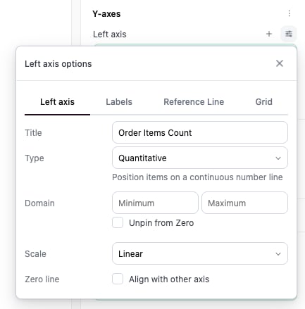
- An axis uses a scale other than linear
- An axis has a minimum of zero or more, or a maximum of zero or less. These values put zero at the edge of the axis.
- Both axes have a minimum and a maximum
Color and legends
One color setup per field
Color settings belong to the field, not to the layer. If two layers color byCountry, they share one set of colors and one legend. A change to the colors from one layer also changes the other layer.
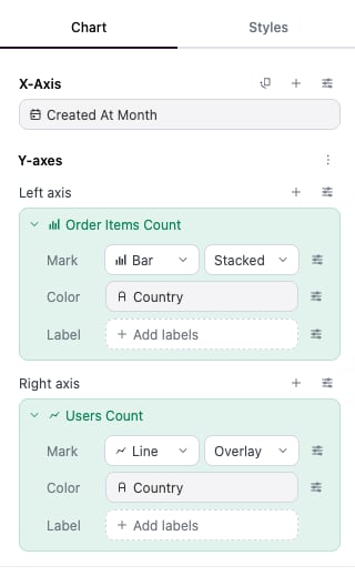
Chart palette
The Styles tab has the Default chart palette for the chart. All layers take colors from this palette unless a layer’s color field has its own palette. Omni assigns palette colors in this order, so that layers don’t duplicate colors:- Layers without a color field take the first colors, one each.
- Each color field takes the next batch of colors, one for each of its values.
colors parameter, keeps its place and doesn’t move the other colors.
Legends
The Styles tab also lists each legend on the chart. A chart has one legend for each color field and each size field. When a chart has two or more layers, the layers without a color field share one Series legend, which has no title by default.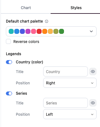
Filter with the legend
Legends in the chart are interactive. Click an item in a legend to show only that item. Cmd+click (Mac) or Ctrl+click (Windows) to select more than one item. When you select items in one legend, layers that belong to other legends are hidden until you clear the selection.Labels and totals
Labels are set per layer. When a layer has no labels, its Label row shows an + Add labels button (+ Add segment labels when simple totals are on). Click it to label the layer with its own field in one click. To label the layer with a different field instead, open the menu from the chevron next to the button. For a stacked layer, the label options include Simple totals, which labels the total of each stack. Simple totals are calculated per layer. To total several measures, put them in one Measure values layer and turn on Simple totals for that layer.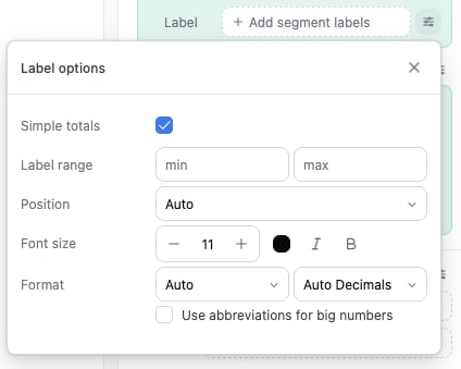
Tooltips
On line, area, and scatter layers, the tooltip displays when you hover near a point, and the point is highlighted.Axis sort order
For a text field on the X-axis:- Automatic keeps the order of the query results when the query is sorted.
- Ascending sorts alphabetically.
- Descending sorts in reverse alphabetical order.
Limitations
- Separate layers don’t stack on each other. Use Measure values to stack measures.
- Each color field has one set of colors for the whole chart. You can’t color the same field differently in two layers.
- Layers on one axis share the axis’s scale and title.
- Two layers that each leave out a different dimension can’t both get totals. One of them looks jagged. Refer to Smart aggregation.
- Size is available only on Scatter layers. If you change a scatter layer to another mark, its size setting is removed.