> ## Documentation Index
> Fetch the complete documentation index at: https://docs.omni.co/llms.txt
> Use this file to discover all available pages before exploring further.
# Wireframing with placeholder content
> Add placeholder items to wireframe your dashboard layout before the actual content exists.
export const DashboardPlaceholderIcon = ({label}) => {
return
{label && ` ${label}`}
;
};
export const DashboardCatalogIcon = ({label}) => {
return
{label && ` ${label}`}
;
};
export const DashboardAddItemIcon = ({label}) => {
return
{label && ` ${label}`}
;
};
**Using a classic dashboard?** [Upgrade it](/visualize-present/dashboards/create#classic-dashboards) to use the features in this guide.
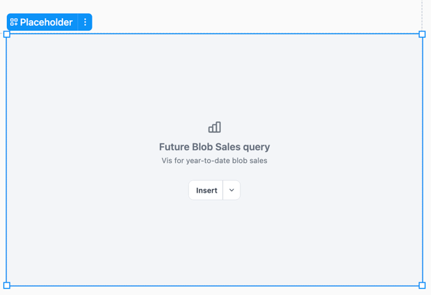
Placeholders let you design and wireframe your dashboard layout before the real content exists, helping you visualize structure and spacing during the design phase.
Placeholders appear in both edit mode and published views, making them useful for sharing work-in-progress dashboards or communicating layout plans to dashboard viewers.
## Requirements
Modifying dashboard layouts requires **Editor**, **Manager**, or **Owner** permissions on the document.
## Adding placeholders
In the toolbar, click **Add >** **Layout >** **Placeholder**. New placeholders are inserted as untyped (**Generic**).
Configuring placeholder type
Placeholders can be configured to mock specific content types, which will filter the replacement options in the **Insert** menu:
* **Query** — Limits replacement to workbook queries and charts
* **Filter & control** — Limits replacement to filters and controls from your workbook
* **Text** — Offers an option to insert a new text block
The **Generic** option will populate the replacement options with **Query** and **Filter & control** items.
To set a placeholder's type:
* Use the option in the placeholder
* Click the placeholder and use the **Settings > Type** option in the properties panel
* Right-click a placeholder and select **Type** from the context menu
## Customizing labels and descriptions
Placeholders display a label and optional description to help communicate their purpose.
* **Labels** - Defaults to `Placeholder `, where `` is `query`, `filter / control`, or `text`. Use the **Label** field in the properties panel to change the label text.
* **Description** - This optional field allow you to add wireframe instructions or notes. Use the **Description** field in the properties panel to edit the description.
Replacing with real content
To replace a placeholder with real content, click the **Insert** button in the placeholder tile or the properties panel. The options in the replacement menu are dependent on the placeholder's [current type](#placeholder-type).
For **Text** placeholder types, clicking the **Insert text** button will convert the placeholder into a [Markdown text tile](/visualize-present/dashboards/text-markdown).
## Limitations
Creating brand-new queries, controls, or filters directly from a placeholder is not currently supported. Use the **Select…** button to choose from existing workbook items only. Text is the exception—you can insert a fresh text block.
 ## Requirements
Modifying dashboard layouts requires **Editor**, **Manager**, or **Owner** permissions on the document.
## Adding placeholders
In the toolbar, click
## Requirements
Modifying dashboard layouts requires **Editor**, **Manager**, or **Owner** permissions on the document.
## Adding placeholders
In the toolbar, click