> ## Documentation Index
> Fetch the complete documentation index at: https://docs.omni.co/llms.txt
> Use this file to discover all available pages before exploring further.
# Building page navigation for multi-page dashboards
> Control how viewers move between pages on multi-page dashboards, including custom tabs and dynamic labels.
export const XCircleIcon = ({label}) => {
return
{label && ` ${label}`}
;
};
export const CheckIcon = ({label}) => {
return
{label && ` ${label}`}
;
};
**Using a classic dashboard?** [Upgrade it](/visualize-present/dashboards/create#classic-dashboards) to use the features in this guide.
When you create a multi-page dashboard, Omni automatically adds page navigation to let viewers switch between pages. The page navigation item renders as an inline page switcher that viewers can interact with.
## Common questions
Yes. Omni adds page navigation automatically in three scenarios:
* **Adding a second page** - When a dashboard goes from 1 to 2 pages, page navigation is added to both pages.
* **Adding subsequent pages** - When you add a third or later page, the new page receives navigation matching the appearance of the previous page's navigation.
* **Duplicating a page** - When you duplicate a page in a multi-page dashboard, page navigation is included in the duplicate.
You can also [manually add page navigation](#manually-add-navigation) at any time.
Yes. New pages are automatically appended as tabs to every customized page switcher in the dashboard, so viewers always have access to newly created pages without requiring manual updates.
* **Default (All-mode) switchers** already show all pages and aren't affected.
* **Empty switchers** remain empty.
* **New tabs** are added at the end of each switcher's tab list.
This behavior maintains consistency across your dashboard and reduces the need to manually synchronize navigation items when your dashboard grows.
Yes. While Omni will automatically add navigation in certain scenarios, you can also [manually add additional navigation items](#manually-add-navigation). This is useful if you want to:
* Add additional page navigation items (for example, at both the top and bottom of a page)
* Customize the appearance or positioning of the auto-added navigation
* Add page navigation to a page that doesn't have it
Yes. See [Linking multiple tabs to one page](#multiple-tabs-one-page).
Dashboards can have up to **15 pages**.
## Requirements
Configuring page navigation in dashboards requires **Editor**, **Manager**, or **Owner** permissions on the document.
Manually adding page navigation
Omni will [automatically add navigation](#auto-add-nav) in certain scenarios. To manually add page navigation to a page, click **Add > Layout > Page navigation**, then place it in a container where you want the page tabs to appear.
Once added, page switchers offer rich editing capabilities to customize how viewers navigate between pages.
## Adding navigation tabs
Tabs for new pages are added to navigation items automatically, but you can also add tabs manually to include [custom URLs](#custom-url-tabs) or [link multiple tabs to one page](#multiple-tabs-one-page).
Select the page navigation item on your dashboard. The properties panel should open on the right side of the page.
In the **Items** section of the panel, click the icon:
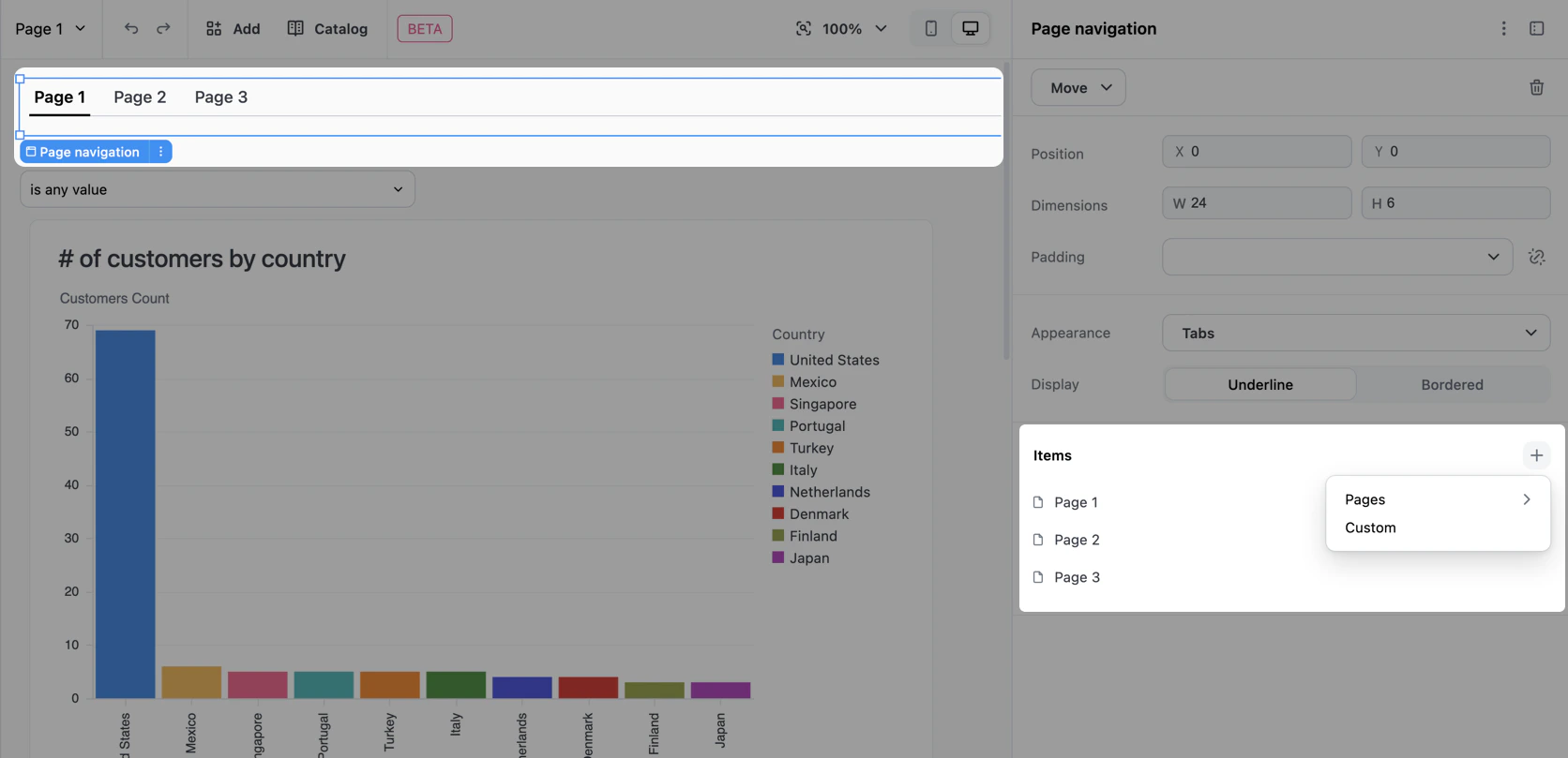 Use the menu to select one of the following:
* **Pages** - Choose an existing page or add a new page. Pages already included in the navigation will be disabled. Adding a new page will automatically add it to the navigation.
* **Custom** - Add a tab that navigates to an internal path or external URL. See [Custom URL tabs](#custom-url-tabs) for more information.
## Editing navigation tabs
To edit an existing tab:
Select the page navigation item on your dashboard. The properties panel should open on the right side of the page.
In the **Items** section of the panel, hover over the tab you want to edit and click the that displays:
Use the menu to select one of the following:
* **Pages** - Choose an existing page or add a new page. Pages already included in the navigation will be disabled. Adding a new page will automatically add it to the navigation.
* **Custom** - Add a tab that navigates to an internal path or external URL. See [Custom URL tabs](#custom-url-tabs) for more information.
## Editing navigation tabs
To edit an existing tab:
Select the page navigation item on your dashboard. The properties panel should open on the right side of the page.
In the **Items** section of the panel, hover over the tab you want to edit and click the that displays:
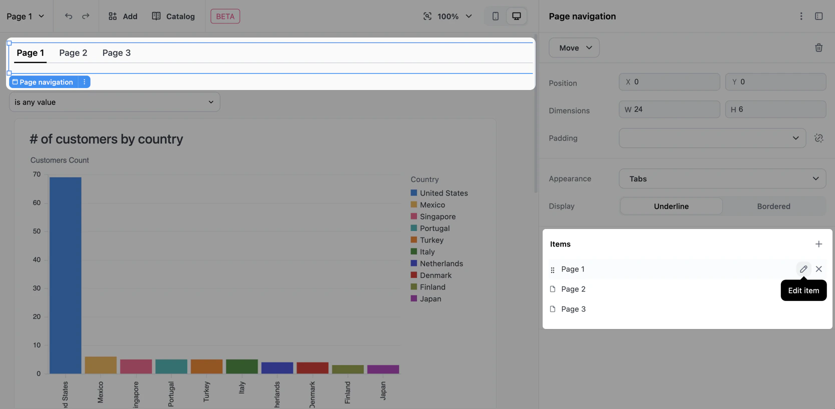 A popover with configuration options will display. Select an option from the **Link to** dropdown:
* **Page** - Allows you to select a dashboard page to link to.
* **Custom** - Allows you to specify a custom URL. See [Custom URL tabs](#custom-url-tabs) for more information.
In the **Label** field, define the display label for the tab. Toggle the icon to connect or disconnect the label from the page's title. See [Labeling navigation tabs](#navigation-labels) for more information.
When finished, click out of the popover.
A popover with configuration options will display. Select an option from the **Link to** dropdown:
* **Page** - Allows you to select a dashboard page to link to.
* **Custom** - Allows you to specify a custom URL. See [Custom URL tabs](#custom-url-tabs) for more information.
In the **Label** field, define the display label for the tab. Toggle the icon to connect or disconnect the label from the page's title. See [Labeling navigation tabs](#navigation-labels) for more information.
When finished, click out of the popover.
Labeling navigation tabs
Each tab in a page navigation item has a label that viewers see in the switcher. Labels can be connected to the linked page's title — so they track renames automatically — or disconnected to display custom text. Disconnected labels also support [dynamic references](#dynamic-labels) that pull in the current page name.
Selecting a label mode
When you create or edit a navigation tab, you can use the icon next to the **Label** field to select how the label should behave:
| Label type | Description | Useful for |
| ---------------- | --------------------------------------------------------------------------------------------------------------------------------------------------------- | ------------------------------------------------------------- |
| **Connected** | Syncs the label with the connected page's title | Consistent naming across the dashboard |
| **Disconnected** | Allows you to specify a custom label that's independent of the connected page's name. Required to use [dynamic page names](#dynamic-labels) in the label. | Multiple tabs pointing to the same page with different labels |
Using dynamic page names in labels
This section only applies to [**disconnected labels**](#label-mode).
When customizing a [disconnected label](#label-mode), you can use `{{page..name}}` to create custom labels that automatically track page renames. This allows you to add custom text to page labels while keeping them synchronized with the actual page names.
```mustache Syntax theme={null}
{{page..name}}
```
Replace `` with the unique key of the page you want to reference. For example, to create a label that displays "Overview — " followed by the page name:
```mustache Example custom label theme={null}
Overview — {{page.dashboard-home.name}}
```
**Not sure where to find page keys?** See [Advanced page settings][page-settings] for more information.
You can include multiple references in a label if needed. When the dashboard renders, the reference will display the current page name.
Additionally, if you rename a page, the reference will automatically update to reference the new page and keep the label in-sync.
#### Supported properties
Only the `.name` property is supported. If you use other properties like `{{page.KEY.description}}`, the reference will be displayed as literal text rather than being expanded.
Linking multiple tabs to one page
Page switchers support multiple tabs pointing to the same page, each with its own label. This is useful when you want to provide different entry points or contexts for the same content.
For example, you might have:
* "Overview" and "Summary" tabs both linking to your main dashboard page
* Multiple entry points labeled for different user roles or workflows
To create multiple tabs that link to the same page:
[Add a tab](#adding-navigation-tabs) to the navigation and select the page you want to link to.
Add another tab, linking to the same page as the tab in step 1.
Use **disconnected** labels to give each tab a distinct name.
The tabs can then be renamed as needed, without changes to one tab impacting the other.
Custom URL tabs
Custom URL tabs let you add navigation to internal dashboard paths or external resources directly from your page switcher.
### Creating a custom URL tab
To add a custom URL tab:
[Add a tab](#adding-navigation-tabs) to the page navigation, selecting **Custom** as the tab type.
Hover over the new tab in the **Items** section and click the icon.
In the popover that displays, fill in the following:
* **Link to** - This should be set to **Custom**
* **Label** - Enter the display text for the tab. Custom URL tabs are automatically created in **disconnected** mode.
* **URL** - Enter the destination URL. See [URL support](#custom-url-support) for support information for different URL types.
Click **Advanced** to display the following options:
* **Target** - Choose how the URL opens:
* **Same tab** - **Default.** Navigate in the current browser tab.
* **New tab** - Open in a new browser tab.
* **Custom** - Specify a custom window name for advanced window management.
* **Forward params** - **Optional**. Toggle on to append the current URL's query string to the destination URL. This is useful for carrying over filter values or other parameters.
The **Forward params** option only appends query parameters when the destination URL is same-origin (same domain). This prevents leaking filter or token state to external sites.
When finished, click out of the popover.
URL support
| Type | Supported? | Notes |
| ------------------------------------------- | ------------------ | ----------------------------- |
| Relative paths (e.g., `/dashboard/reports`) | Yes | |
| External URLs with `http://` or `https://` | Yes | |
| Email links with `mailto:` | Yes | |
| Anchor links (e.g., `#overview`) | Yes | |
| `javascript:` URLs | No | Not permitted due to security |
| `data:` URLs | No | Not permitted due to security |
## Reordering tabs
Tabs can be reordered using drag-and-drop to match your preferred navigation flow:
Select the page navigation item on your dashboard. The properties panel should open on the right side of the page.
In the **Items** section of the panel, click and hold the tab you want to move:
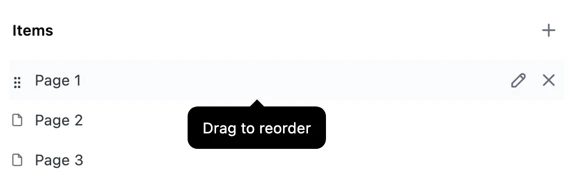 Drag the tab to your preferred position and release.
The new order persists and will be visible to all dashboard viewers.
## Removing tabs
Tabs can be removed from the page switcher without deleting the underlying page:
Click the page navigation item.
In the **Items** section of the panel, hover over the tab you want to edit and click the that displays.
The page will still be accessible in the catalog and can be re-added to the switcher at any time using the add menu.
## Navigating in edit mode
When editing a dashboard, clicking on page switcher items displays a context menu to help prevent accidental page changes. This behavior varies by appearance type:
* **Tabs, buttons, and list**: Right-click or click to open a context menu with **Go to page** (for dashboard pages) or **Open link** (for custom URLs). Select the option to navigate.
* **Dropdown**: Navigates directly to the page.
In view mode, all page switcher appearances navigate directly when clicked.
## Troubleshooting
Page name references are displayed as literal text when:
* **The property isn't `.name`** - Only `.name` is supported. Properties like `{{page.KEY.description}}` won't be expanded.
* **The page key doesn't exist** - For example, `{{page.nonexistent-page.name}}` will display as-is. The dashboard won't crash, but the reference won't expand.
* **The label is in connected mode** - References only work on custom (disconnected) labels. Connected labels automatically use the page name and can't include references.
The **Forward params** option only appends query parameters when the destination URL is same-origin (same domain). This prevents leaking filter values or token state to external sites. If you need to forward parameters to an external destination, you'll need to construct the URL manually.
## Next steps
* Learn to [build dashboard layouts](/visualize-present/dashboards/containers-items) with containers and items like charts, text, filters, and controls.
* Use [pages](/visualize-present/dashboards/pages) to create multi-page dashboards, where each page has its own layout, items, and filters.
* Configure [filters](/visualize-present/dashboards/filter-display-options) to display filters as button toggles, multi-select dropdowns, single-day pickers, and timeframe controls.
[page-settings]: /visualize-present/dashboards/pages#settings
Drag the tab to your preferred position and release.
The new order persists and will be visible to all dashboard viewers.
## Removing tabs
Tabs can be removed from the page switcher without deleting the underlying page:
Click the page navigation item.
In the **Items** section of the panel, hover over the tab you want to edit and click the that displays.
The page will still be accessible in the catalog and can be re-added to the switcher at any time using the add menu.
## Navigating in edit mode
When editing a dashboard, clicking on page switcher items displays a context menu to help prevent accidental page changes. This behavior varies by appearance type:
* **Tabs, buttons, and list**: Right-click or click to open a context menu with **Go to page** (for dashboard pages) or **Open link** (for custom URLs). Select the option to navigate.
* **Dropdown**: Navigates directly to the page.
In view mode, all page switcher appearances navigate directly when clicked.
## Troubleshooting
Page name references are displayed as literal text when:
* **The property isn't `.name`** - Only `.name` is supported. Properties like `{{page.KEY.description}}` won't be expanded.
* **The page key doesn't exist** - For example, `{{page.nonexistent-page.name}}` will display as-is. The dashboard won't crash, but the reference won't expand.
* **The label is in connected mode** - References only work on custom (disconnected) labels. Connected labels automatically use the page name and can't include references.
The **Forward params** option only appends query parameters when the destination URL is same-origin (same domain). This prevents leaking filter values or token state to external sites. If you need to forward parameters to an external destination, you'll need to construct the URL manually.
## Next steps
* Learn to [build dashboard layouts](/visualize-present/dashboards/containers-items) with containers and items like charts, text, filters, and controls.
* Use [pages](/visualize-present/dashboards/pages) to create multi-page dashboards, where each page has its own layout, items, and filters.
* Configure [filters](/visualize-present/dashboards/filter-display-options) to display filters as button toggles, multi-select dropdowns, single-day pickers, and timeframe controls.
[page-settings]: /visualize-present/dashboards/pages#settings