> ## Documentation Index
> Fetch the complete documentation index at: https://docs.omni.co/llms.txt
> Use this file to discover all available pages before exploring further.
# Uptime heatmaps
> The code for these examples can be used in the Markdown visualization to heatmap that colors each time slot based on a percentage value.
Typically used to show the reliability of a service over time, these can be configured for different timeframes or coloring thresholds.
## Red/green uptime heatmap
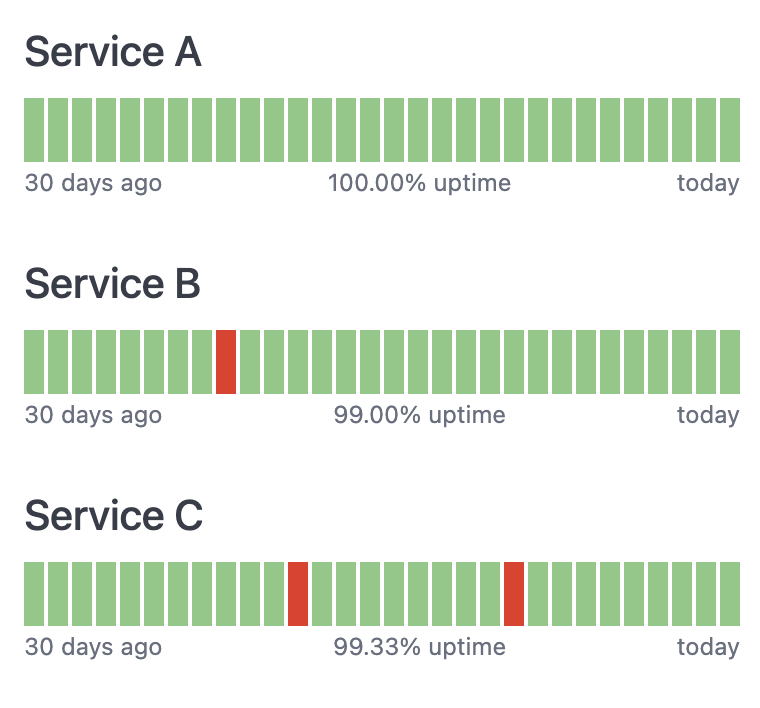
This example shows the last 30 days of data, coloring any day red if the service level percentage is anything but 100%.
 ### Setup
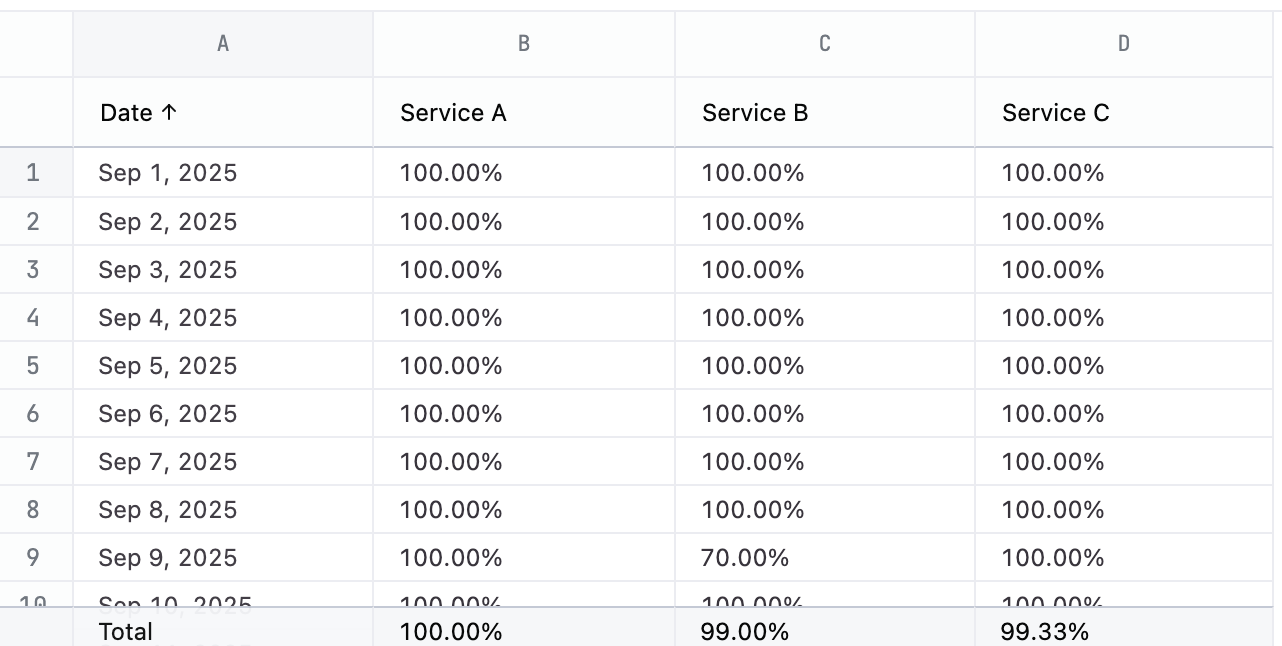
This chart has a simple structure - the time slot and a % value for each chart you want to make. [Add column totals to the query](/analyze-explore/point-click-queries#column-totals) and change the total calculation to `average` to add the average uptime below each chart.
### Setup
This chart has a simple structure - the time slot and a % value for each chart you want to make. [Add column totals to the query](/analyze-explore/point-click-queries#column-totals) and change the total calculation to `average` to add the average uptime below each chart.
 ### Example code
```html expandable theme={null}
### Example code
```html expandable theme={null}
Service A
- 30 days ago
- Service A uptime
- today
Service B
- 30 days ago
- Service B uptime
- today
Service C
- 30 days ago
- Service C uptime
- today
```
## Gradient uptime heatmap
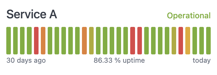
This example shows the last 30 days of data, bucketing the colors along a red to yellow to green gradient. It also adds colored text to explain the current status.
 ### Setup
You'll need a column for the time unit, a column for the percentage measurement, and a calculation to figure out how to apply the color. The gradient in this example is bucketed into 5 possible values. Adjust the calculation for `Color tier` to control how the coloring is applied. [Add column totals to the query](/analyze-explore/point-click-queries#column-totals) and change the total calculation to `average` to add the average uptime below each chart.
Note that this example invents an uptime percentage value via a calculation.
The following table explains the query setup, including the calculation formulas.
| Col | Name | Description or formula | Purpose |
| --- | --------------------- | ----------------------------------------------------------------------- | --------------------------- |
| A | Date | Time unit slot | used for drawing each box |
| B | Uptime (`calc_1`) | Uptime value | 0-1 value for the time slot |
| C | Color tier (`calc_2`) | IF(B1 > 0.75, 1, IF(B1 > 0.7, 2, IF(B1 > 0.65, 3, IF(B1 > 0.6, 4, 5)))) | Bucket-ize the uptime value |
### Example code
```html expandable theme={null}
### Setup
You'll need a column for the time unit, a column for the percentage measurement, and a calculation to figure out how to apply the color. The gradient in this example is bucketed into 5 possible values. Adjust the calculation for `Color tier` to control how the coloring is applied. [Add column totals to the query](/analyze-explore/point-click-queries#column-totals) and change the total calculation to `average` to add the average uptime below each chart.
Note that this example invents an uptime percentage value via a calculation.
The following table explains the query setup, including the calculation formulas.
| Col | Name | Description or formula | Purpose |
| --- | --------------------- | ----------------------------------------------------------------------- | --------------------------- |
| A | Date | Time unit slot | used for drawing each box |
| B | Uptime (`calc_1`) | Uptime value | 0-1 value for the time slot |
| C | Color tier (`calc_2`) | IF(B1 > 0.75, 1, IF(B1 > 0.7, 2, IF(B1 > 0.65, 3, IF(B1 > 0.6, 4, 5)))) | Bucket-ize the uptime value |
### Example code
```html expandable theme={null}
Service A
Operational
Impacted
Down
- 30 days ago
- 86.33 % uptime
- today
```