> ## Documentation Index
> Fetch the complete documentation index at: https://docs.omni.co/llms.txt
> Use this file to discover all available pages before exploring further.

# Status indicator

> The code for this example can be used in a Markdown column to display a status next to a colored indicator dot.

This example uses a Markdown column to display a status value next to a colored indicator dot in a [table](/visualize-present/visualizations/types/table)—green for active and red for inactive. The status value is used as a CSS class name, and the CSS defines the dot color for each possible value.

<img src="https://mintcdn.com/omni-e7402367/yeWZzwadMOqVYKJ6/showcase/visualizations/images/status-indicator.png?fit=max&auto=format&n=yeWZzwadMOqVYKJ6&q=85&s=df9cec0a98c618182804185bc18cfd32" alt="A table column showing each row's status as text next to a colored dot: a green dot for active and a red dot for inactive" width="215" height="228" data-path="showcase/visualizations/images/status-indicator.png" />

## Setup

In the table visualization, select the column you want to format and set **Display as** to **Markdown**. Then add the Markdown template and CSS below.

The template sets the field's value as the `class` of a `<div>` 
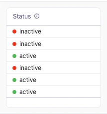
so that the matching CSS rule controls the dot's color, and repeats the value as the label text. Add one CSS class for each possible value in your data—in this example, `active` and `inactive`. The class names must match the values exactly, so this pattern works best for fields with a small, fixed set of values that don't contain spaces or special characters.

This example references the `status` field from the `saas__users_detailed` view using [Mustache syntax](/visualize-present/mustache-reference). Replace these references with your own field.

## Example code

**Markdown template**:

```handlebars wrap theme={null}
<div style="display:flex; align-items:center; gap:6px;">
  <div class="{{saas__users_detailed.status.value}}"></div>
  <span>{{saas__users_detailed.status.value}}</span>
</div>
```

**CSS styles**:

```css expandable theme={null}
<style>
  .status-row {
    display: flex;
    align-items: center;
    gap: 6px;
  }

  .active {
    width: 8px;
    height: 8px;
    border-radius: 50%;
    background: #22c55e;
    flex-shrink: 0;
  }
  .inactive {
    width: 8px;
    height: 8px;
    border-radius: 50%;
    background: red;
    flex-shrink: 0;
  }
</style>
```
