> ## Documentation Index
> Fetch the complete documentation index at: https://docs.omni.co/llms.txt
> Use this file to discover all available pages before exploring further.
# Improving date flexibility with templated filters
> A guide to going beyond the out of the box controls to give users more flexibility to manipulate dates by utilizing templated filters.
export const categoryIcons = {
'administration': 'lock',
'api': 'terminal',
'connections': 'database',
'dashboards': 'table-columns',
'embed': 'code',
'errors': 'exclamation',
'modeling': 'wrench',
'patterns': 'plus',
'schedules & alerts': 'envelope',
'visualizations': 'chart-column',
'workbooks': 'book'
};
export const GuideSidebar = ({category, relatedLinks, updatedDate}) => {
const [progress, setProgress] = React.useState(0);
React.useEffect(() => {
const sidebar = document.querySelector('.guide-sidebar');
if (!sidebar) return;
let container = sidebar.parentElement;
while (container && !container.querySelector('.guide-header')) {
container = container.parentElement;
}
if (container && !container.classList.contains('guide-page-layout')) {
container.classList.add('guide-page-layout');
}
}, []);
React.useEffect(() => {
const handleScroll = () => {
const scrollTop = window.scrollY;
const docHeight = document.documentElement.scrollHeight - window.innerHeight;
const scrollPercent = docHeight > 0 ? scrollTop / docHeight * 100 : 0;
setProgress(Math.min(100, Math.max(0, scrollPercent)));
};
window.addEventListener('scroll', handleScroll, {
passive: true
});
handleScroll();
return () => window.removeEventListener('scroll', handleScroll);
}, []);
const icon = category ? categoryIcons[category.toLowerCase()] || 'book' : 'book';
return ;
};
export const GuideTitle = ({title}) => {
return
{title}
;
};
Omni provides powerful, built-in options for manipulating dates on a dashboard, such as [time frame switchers](/visualize-present/dashboards/controls) and [period over period analysis](/visualize-present/dashboards/controls).
However, if you want to give your users even more control, [templated filters](/modeling/templated-filters) are the answer. This guide walks through two advanced patterns for date flexibility:
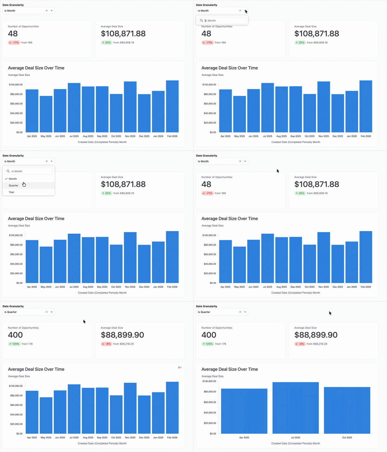
1. **Granularity control with automated filtering:** A single control that changes the granularity of time series charts (e.g., month to quarter) while simultaneously filtering to the "last complete" period.
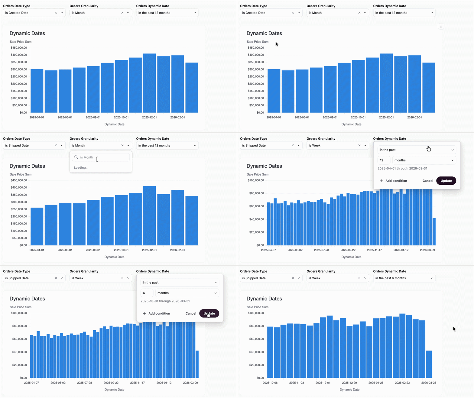
2. **The "everything" toggles:** Giving you the ability to swap the underlying date field, timeframe granularity, and date range all from a single dashboard interface using multiple filters.
Implementing these patterns allows you to create a system where you can redefine the context of your data on the fly.
## Requirements
To follow the steps in this guide, you'll need:
* **Modeler** or **Connection Admin** permissions for the model you want to work with
* A basic understanding of [templated filters](/modeling/templated-filters)
## Pattern 1: Dynamic charts with "last complete period" logic
When looking at data over time, comparing a partial current month against a full previous month can be misleading. This pattern creates a dimension that automatically nulls out the current, incomplete period based on the granularity you've selected.
In your model, define a string filter that will act as the toggle:
```yaml theme={null}
date_granularity:
type: string
label: Date Granularity
description: Select the timeframe for the completion filter
suggestion_list:
- value: Month
- value: Quarter
- value: Year
filter_single_select_only: true
```
Next, create a custom dimension using templated filters. This dimension will evaluate the user's selection and apply the "last complete" logic.
For example, when `Quarter` is selected, the `CASE` statement returns `NULL` for the current (incomplete) quarter and truncates to the quarter otherwise. The same pattern applies for `Year` and `Month`.
Use the following code to add the dimension, replacing `saas__opportunities.created_date` with your own view and date field:
```yaml wrap theme={null}
created_date_completed_periods:
sql: |-
CASE
WHEN {{# saas__opportunities.date_granularity.filter }} 'Quarter' {{/ saas__opportunities.date_granularity.filter }}
THEN CASE
WHEN DATE_TRUNC('quarter', ${saas__opportunities.created_date}) >= DATE_TRUNC('quarter', CURRENT_DATE)
THEN NULL
ELSE DATE_TRUNC('quarter', ${saas__opportunities.created_date})
END
WHEN {{# saas__opportunities.date_granularity.filter }} 'Year' {{/ saas__opportunities.date_granularity.filter }}
THEN CASE
WHEN DATE_TRUNC('year', ${saas__opportunities.created_date}) >= DATE_TRUNC('year', CURRENT_DATE)
THEN NULL
ELSE DATE_TRUNC('year', ${saas__opportunities.created_date})
END
ELSE CASE
WHEN DATE_TRUNC('month', ${saas__opportunities.created_date}) >= DATE_TRUNC('month', CURRENT_DATE)
THEN NULL
ELSE DATE_TRUNC('month', ${saas__opportunities.created_date})
END
END
label: Created Date (Completed Periods)
```
1. In a workbook, **select** the `Created Date (Completed Periods)` dimension for your time series charts.
2. Navigate to your dashboard and click **Add > Filter**.
3. Configure the filter to point at your `date_granularity` field.
Now when the filter is used, the connected tiles will automatically update to use the selected granularity:
## Pattern 2: The "everything" toggles
This pattern gives you three independent dashboard controls: the date field (e.g., switching from **Created Date** to **Shipped Date**), the granularity, and the date range window.
In your model, create two [filter-only fields](/modeling/templated-filters/parameters): one for the field choice and one for the granularity.
```yaml wrap theme={null}
as_of_date_field:
type: string
label: As of Date
suggestion_list:
- value: Created At
- value: Shipped At
- value: Delivered At
- value: Returned At
default_filter:
is: Created At
filter_single_select_only: true
as_of_date_field_granularity:
type: string
label: Date Granularity
suggestion_list:
- value: Daily
- value: Weekly
- value: Monthly
default_filter:
is: Daily
filter_single_select_only: true
```
This pattern requires two dimensions to work: one to swap the raw date field, and the second to truncate that field based on the selected granularity.
The `dynamic_date` dimension uses a `CASE` statement to swap the underlying source column (for example, `created_at` vs. `shipped_at`) based on the filter selection:
```yaml wrap theme={null}
dynamic_date:
sql: |-
CASE
WHEN {{# order_items.as_of_date_field.filter }} 'Created At' {{/ order_items.as_of_date_field.filter }} THEN ${order_items.created_at}
WHEN {{# order_items.as_of_date_field.filter }} 'Shipped At' {{/ order_items.as_of_date_field.filter }} THEN ${order_items.shipped_at}
WHEN {{# order_items.as_of_date_field.filter }} 'Delivered At' {{/ order_items.as_of_date_field.filter }} THEN ${order_items.delivered_at}
WHEN {{# order_items.as_of_date_field.filter }} 'Returned At' {{/ order_items.as_of_date_field.filter }} THEN ${order_items.returned_at}
ELSE ${order_items.created_at}
END
label: Dynamic Date
```
The `dynamic_date_granularity` dimension takes the result of `dynamic_date` and applies the truncation level (daily, weekly, or monthly) that you've selected:
```yaml wrap theme={null}
dynamic_date_granularity:
sql: |-
CASE
WHEN {{# order_items.as_of_date_field_granularity.filter }} 'Daily' {{/ order_items.as_of_date_field_granularity.filter }} THEN ${order_items.dynamic_date[date]}
WHEN {{# order_items.as_of_date_field_granularity.filter }} 'Weekly' {{/ order_items.as_of_date_field_granularity.filter }} THEN ${order_items.dynamic_date[week]}
WHEN {{# order_items.as_of_date_field_granularity.filter }} 'Monthly' {{/ order_items.as_of_date_field_granularity.filter }} THEN ${order_items.dynamic_date[month]}
ELSE ${order_items.dynamic_date[date]}
END
label: Dynamic Date Granularity
```
1. In a workbook, build your charts using the `Dynamic Date Granularity` dimension.
2. When finished, complete the following on the document's dashboard:
1. Add filters to the dashboard for both `As of Date` and `Date Granularity`.
2. Add a standard date range filter and [map it](/visualize-present/dashboards/filters#map-different-fields) to the `Dynamic Date Granularity` field to control the window of time.
## Next steps
* Learn more about [filter-only fields](/modeling/templated-filters/parameters) to create more interactive toggles.
* Learn how to [map dashboard filters to different tile fields](/visualize-present/dashboards/filters) to ensure your filters apply correctly across tiles.