Table visualizations are useful for displaying detailed information in a clear, organized way. You can also use options like conditional formatting to add additional information to the visualization. Omni offers many ways to configure tables for more visual sharing, including layout controls, in-line visualization, conditional formatting, and other controls.Documentation Index
Fetch the complete documentation index at: https://docs.omni.co/llms.txt
Use this file to discover all available pages before exploring further.
Table visualizations are different than the results table. Think of a table visualization as the way you want to present the data in the results table.
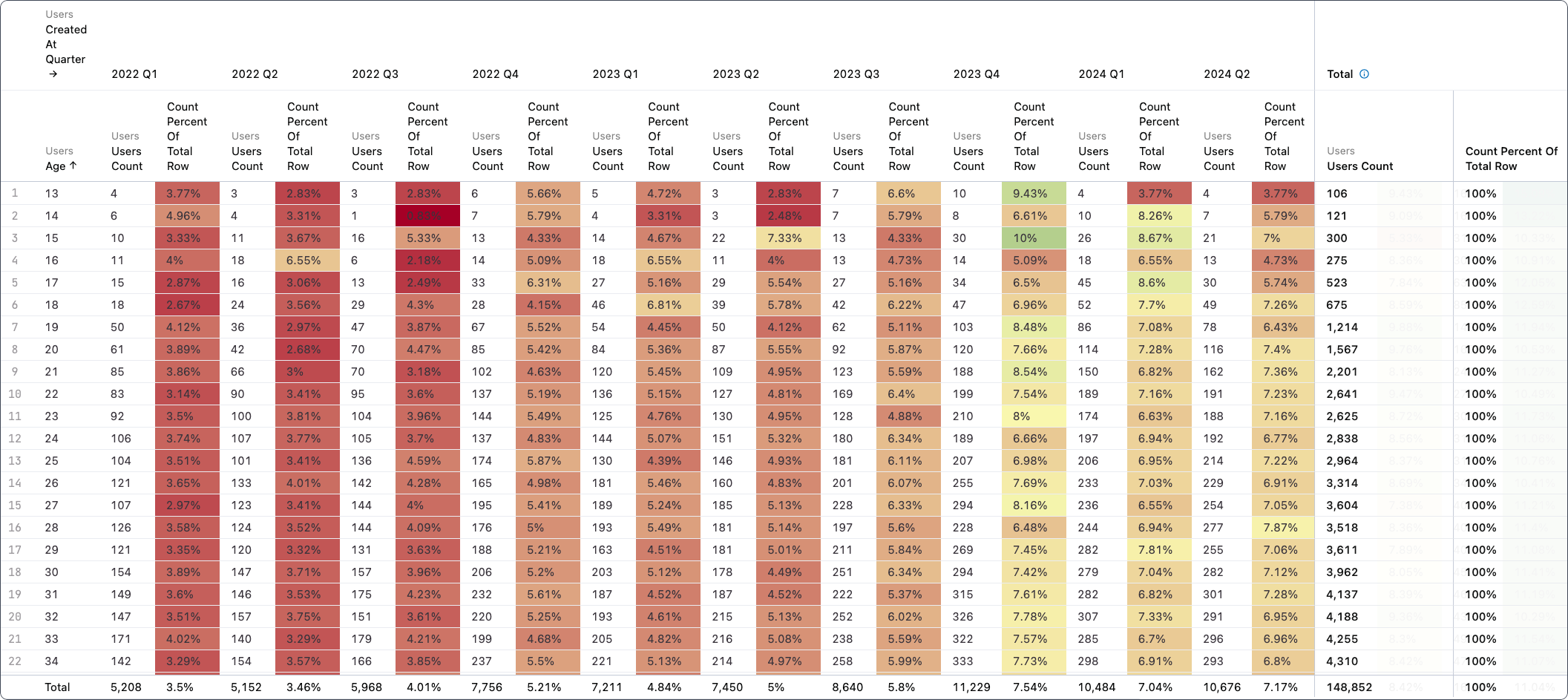
Showing and hiding columns
To hide columns from the table, right click on any column in the result set from the table visualization configuration. Hidden columns can then be returned from the configuration. Columns may also be hidden from the table options menu.Re-sorting and reordering columns
Columns in the results table can be re-arranged using the drag target on each column header. Pivots can only be re-arranged via re-sort, not on an ad hoc basis. Note: Dimensions and measures can be interspersed if there is no pivot.Working with pivots
Pivots can be sorted the same way that columns are sorted, by clicking on the field header in the results table. Pivots can also be sorted based on values in the results table by clicking the row number, including by the total. Click the blank row number for totals.Table options
The Table tab in the Options panel allows you to configure column width, pivots, and add or remove columns from the visualization:- Column width - Choose between a full width table (stretch) and a fixed table where column widths will remain fixed regardless of table size, any extra space in the table tile will be blank.
- Header text - Controls if a column header will truncate or wrap to the next line if text doesn’t fit.
- View names - If enabled, the view name will show in the results table.
-
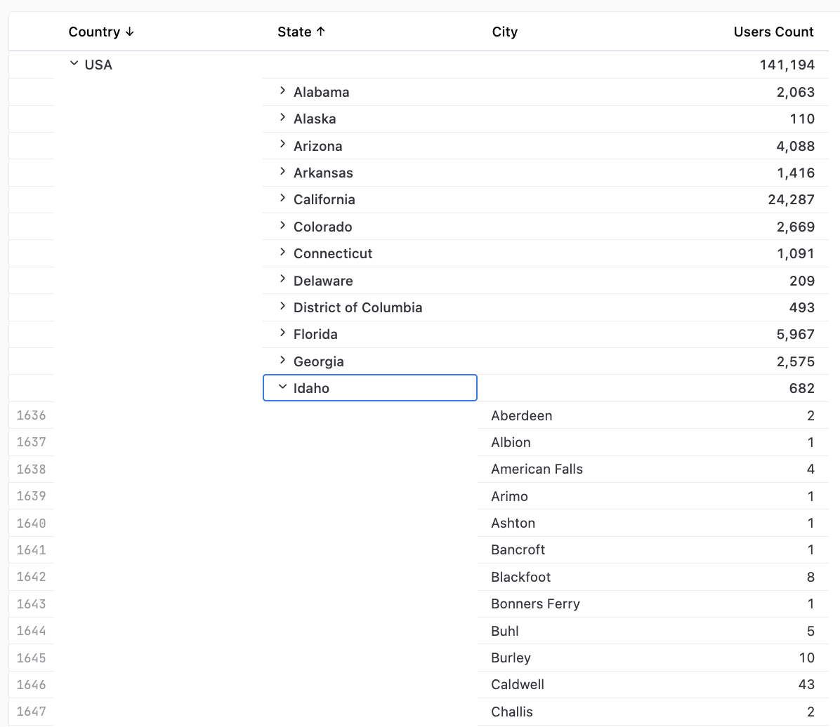
Group dimensions - If enabled and there’s more than one dimension per row, dimensions will be grouped into one expandable section. This allows you to subtotal datasets and increase interactivity in the table:
Pivots
Drag and drop fields to pivot the table. Pivots can also be hidden, but must be hidden from the table itself and they will be indexed to the value of the pivoted series. This means if you hide the first pivot, saystatus: Returned, the hide is not indexed to the first pivot, but rather status: Returned.
Fields
Drag and drop fields to add to the table and reorder them directly in this section. Use the drop down arrow to further customize the data in the table.Field options
- Label
- Alignment
- Word wrap
- Hide - Can be used to hide or unhide columns
Display tab
The Display tab allows you to customize how the field is displayed in the table. Fields can be displayed as the original value, images, links, or bars. By default, Omni will display the current value of the field.Displaying fields as images
To display a field as an image, select Image from the Display as dropdown. The tab will update to display image options, including Height and Width. To create a linked image, check the Link image box and use the Link URL setting to finish configuring the link. This will create a hyperlink that, when clicked, will send the user to a link, a custom link, or an embed event.The Link URL must be publicly accessible without authentication
Displaying fields as links
Omni supports displaying field values as links, making it easy to link to relevant pages from the visualization. Dynamic links for each row can be created in just a few steps:-
In the query results table, create a table calculation that results in a valid URL. In this example, the
Acolumn contains a GitHub issue number like10321:This would result in a value likehttps://github.com/blobsrus/issues/10321. - In the table visualization, hide the calculation column.
- Open the visualization’s Options panel.
- In the Fields section, click the down arrow to open the field options.
- In the Display tab, select Link from the Display as menu.
- In the URL dropdown, select the hidden URL calculation field.
Displaying numeric fields as bars
Numeric columns can be displayed as bars in the table, allowing you show relative sizes. Select Bar from the Display as dropdown to view configuration options.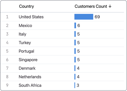
Style options
The Style tab allows you to adjust the look and feel of your table by making descriptions available, adding row numbers, banding rows, adjusting the font size, and text and background color of the various elements. Banding will set the rows to alternate between the base background table value color (white) and the base banding background color (grey). Font Size can be increased or decreased for Headers, Values, and Totals.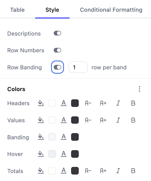
Colors
In the Colors section, you can select a background color and apply text styling to:- Table headers
- Values
- Banding
- Hover
- Totals
Resetting and copying table color palettes
Using the (three dots) menu in the Colors section allows you to reset the colors to their defaults or copy the hex codes of each defined color. For example, copying the table palette would create something like the following, making it easily reusable:Conditional formatting options
The Conditional formatting tab allows you to specify conditions that, if met, will apply the styling you specify to matching rows or a column.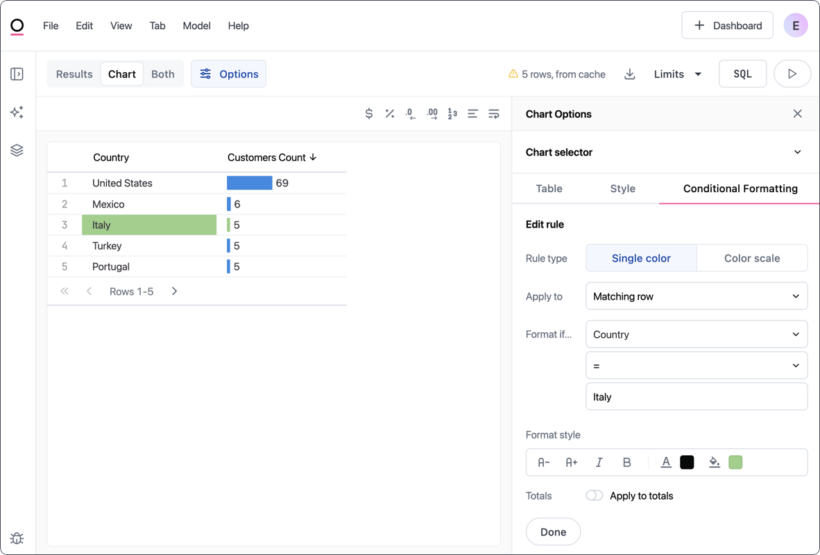
To make a background transparent, click the (bucket icon) and then the Custom tab. Remove the hex code.
Applying gradients
The Color scale tab allows you to conditionally apply gradients to table visualizations. Note: If you do not set amapping value, the color scale will apply across visible rows which may be confusing when row limits or pagination are active.
Use the Treat as zero toggle to handle nulls in the dataset.
