Bar + LineDocumentation Index
Fetch the complete documentation index at: https://docs.omni.co/llms.txt
Use this file to discover all available pages before exploring further.


Configuration
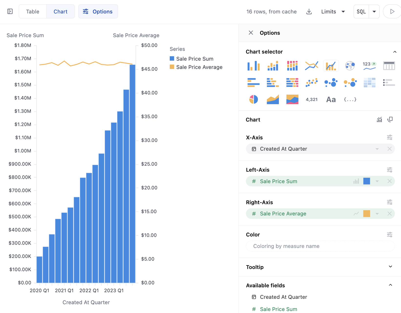
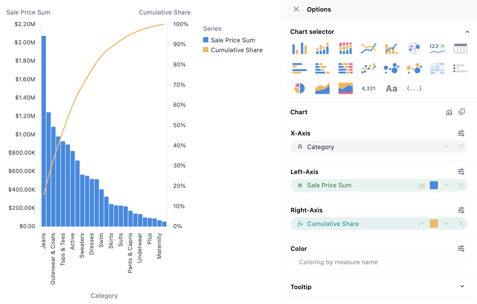
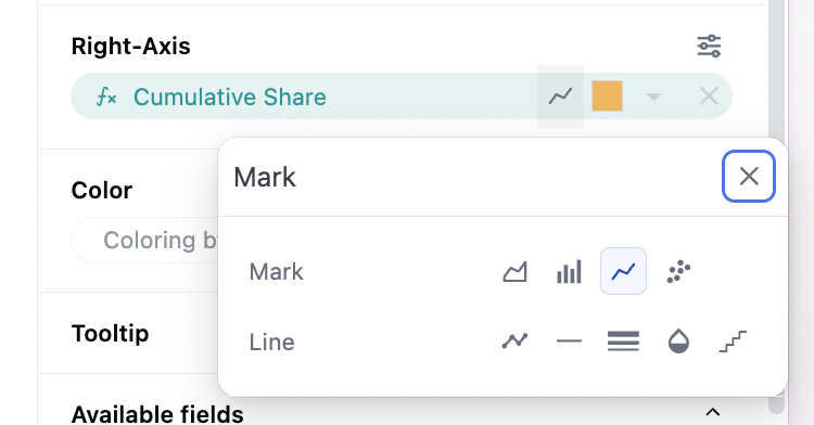
See bar, line, scatter, and area docs. The overall mark selector at the top of the configuration sets the global chart configuration (configuration across all series). Note that each series can be set independently to bar, line, scatter, area independently under their y-axis controls. To build a mixed chart, either select the bar/line accelerator, or set a base chart type and adjust the other series using the icon on the y-axis:

