Documentation Index
Fetch the complete documentation index at: https://docs.omni.co/llms.txt
Use this file to discover all available pages before exploring further.

Getting Started with KPIs
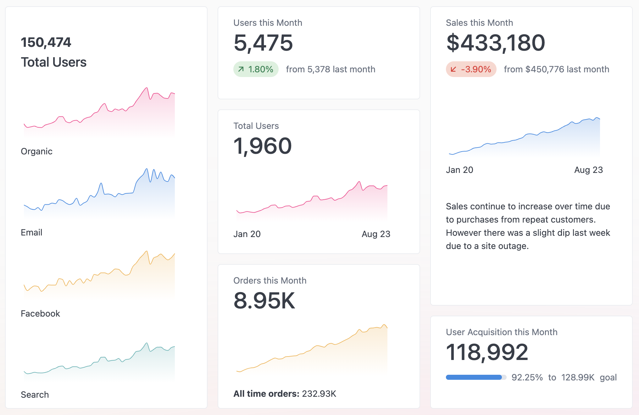
The KPI vis is row based. By default it will start with a Number vis that compares the first and second rows of data for a numeric column.
Use the button within the visualization to add new rows. You can choose the type of row you’d like to add, then configure it in the panel beside the visualization.
 To select a different row to edit, click on the row within the visualization to select it, then configure it in the side panel.
Rows can be rearranged by dragging the handle on the left hand side and they can be deleted via the trash icon within the config panel.
Components
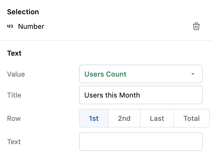
The Number Component
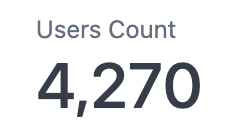
The number component highlights a single value. This component pairs well with the Comparison component below.
| Vis Component | Configuration |
|---|
 |  |
The Comparison Component
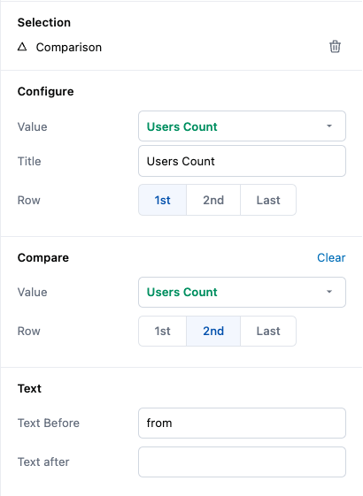
The comparison component takes one value and compares it to another value. You can compare across columns and pivots by selecting a specific column in the configuration panel. Selecting the same column for both fields allows you to compare two rows within a data set.
| Vis Component | Configuration |
|---|
 |  |
The Progress Component
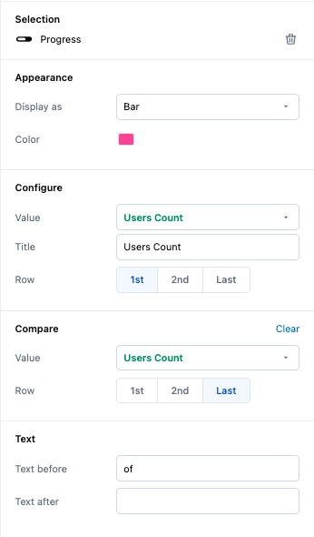
Similar to the number component, a progress row will also compare two values. This section is useful for comparing to a goal or across separate fields. It can be configured in the side panel to show as either a bar or a circle.
Hint: If you want to compare to a static number, such as a goal, try adding a column to your query that always returns the same number titled ‘goal’.
| Vis Component | Configuration |
|---|
 |  |
The Chart Component
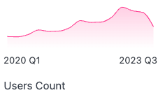
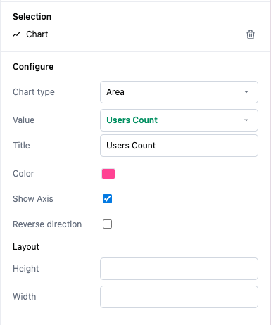
Selecting a chart row will render a sparkline chart. Sparklines are simple charts that show a general trend. Sparklines can be swapped between bars and lines. These charts have a configurable height and width.
| Vis Component | Configuration |
|---|
 |  |
The Text Component
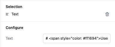
The text component is a markdown enabled simple text field for small amounts of styled text. Consider this for adding a title, heading or description of your visualization.
It is not suggested to use text components for complex markdown tasks as it can break your visualization layout, if you need complex markdown layouts, consider using the Markdown Vis.
| Vis Component | Configuration |
|---|
 |  |
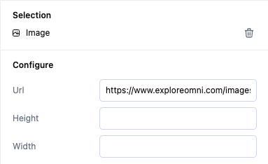
The Image Component
Configure the url to add an image to your visualization.
| Vis Component | Configuration |
|---|
 |  |
https://en.gravatar.com/{{result._first.users.img_link}}
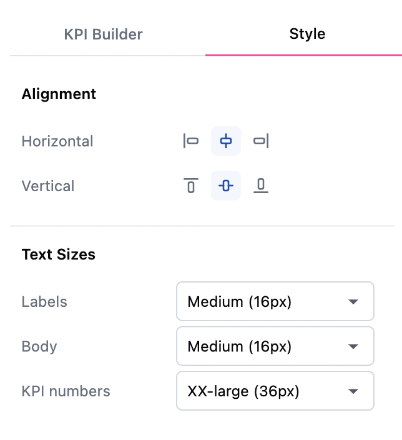
Styling Options
From the visualization controls in a workbook users can now customize the alignment and text sizes for each component of the KPI.

Advanced usage
Converting to raw markdown
If you’ve created a KPI vis but want to further customize it beyond what the UI allows, you can convert your vis directly to markdown by clicking on the markdown visualization.
Note: This is a one-way operation. If you do this accidentally, undo your changes with the back button.