Dashboards
Workbooks can be presented as dashboards, displaying many queries at once with interactive filters. Each workbook query will be tiled onto a unified piece of content:
Creating & editing dashboards
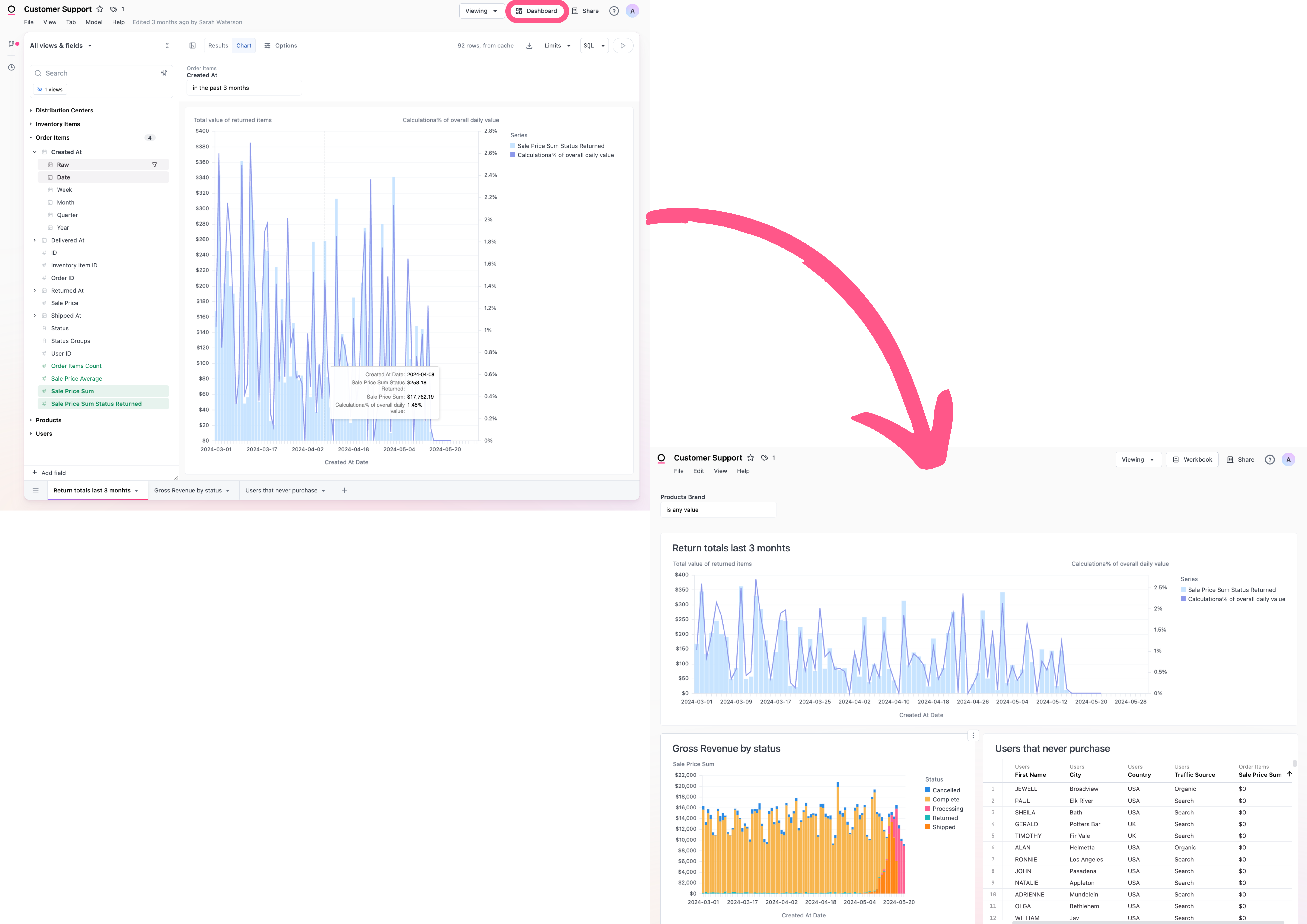
To create a new dashboard in a workbook, you'll need to be in a draft. Click the + Dashboard button in the top right corner of the document.
To edit an existing dashboard, click the Edit button in the top right corner of the document. If you're in the workbook portion of the document you'll also need to click the Dashboard button.
Your changes will be automatically saved as you work.
Edit a dashboard tile
The vertical three-dot menu in the top right corner of a tile when you hover over the tile is how you can edit the content or the appearance of a tile. If you have dashboard filters, keep in mind that when you are viewing a specific workbook tab in edit mode the dashboard filters aren't applied so the results may look different.
Edit tile content
To edit the visualization in a tile, click the ⠇ (three dots) in the right corner of the tile. Then, click Edit chart to edit the chart on the dashboard, or Edit in workbook to edit the chart in the workbook.
Edit tile appearance
- Choose Hide Chart to hide the tile from the dashboard. Perhaps the underlying data is important to the workbook, but you don't want to have end users be able to interact with the data on a dashboard level. Note: Other queries on the dashboard can still access hidden tiles (via XLOOKUP), if you need to filter a hidden tile you can map the filter before hiding the tile and it will update with the filter selection.
- Choose Remove Background to make the background of a tile be transparent.
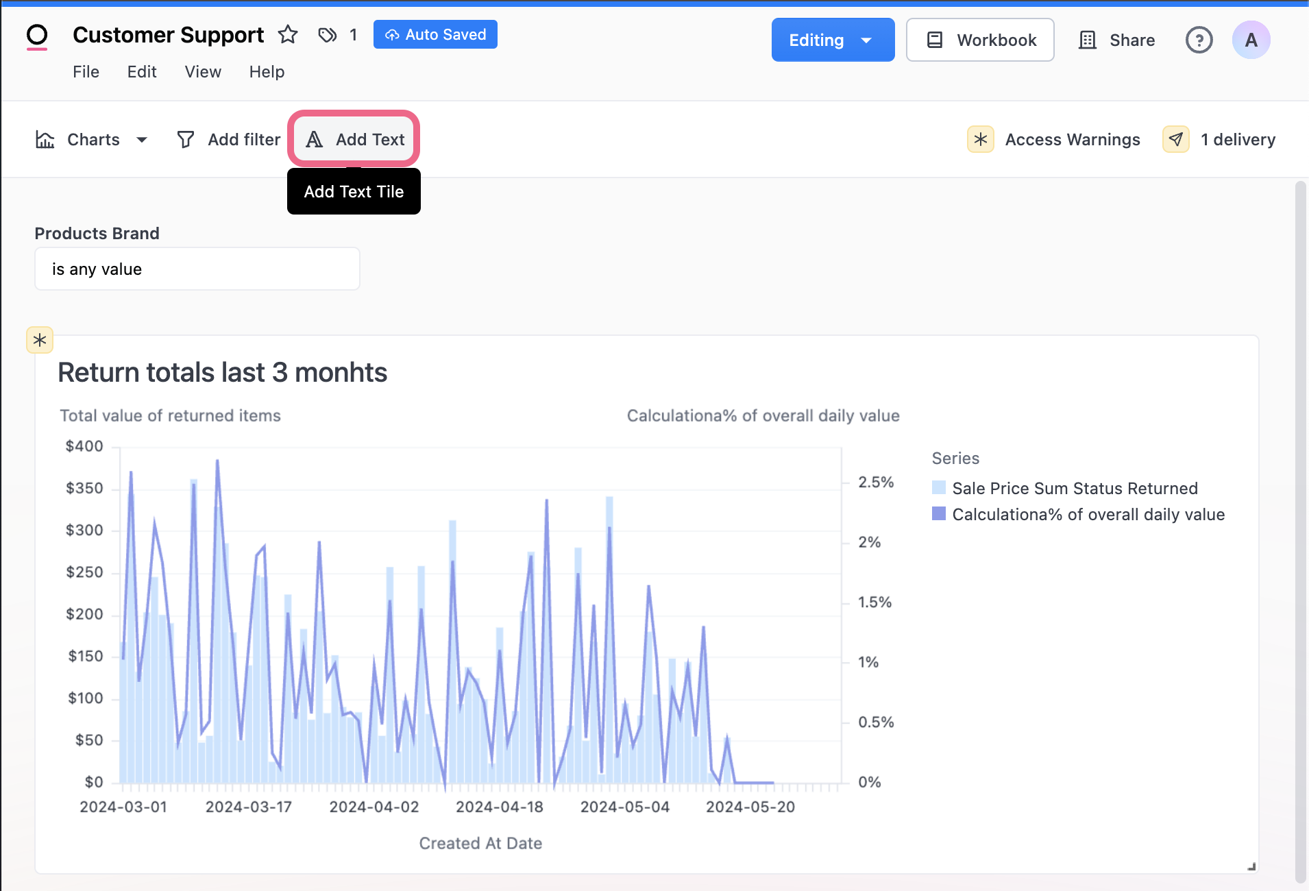
Markdown (Text) Tiles
To add text to the dashboard, go into edit mode and select Add Text. Text tiles support markdown so you can add styling, images, links, and more. See a markdown syntax reference here.
See more examples of how the Text tiles can make dashboards dynamic with mustache syntax and markdown.
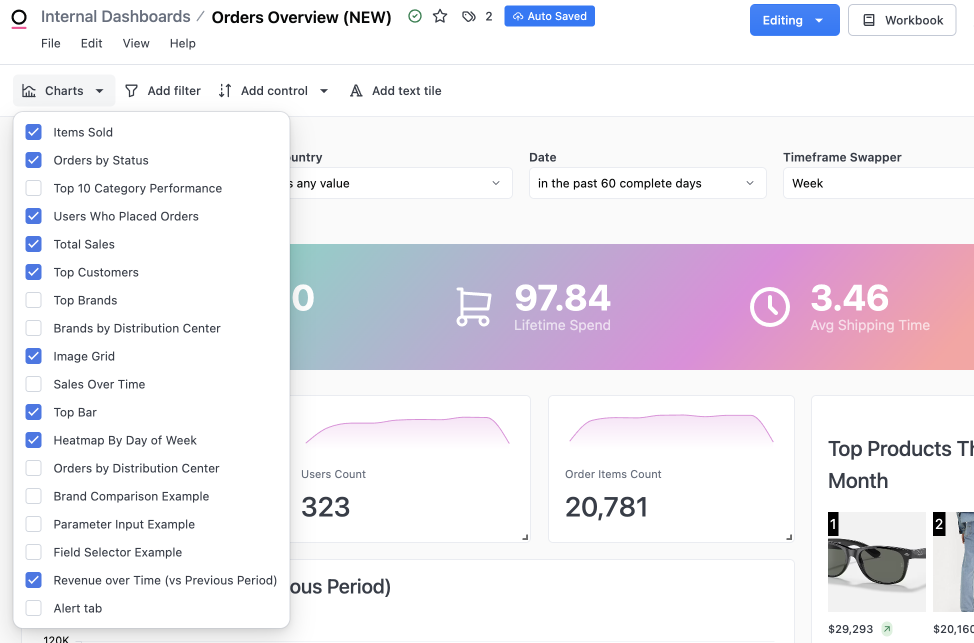
Excluding Tiles (Workbook Tabs)
You may have queries in the workbook that aren't intended for dashboard consumption (intermediate query-views or debug queries, for example). To exclude queries from the dashboard, simple uncheck the corresponding workbook tab from edit mode on the dashboard: Note: charts that are excluded from the dashboard will not run on the dashboard unless they are invoked by another query (i.e. XLOOKUP, alert, or used in a filter).
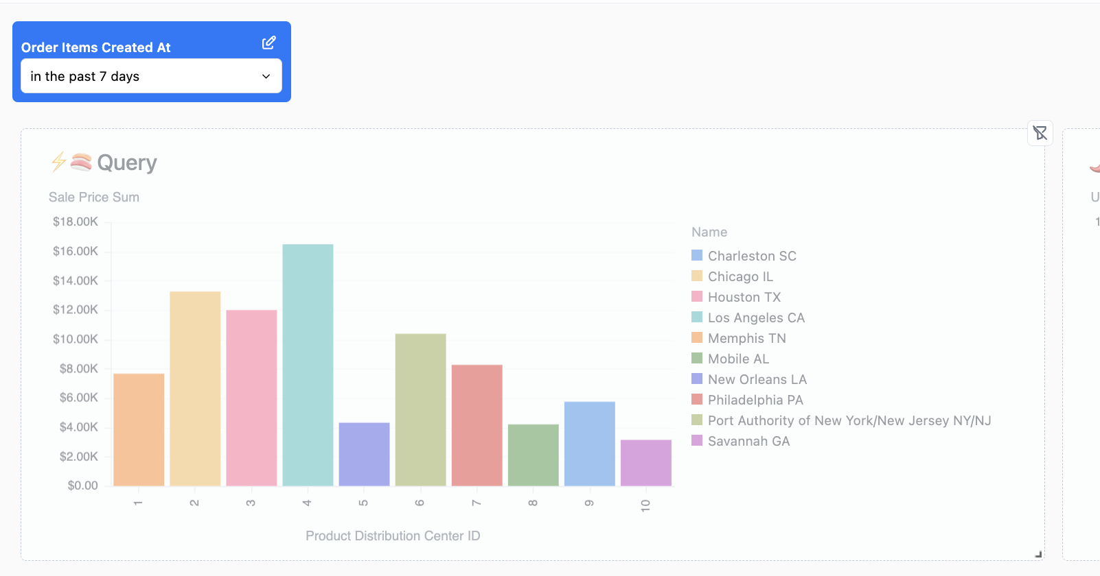
Filters
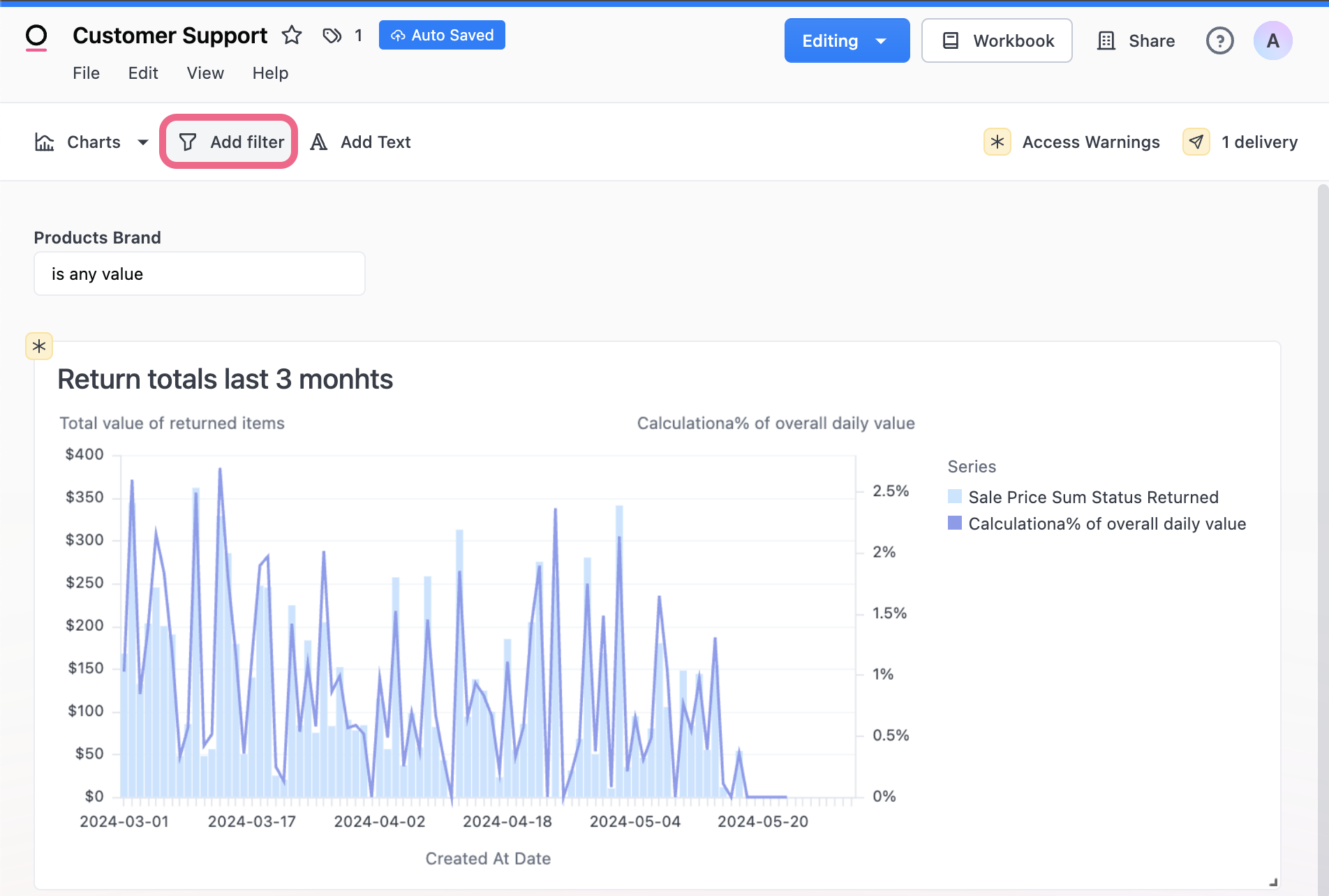
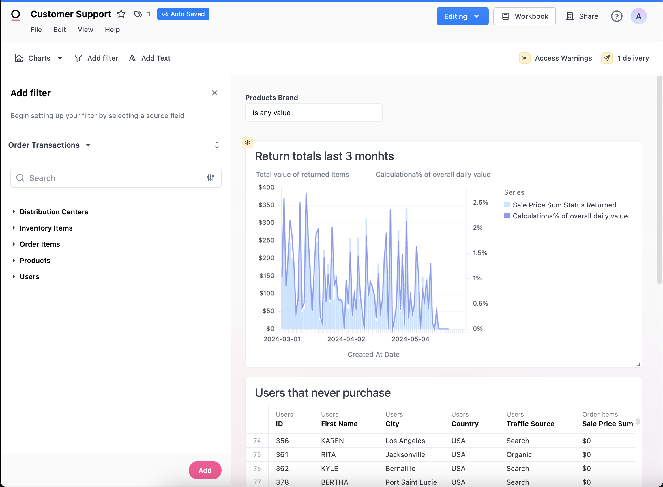
Add Filters
Add a filter to the dashboard, go into edit mode and select Add Filter. Choose the field you want to base your filter on. The field you choose as your filter base will determine:
- where suggested filter values come from
- determine which field on your dashboard tiles Omni will automatically map to initially (can be edited)
- the type of field the dashboard filter can be applied to (i.e string, numeric, date)
Troubleshooting tip: if you do not see options in the dropdown when connecting a filter to a chart, check to make sure the types match. E.g. If your filter is based on a string field you will only see options to apply to filter to fields of the same type. If a field is unknown, it will not know how to map it and display no matches as well.
If you want to set a default value for the filter, you need to configure the values in the left pane during edit mode (note that filters done in the page in edit mode will not change the default filter experience). This value will be pre-loaded anytime the Dashboard is opened. Filters can be disconnected from specific dashboard tiles by clicking the blue filter button in the top right corner of a tile. Dashboard filters will override any workbook level filters that exist on the field they are applied to.
If a tile is hidden, but still needs to have the filter applied, first un-hide the tile, then add the filter, and then re-hide the tile.
Filters will not automatically apply to custom-written SQL queries. Learn more about dynamic filtering in SQL.
Filter Controls
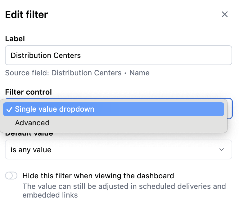
Omni has two filter control types:
- Advanced: the default filters which allows users to select multiple options
- Single select: a filter control that only allows the user to put in one option into the filter.
When creating or editing a filter the options are available in the filter panel.
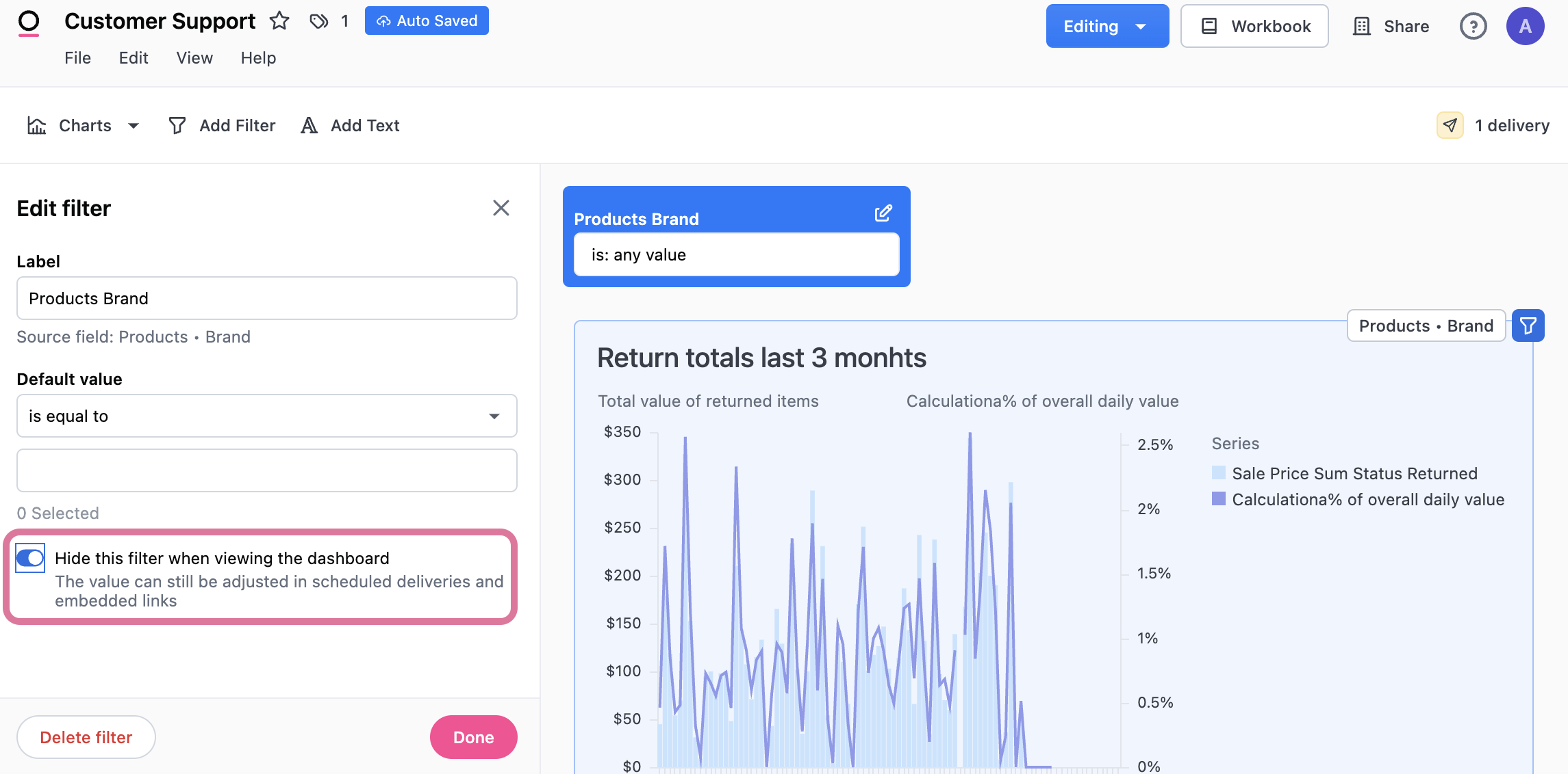
Hide Filters
Users can hide filters on a dashboard. The value will still be applied in the background to whichever tiles the filter is applied to. The value of the filter can also be manipulated via the dashboard's URL, but ultimately the control is hidden from the user.
Hiding dashboard filters may seem like a quick fix for restricting user access to sensitive data, but it's not a foolproof security measure. Instead, we strongly advise implementing access filters as a more robust solution. These filters provide a structured approach to control data access, preventing users from altering filters to access unauthorized information.
Map Filters to Different Fields Per Dashboard Tile
Filters can optionally be mapped to different fields on each tile. A common example is when you have a dashboard date filter, but want it to update a different date field on each tile (e.g. the users tile uses user_created_at and the orders tile uses orders_created_at). To configure, edit the filter then on the top right of each tile, select the field you want to map the filter to.
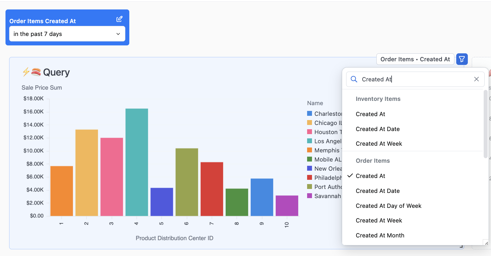
When mapping filters, the available fields on any given tile will reflect available fields of the same type as the filter source field. If you are mapping to a tile built from a topic you will only be able to map to fields of the same type within that tiles’ topic.
Disable Filters Per Dashboard Tile
Filters can be disabled from filtering different tiles on the dashboard. When editing a filter, select the filter icon upper right of each tile and it will disable the filter for that tile.
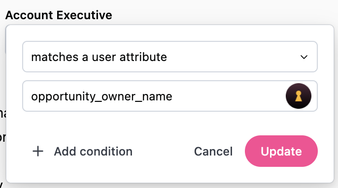
Filtering by a User Attribute
Filter values can be set to a user attribute so that the default filter value changes based on the user accessing the content. This is useful for when you want to create a single dashboard and have it dynamically filter the information to the end user. One example is a sales dashboard with a filter set to an attribute on Account Executives name, so when that user views the dashboard it is automatically narrowed to their own deals.
Mobile Layout
Omni auto creates a stacked-layout when the screen size shrinks horizontally (often most obvious on mobile devices). This layout can be edited/re-arranged independently from the standard tiled layout, and will not impact the standard unstacked layout. To do so, shrink the window of the dashboard on the web until you see the stacked layout, and make layout edits in the order you'd like.
Controls / Parameters / Time frame switching / Dynamic fields
Controls allow you to choose which fields will be shown in a tile. To add a control to the dashboard, go into edit mode and select Add Control. Configuring a control asks that you start by picking one of the underlying fields common to the tiles you want to control. Otherwise the control will have no impact (e.g. adding a field switcher between "order volume" and "total sales" to a tile that is showing "user count" will have no impact).
Like filters, when you are editing the control you can pick which tiles on the dashboard to connect by toggling the icon in the top right of each tile. You can also set initial default values and optionally hide the control from dashboard viewing.
There are five types of controls:
- Field switcher
- Multi-field picker
- Time frame switcher
- Period over period
- Parent control
Field Switcher
These controls will allow the dashboard viewer to swap a single field for another field within the underlying query. When used with dimensions, this will change the grouping or breakdown of a query. For example, a field switcher with dimensions like country, gender, and age group to allow viewers to slice the metrics in the connected tiles in different ways. When used with measures, the metric to displayed in the connected charts will update.
When configuring, you can add as many fields to the field swapper as you need. While typically a field swapper is all measures or all dimensions, they can be mixed. You can also select to add a "no field" option. This is useful for situations where you may want to offer viewers a way to see the total metric value or pick a dimension to change the grouping
Multi-Field Picker
A multi-field picker allows you to pick zero or more fields to show in a chart. Usually most useful on table visualizations, it can be connected to any chart tile on the dashboard.
Time Frame Switcher
For date fields, you may want to provide a control to allow the viewer to change the granularity of the date grouping. For example, change a grouping from months to weeks or to days. Time frame switchers make this easy. When configuring, select the underlying date field to control and then select the time frames you want to make available.
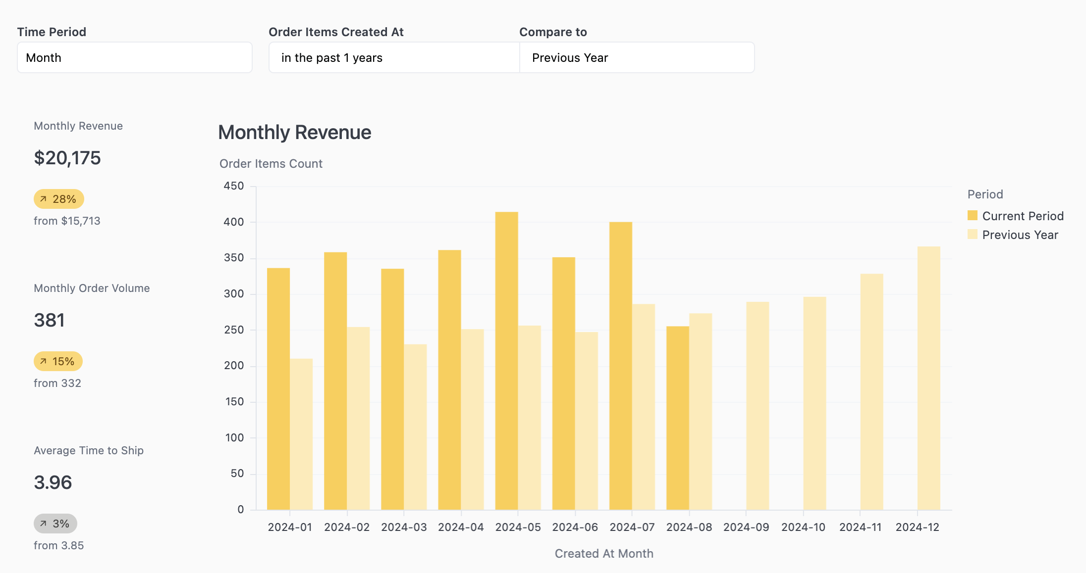
Period over Period
To compare a metric between time periods, use a period over period control. When configuring, select the underlying date field that controls the time periods you want to compare. Choose the current period and one or more comparison periods. Any attached charts will break down the metric between the current and previous time period(s).
Parent Control
A parent controls coordinates the toggling of multiple controls at once. A common example here is for a dashboard that has a timeseries with a created_at date, another timeseries with a recieved_at date, and lastly a timeseries with a returned_at date. This can't be done with a single time frame switcher. Instead, build 3 time frame switchers and then add a parent control to control all 3 time frame switchers. You can then hide each child time frame switcher.
To configure, you'll need to add the display options for the parent control and then connect the children options to the parent options.
Dashboard Settings
There are two Dashboard settings available under the Edit menu: Auto-refresh and Faceted filters.
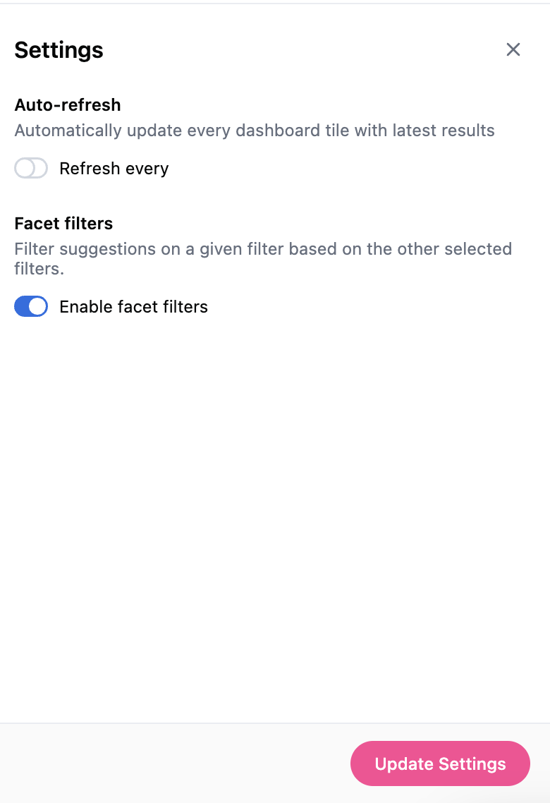
Dashboard Auto-refresh
Auto-refresh functionality proves invaluable for dynamic data environments, such as medical or financial sectors, where real-time updates are essential. Conversely, for more static data, users can extend the auto-refresh timeframe, opting to rely on cached data rather than reloading from the database as frequently, thus optimizing resource utilization.
Faceted Filters
When toggled on, this dashboard setting automatically links filters so that one filter will limit the results of another. For instance a State filter will reduce the city options to only cities that are in that State. Faceted filters will also work in combination with access filters.
The feature is turned off by default, in order to enable it, go to Edit and then Dashboard Settings and turn on the toggle.
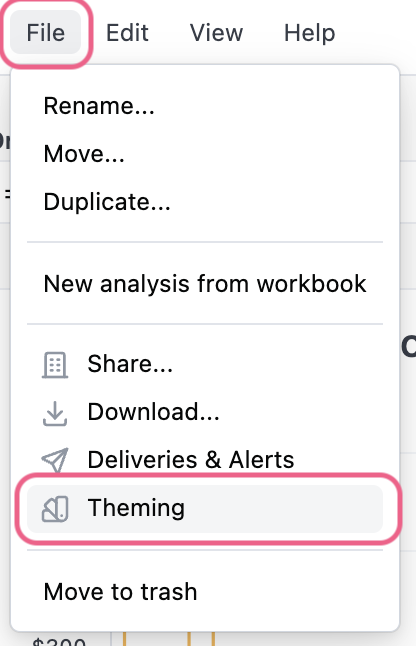
Theming
Omni Admins can create dashboard themes to customize the look and feel of dashboards. Once a theme is created, it can be reused on any dashboard. For internal dashboards it is available under File > Theming and for embedded dashboards it is available as a url parameter.
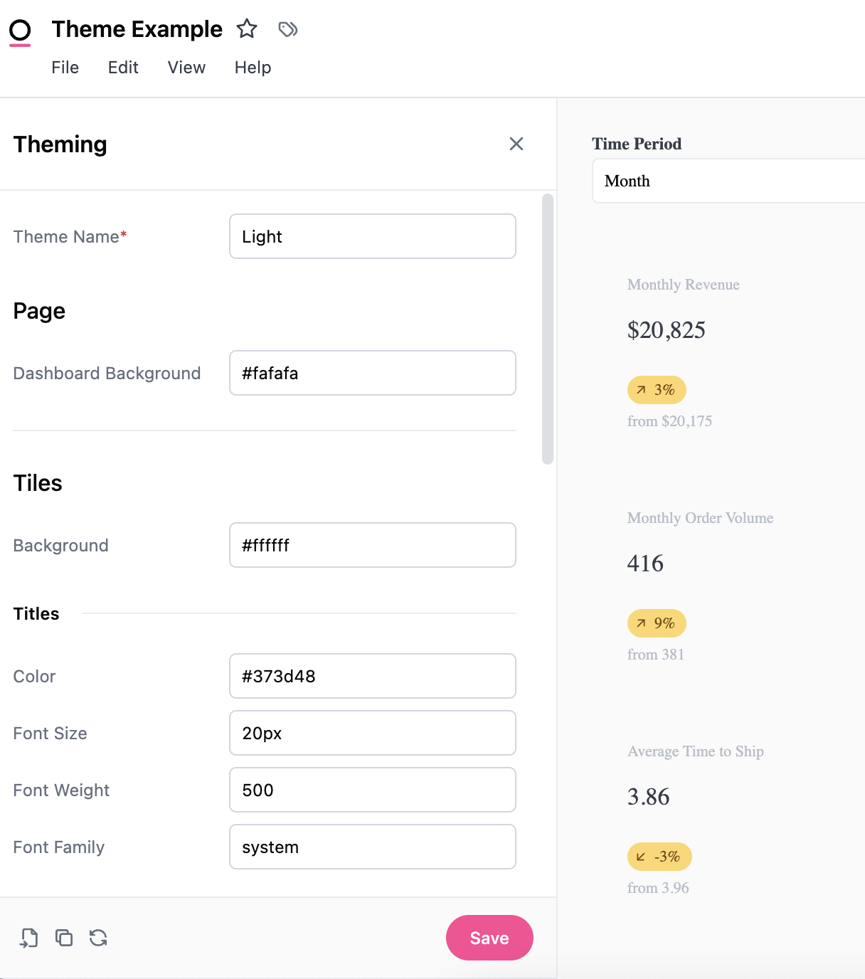
Create a new theme
There are four main areas that can be controlled by themes: background, titles, borders, and elements. Changes are automatically applied when a user interacts with the theme builder, but are only saved by pressing the Save button in the bottom right-hand corner of the panel.
What is possible to theme today?
Omni leverages the power of CSS in themes. For example themable items that use CSS <color> value syntax support and valid css color value:
| Named colors | salmon |
|---|---|
| Hex codes | #ff4794 |
| Color functions | rgb(255 71 148) or hsl(334.89deg 100% 63.92%) |
Background colors can also accept css <gradient> values:
| Gradients | linear-gradient (#ff4794, #faaa6f) |
|---|
This table highlights the elements currently available (and some sneak peaks for what is going to be available soon). For a visual example, you can toggle between light and dark mode to see how the different elements are impacted by themes and how that lines up with the CSS.
| Category | Element | Sub-element | Default light | Default Dark | Accepts |
|---|---|---|---|---|---|
| Page | Dashboard Background | #FAFAFA | #262B36 | CSS <color> value | |
| Padding | 16px | 16px | CSS <length> value [Shorthand or individual side] | ||
| Palettes | Discrete | Any existing palette | |||
| Continuous | Any existing palette | ||||
| Tiles | Background | #ffffff | #161A22 | CSS <color> value | |
| Shadow | CSS box-shadow values | ||||
| Margin | 8px | 8px | CSS <length> value | ||
| Titles | Color | #373D48 | #CCD0D7 | CSS <color> value | |
| Font Size | 20px | 20px | CSS <length> value | ||
| Font Weight | 500 | 500 | CSS <number> value | ||
| Font Family | system | system | URL to remote woff2 file | ||
| Text | Color | #373D48 | #CCD0D7 | CSS <color> value | |
| Secondary Color | #676F7E | #B7BDC8 | CSS <color> value | ||
| Body Font Family | system | system | URL to remote woff2 file | ||
| Code Font Family | JetBrains Mono | JetBrains Mono | URL to remote woff2 file | ||
| Borders | Color | #EAECF1 | #2d343e | CSS <color> value | |
| Radius | 5px | 5px | CSS <length> value [Shorthand or individual side] | ||
| Style | Solid | Solid | CSS <line-style> value | ||
| Width | 1px | 1px | CSS <length> value | ||
| Controls | Background | #ffffff | #161A22 | CSS <color> value | |
| Border color | #D1D7E0 | #424857 | CSS <color> value | ||
| Text color | #070808 | #EBEDEF | CSS <color> value | ||
| Placeholder color | #6F7780 | #8F96A3 | CSS <color> value | ||
| Label color | #070808 | #EBEDEF | CSS <color> value | ||
| Radius | 5px | 5px | CSS <length> value [Shorthand or individual side] | ||
| Focus outline color | #3F78E9 | #3F78E9 | CSS <color> value | ||
| Control popover | Background | #ffffff | #22252A | CSS <color> value | |
| Text color | #070808 | #EBEDEF | CSS <color> value | ||
| Secondary text color | #6F7780 | #8F96A3 | CSS <color> value | ||
| Link color | ##006CBA | #64A4DF | CSS <color> value | ||
| Border color | #D1D7E0 | #424857 | CSS <color> value | ||
| Radius | 5px | 5px | CSS <length> value [Shorthand or individual side] | ||
| Divider color | #E0E4EB | #343B46 | CSS <color> value | ||
| Inputs | Background | #FFFFFF | #161A22 | CSS <color> value | |
| Border color | #D1D7E0 | #424857 | CSS <color> value | ||
| Text color | #070808 | #EBEDEF | CSS <color> value | ||
| Placeholder color | #6F7780 | #8F96A3 | CSS <color> value | ||
| Icon color | #676F7E | #B7BDC8 | CSS <color> value | ||
| Radius | 5px | 5px | CSS <length> value [Shorthand or individual side] | ||
| Focus outline color | #3F78E9 | #3F78E9 | CSS <color> value | ||
| Accent color | #3F78E9 | #3F78E9 | CSS <color> value | ||
| Accent invert color | #FFFFFF | #080808 | CSS <color> value | ||
| Tokens | Background | #F0F6FF | #1A2432 | CSS <color> value | |
| Text color | #070808 | #EBEDEF | CSS <color> value | ||
| Buttons | Radius | 10rem | 10rem | CSS <length> value [Shorthand or individual side] | |
| Primary button | Background | #FF4794 | #F787AD | CSS <color> value | |
| Text color | #FFFFFF | #080808 | CSS <color> value | ||
| Transparent button | Text color | #373D48 | #CCD0D7 | CSS <color> value | |
| Hover background | rgba(115,123,140,.08) | rgba(115,123,140,.24) | CSS <color> value | ||
| Menu item | Hover background | rgba(115,123,140,.08) | rgba(115,123,140,.24) | CSS <color> value |
The table also matches the order of the Theming Panel. It will automatically refresh as you make changes, but don't forget to press Save to make it available to apply.
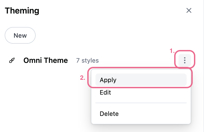
Once a theme is saved, it will appear in the Theming panel and the Admin can use 1. the three dot menu 2. apply the theme to individual dashboards.
There is not a global theme setting for internal dashboards. It is done on a one off basis for now.
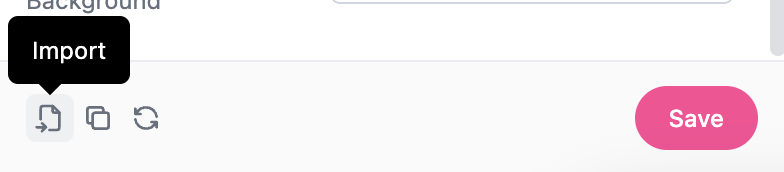
Import a theme
If you’ve already created a theme for your embedded dashboards you can import the theme by pasting the JSON into the Import **modal.
Edit a theme
To make changes to the theme, use the three dot menu to select Edit. Any changes made to the theme will impact other internal dashboards that are using the theme.
Appearance settings
Themes are not designed to work with the Appearance settings for individuals. For instance if an individual user has selected dark mode, for their appearance settings, some themes might look a little off.
Downloading dashboards
If given the ability, users can download dashboards by navigating to File > Download. For PDF downloads, you'll also have the ability to select a paper size (ex: legal) and orientation for the resulting PDF. Note: Reach out to Omni support to request access to the PDF customization feature.
Dashboard themes will be applied when downloaded. You can also schedule a recurring download or set an alert on dashboards.