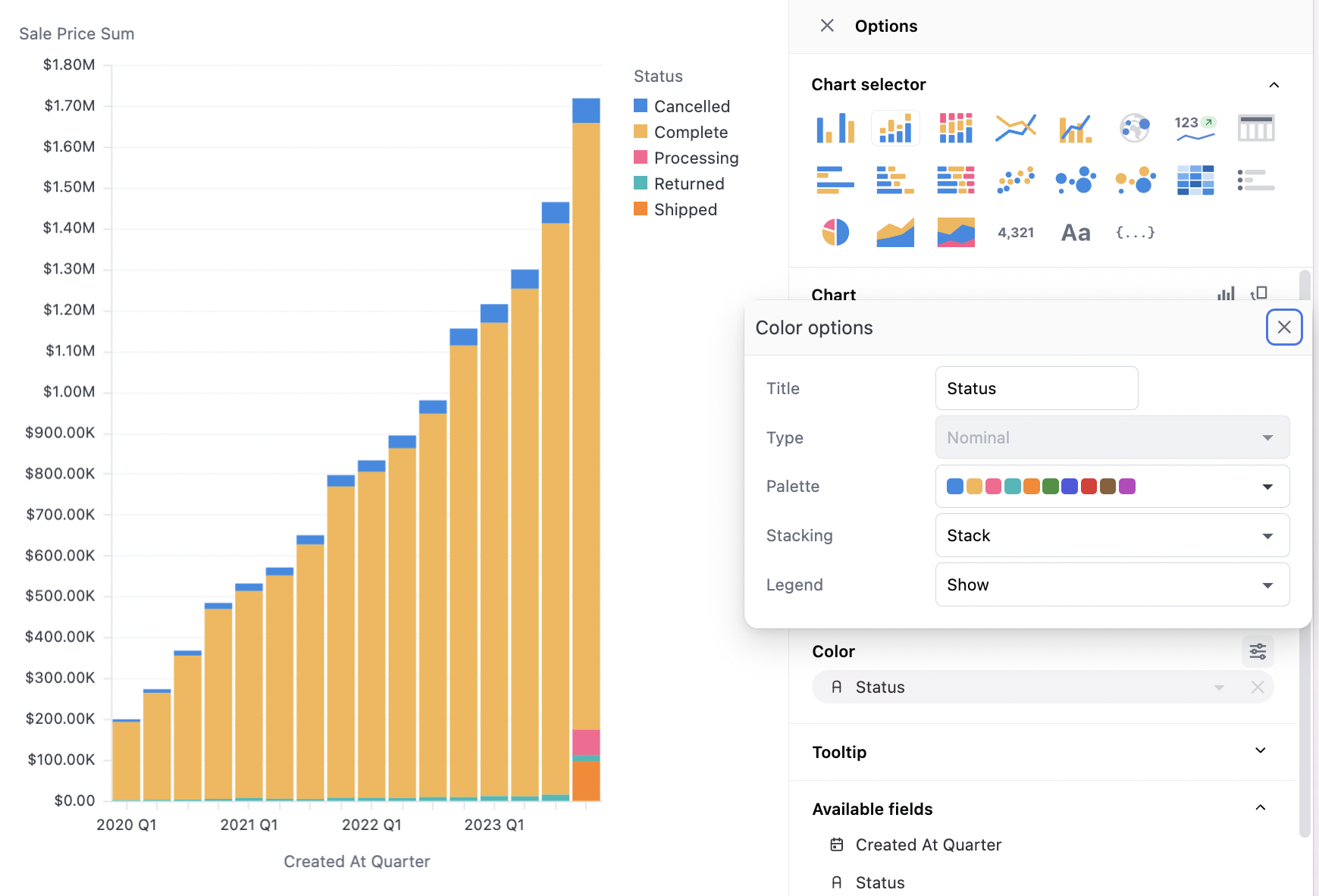
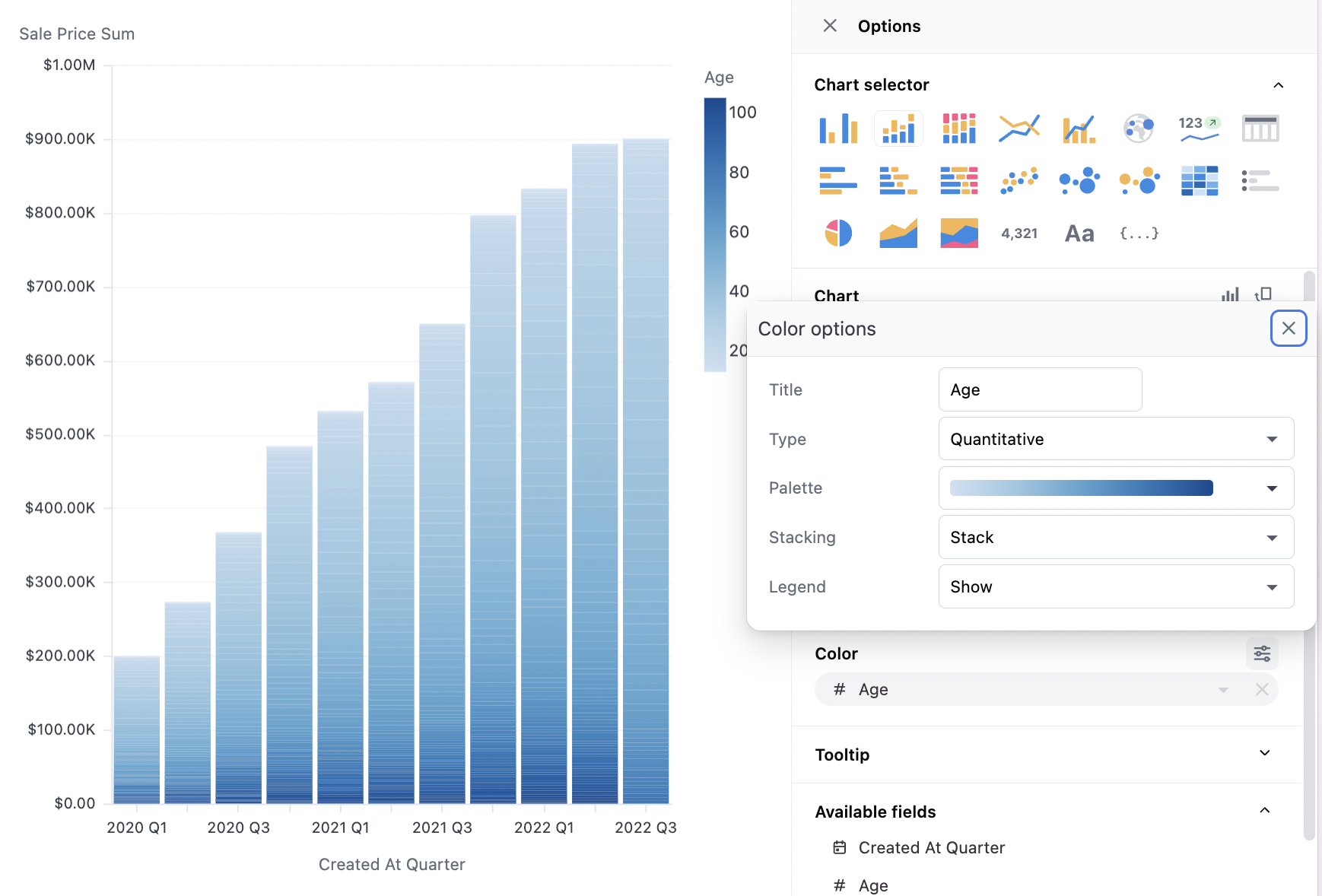
Color options
Color sets a facet across the given data set to create individual series. Color options also include stacking controls for the visualization. There will be slightly different options for string, date, and numeric data. Strings only offer discrete bucketing, while date and numeric data will offer both discrete (nominal) and continuous (temporal or quantitative) coloring. Note also that the palette options will change for discrete vs continuous, with discrete offering diverging color palettes and continuous offering a set of gradient color palettes. When continuous options are not offered on an apparent date or numeric, casting the field may solve the problem.String options
String options
Numeric options
Numeric options
Date options
Date options
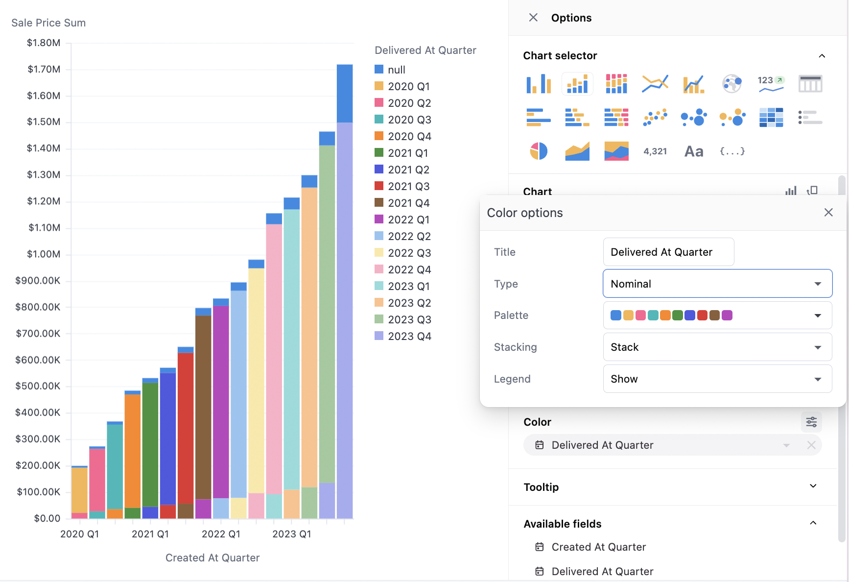
Palettes and color faceting
When using color faceting, Omni automatically applies the organization’s default color palette to your chart, using the discrete or continuous palette appropriate to the data. In the case of discrete data, colors from the palette are automatically applied based on the sort order of the query and the color order in the palette. For continuous data, the gradient palette is automatically applied to the range of the values from the query results. Select a different option from the palette menu to update the color treatment.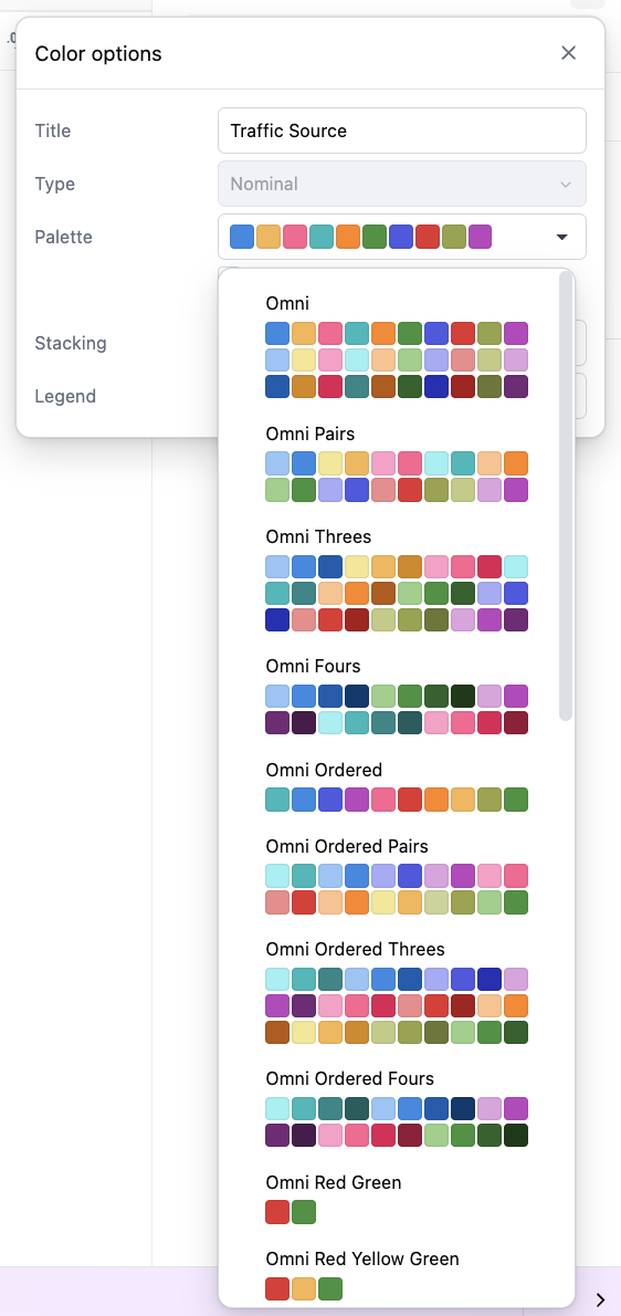
Custom palettes
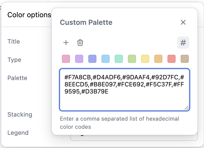
If one of the provided palettes doesn’t quite suit your visualization needs, a custom palette can be built for an individual chart. The last option in either the continuous or discrete palette menus is a Custom palette option. Select this option and then click the Customize button next to the menu. From here you can add, remove, and edit the palette colors: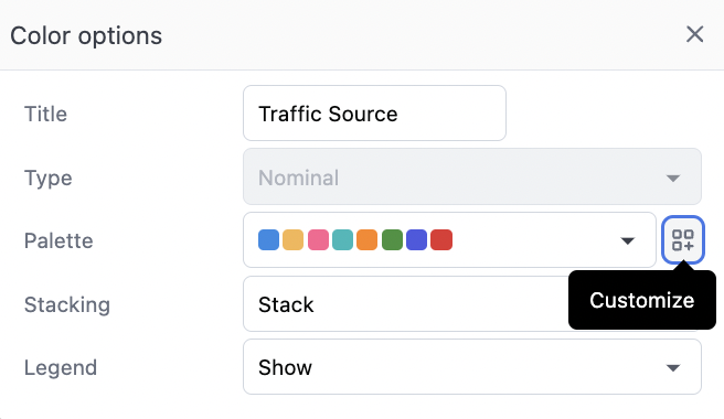
Gradient color scale values
When using a continuous gradient palette to color a visualization by a numeric field, you can pin specific values for the minimum, midpoint, and maximum of the color scale. This allows you to control exactly which data values map to which colors in the gradient, rather than always using the automatic data range. A Scale values row appears in the color configuration panel whenever you have a quantitative (continuous numeric) color field. You can set:- Min - The minimum value for the color scale. Values at or below this value will use the first color in the gradient. If left unset, defaults to the minimum value in the data.
- Mid - The midpoint value for the color scale. This value will use the middle color in the gradient and remain within the min and max bounds.
- Max - The maximum value for the color scale. Values at or above this value will use the last color in the gradient. If left unset, defaults to the maximum value in the data.
100 but have data values of 150, those values will display using the same color as the 100 value.
Series color controls
Color controls are available on a series-by-series basis when no color facet is applied (with a single measure and no color, or with multiple measures). This will offer a simple color picker for each series.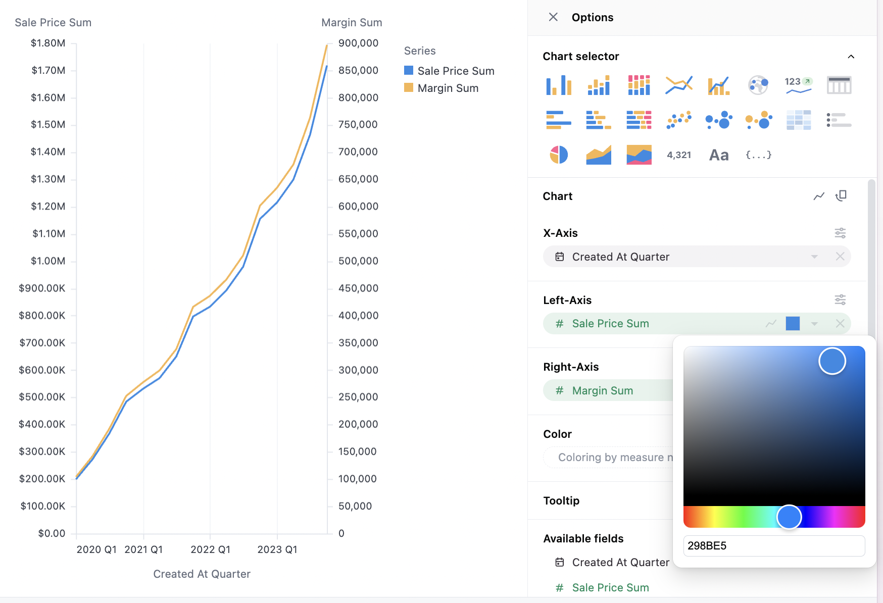
colors parameter.
Stacking options
Several stacking options are supported:- Automatic: Omni will attempt to select the best option from the four below
- Stack: The series will be stacked
- Group: The series will appear side-by-side (only offered for bar charts)
- Overlay: The series will appear on top of each other. This is how points and lines frequently work, but rarely valuable for bar.
- Stack %: The series will be stacked, and shown as the percentage rather than the absolute values. Note: The tooltip will show the raw value, not the percentage, so to add percentage it’s recommended to use table calculations like
% of row.
Stacked segment sorting
When using stacking, you can control how the stacked segments are sorted using the Sort stack by option. The following sorting options are available:- Label: Sorts segments alphabetically by dimension value. This is the default option.
- Value: Sorts segments by their measure value within each individual stack. This option is only available for bar and column charts.
- Sum: Sorts segments by their total sum across all stacks. This is useful when you want to see which segments contribute the most overall, regardless of their value in any individual stack.
- Unsorted: Preserves the original data order from your query results.
The Value sorting option is only available for bar and column charts. For area and line charts, use Sum to sort by total contribution or Label for alphabetical ordering.
Legend options
Legends can be located on the right, left, top, or bottom of the chart. They can also be hidden.Dimension colors
Dimension color modeling isn’t currently supported everywhere in the workbook. For example, dimension color mapping won’t apply colors to table cells.
colors parameter in a dimension, you can map a color to specific values.
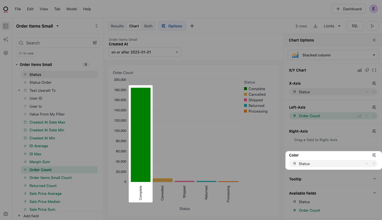
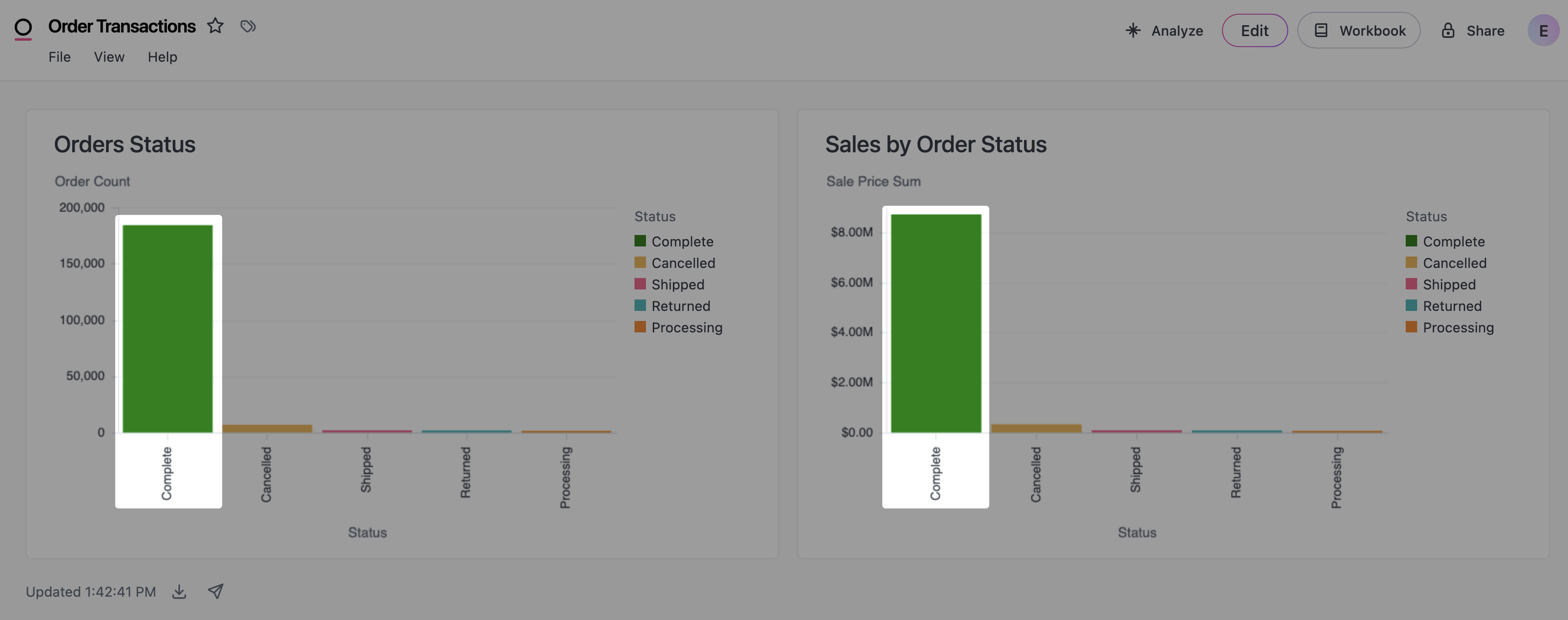
For example, the following image shows an example of two bar charts that include a status field. Notice that the bars for the Complete status are the same color:
Assigning colors to dimensions in the IDE
To achieve this in your own visualizations:-
In the IDE, add the
colorsparameter to a dimension in a view or query view. For example:Refer to the Dimensions parameter reference for more information and examples. -
In the Chart tab of the workbook, drag the dimension to the Color field: